Highlighting Specific Performance Metrics in a Dashboard
You can highlight chart elements based on the values that they contain. To add highlights to a chart, follow these steps:
1. Right-click on a data group in the chart, and select ‘Highlight’ from the context menu. This opens the ‘Highlight’ dialog box.
2. In the �Highlight� dialog box, define the desired highlight.
In this example, you will create a chart to display �Quantity Purchased� vs.
�State�, and use highlighting to draw attention to values that exceed 5000 or fall
below 1000. Follow the steps below:
1. Create a new Viewsheet based on the sample �Analysis� Worksheet.
2. Add a chart component, and click the �Edit� button. This opens the
Chart Editor.
3. In the �Data Source� pane, expand the �OrdersAndReturns� data
block.
4. From the �Dimensions� node, drag the �State� field to the �X� field of
the �Data� panel.
5. From the �Measures� node, drag the �Quantity Purchased� field to the
�Y� field of the �Data� panel. This creates the desired chart.
6. Right-click in any bar on the chart, and select the �Highlight� option
from the context menu. This opens the �Highlight� dialog box.
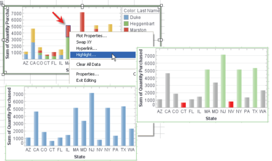
7. Click the �Add� button to open the �Name� dialog box.
8. Enter �Under1000� as the name of the first highlight. Click �OK� to
close the dialog box. The new highlight name appears in the highlight
list.
9. Click the highlight name in the list to select it. From the �Color�
palette, select the color red (rgb value �FF0000�).
10. In the �Condition� panel, click the �Edit� button to open the
�Condition� dialog box. Enter the following condition, and click �OK�.
[Sum of Quantity Purchased][is][less than][1000]
11. Repeat Steps 7-10 to add the following conditions and formats:
a. Name = �Over5000�, rgb value = �AAFFAA�
[Sum of Quantity Purchased][is][greater than][5000]
b. Name = �Between1000and5000�, rgb value = �B0B0B0�
[Sum of Quantity Purchased][is][between][1000,5000]
12. Click �OK� to exit the �Highlight� dialog box.
The chart table now shows the value-keyed highlighting you specified.
In particular, the very large and very small order quantities have been
highlighted in green and red, respectively.