-
An Additional Dashboard Color Tip: Keep Your Measures Distinct From Your Dimensions
Read moreWe’ve covered questions such as what kind of color palette to use in dashboard creation, how many colors to...
May 9, 20172 -
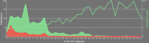
When to use a Dual Axis Chart
Read moreWhether comparing bar sizes, slices of a pie or the varying height of a line, the main advantage of...
-
Choosing the Right Colors for your Dashboard
Read moreIn a recent post, we discussed good guidelines for plotting an extra dimension or measure by color. In this...
-
Check Out the New and Improved VisualizeFree!
Read moreWhether you’re a student interested in learning the basics of analysis and data visualization software, or a professional who...
-
The Best of Both Worlds: Visualizing Proportions With a Waterfall Chart
Read moreThe pie chart has long been the standard way to show different categories of data as proportions of a dataset; in...
