
As a provider of data visualization tools we’re always curious to find interesting data visualizations that people are making in the real world. Here’s we’ve collected five good-looking, well thought-out and interesting examples.
1. Communicating Transparency and Corruption
Transparency.org‘s Global Corruption Barometer is an excellent example of an interactive data visualization. In the screenshot below, you can see how global survey respondents perceived the level of corruption in their respective countries. This particular screenshot is displaying perceived corruption data as it relates to political parties.

2. Relationships of Common Health Symptoms
Have you ever wondered how common your health symptoms are or if they’re related to other conditions? GE has. Its Health InfoScope allows you to look at data from millions of patients to get a deeper understanding of common health conditions. This is another interactive chart where you can drill down into the data according to your interests.

3. Historical Browser Statistics
Remember when AOL and Netscape were the browsers of choice for early Internet surfers? They’re mere blips in the history of Web browsers according to this data visualization on Axiis.org. Presented as a series of colored rings, much like the inside of a tree trunk, this data visualization shows how market share has changed over time.

4. Election Visualizations
Voters often change their minds just before voting, and the following data visualization shows how the nation shifted during the 2012 election. This particular visualization also allows you to see how the nation shifted from the 2008 election as well as how women, hispanics, and young voters influenced the elections.

5. Fuel Economy by Auto Manufacturer
Curious about which auto manufacturers are boosting fuel economy? InetSoft’s interactive Fuel Economy by Manufacturer allows you to look at fuel economy by manufacturer in numerous ways including by manufacturer, model, fuel type, or the number of cylinders. With just a quick glance, you can easily see which manufacturers are focused on fuel economy and which ones aren’t.

From corruption and health conditions to browser types, voting, fuel economy, and beyond, the world of data is waiting to be explored visually. How will you learn more about your world?
Sources:
1. InetSoft, “BI Visualization Gallery,” – /evaluate/bi_visualization_gallery/
2. Key Webmetrics, “20 Inspiring Big Data Visualization Examples,” – https://www.keywebmetrics.com/2013/07/big-data-visualizations/
3. Transparency.org, “Institutions Perceived By Respondents To Be Among The Most Affected By Corruption,” – https://www.transparency.org/gcb2013/results
4. GE, “Health InfoScope,” – http://visualization.geblogs.com/visualization/network/
5. Axiis, “Historical Browser Statistics,” – https://www.axiis.org/examples/BrowserMarketShare.html
++++++++++++++++++++++++++++++++++++++++++
Related Articles
-
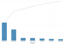
Reading Proportionality Clusters with a Pareto Analysis Chart
-
InetSoft’s VisualizeFree Included in Top 10 Free Data Visualization Tools!
-

Back to the Basics, Part 2: Using Sortings and Rankings to Analyze Data with Many Distinct Values
-
Back to the Basics: Adding Context to Charts With Text KPI Metrics