-
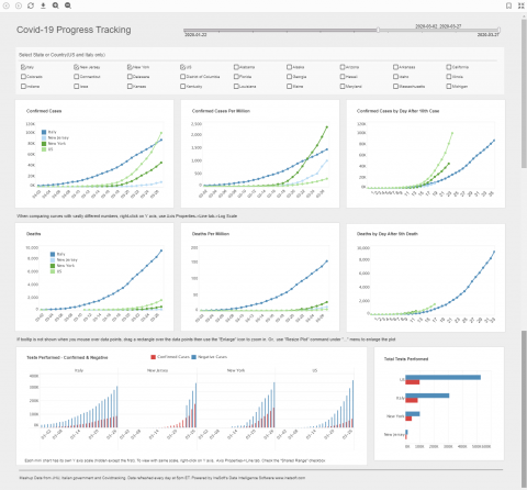
InetSoft Creates Live Data Dashboard for Coronavirus Tracking
Read moreThis Covid-19 tracker mashes up data from a few different sources to give views that aren’t found in the...
March 29, 20201 -
Choosing InetSoft over SAP Lumira
Read moreChoosing the right solution for business intelligence and automated reporting can be daunting. In a recent match up compiled...
-
InetSoft vs. Slemma
Read moreHow does InetSoft compare to dashboard and analytics provider Slemma? In a recent matchup of user reviews on G2...
-
Style Intelligence vs Avora
Read moreHow do Style Intelligence and Avora compare? When recently placed head to head in ratings by research firm G2 Crowd,...
-
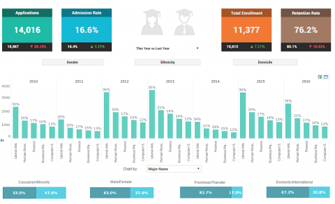
College KPI Dashboard
Read moreHow can data visualization help admissions officers track student enrollment patterns? Check out this interactive College KPI Dashboard from...
