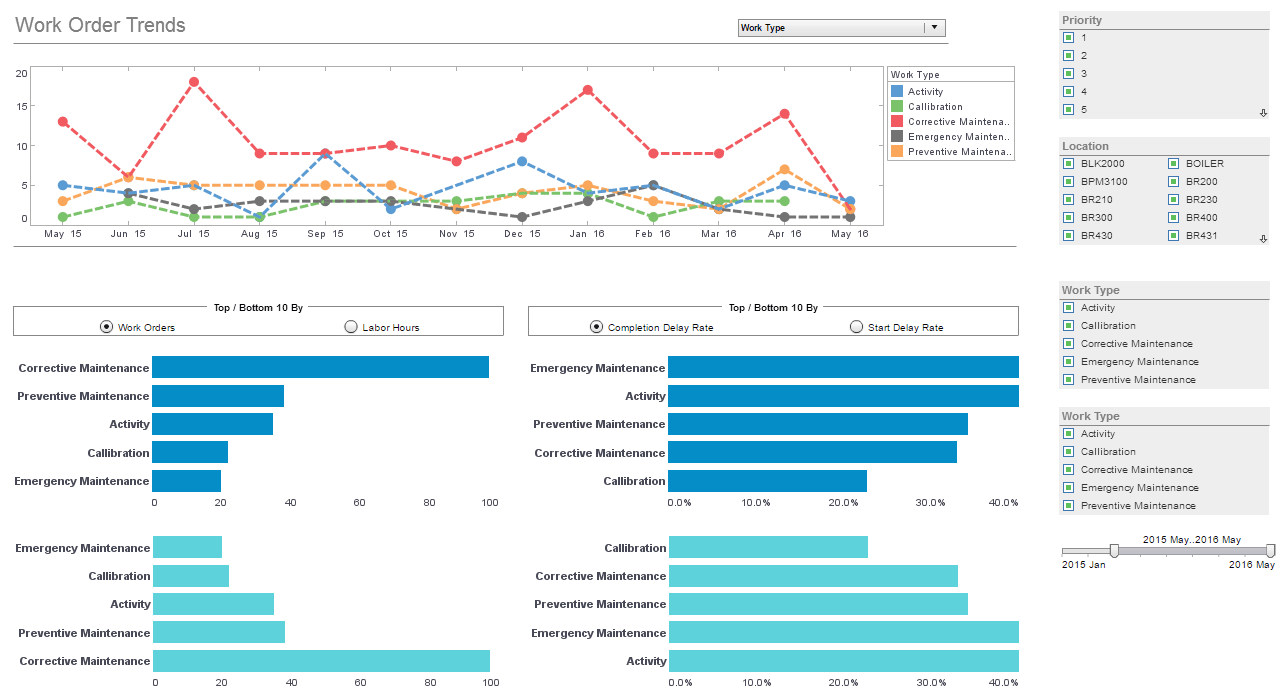
Operations Management Dashboards
Below is the continuation of the transcript of a Webinar hosted by InetSoft on the topic of Agile Data Access and Agile Business Intelligence. The presenter is Mark Flaherty, CMO at InetSoft.
Mark Flaherty (MF): A large part of the North American market data was available in a data warehouse which also included some of the forecast and budget information. But the real challenge that they faced was how to relate that on a global basis because the drugs in rest of the world Europe, Asia Pacific, et cetera were being primarily sold through wholesalers and distributors, and to get a full picture they have had to federate a lot of that information. So they had multiple challenges.
First the formats in which they were getting the data was very disparate and had to be normalized and accessed. Some of that was semi-structured data and had to be transformed, matched and integrated. But also they needed to be able to access it in a very dynamic real time way.
So the data services platform in this case is taking data from a data warehouse or a physical data store and mashing that up with a variety of data sources and then presenting the same virtual view of data in multiple ways.
| #1 Ranking: Read how InetSoft was rated #1 for user adoption in G2's user survey-based index | Read More |
One of the benefits of the data services platform is you can have a logical view but then you can present it in different upfront formats. So in this case it can be pushed to an Excel spreadsheet or a query but it can also be accessed as a daily sales report, which is standard practice today, and they will continue to do that. But now they are also able to enable a Web portal and mobile applications to pull up specific drugs by specific drilldowns by geography, et cetera., et cetera, and also push that data in a batch mode to a historical data mart for analysis.
The last example I will use here is one around operations management. Operations management can be very complex whether you are talking about manufacturing operations, whether you are talking about customer service logistics, et cetera. In this particular case, it's about network management, provisioning IT services, as well as, network services in a very large telco company.
What they were trying to do is adopt the best practices for operations management dashboards where they would get real time views with drill down capability with some indication of causality in terms of how all of their systems were performing. Now this company had significant investments already in all kinds of specialized network monitoring suites. Some were IT monitoring, some were managing the actual telecom networks.
There was information about the applications and the support personnel and calendars for upgrades and all kinds of stuff including some semi-structured and unstructured data and log files, Excel, etc. Again here the challenge was not building the front end of the dashboards which will continue in a traditional model, but how do you provision those front ends?
What Is Displayed in a Network Management Operations Management Dashboard?
A network management operations management dashboard provides a comprehensive overview of the status, performance, and health of an organization's network infrastructure. At its core, the dashboard displays real-time and historical data on network devices, connections, and traffic, allowing network administrators to monitor and manage the network efficiently. One essential component of the dashboard is the network topology map, which visually represents the layout and interconnections of network devices such as routers, switches, and servers. This map provides administrators with a clear understanding of the network's architecture and helps identify potential points of failure or congestion. In addition to the topology map, a network management operations management dashboard typically includes key performance indicators (KPIs) and metrics related to network performance and availability. These metrics may include bandwidth utilization, packet loss, latency, error rates, and uptime percentages for various network components.
By monitoring these KPIs in real-time, administrators can identify performance bottlenecks, troubleshoot issues, and proactively address potential network disruptions before they impact users or applications. Furthermore, the dashboard often features alerting and notification capabilities to alert administrators to critical events or anomalies within the network. Alerts may be triggered based on predefined thresholds for KPIs, such as exceeding bandwidth limits or detecting unusual patterns in network traffic. Administrators can configure the dashboard to send notifications via email, SMS, or other channels, ensuring timely response to network incidents and minimizing downtime.
Lastly, a network management operations management dashboard may provide reporting and analytics features to help administrators analyze trends, track historical performance, and make data-driven decisions about network optimization and capacity planning. Reporting capabilities may include customizable dashboards, trend analysis charts, and detailed performance reports that provide insights into network usage patterns, peak traffic times, and resource allocation. By leveraging these reporting tools, administrators can gain deeper visibility into network performance trends and make informed decisions to optimize network efficiency and reliability.
| Previous: Data Services Platform |


