In previous posts, we’ve discussed how different charts are more effective for different purposes, with bar charts and scatter plots for displaying discrete aggregates, and a line chart to display a time series. However, as this post will show, using a line chart for a time series has its limitations when it comes to displaying the most actionable information needed. One example would be using a line chart to follow stock prices. A simple time series showing average price per day would be somewhat useful, however the volatility of the stock might not be obvious from viewing the fluctuations in daily average price, as stocks often have large gains and losses in a single day.
The time series could be broken down by hour to show more detailed fluctuations, however an hourly time series of a stock value over the course of a period as brief as a week would be so full of fluctuations it would not effectively give an overall impression of the stocks performance. The art and science of data visualization is creating visual displays that cut through the noise and details and deliver the most crucial metrics, the metrics which help answer common questions about the data. The most important daily metrics for a stock are the opening and closing price, and the highest and lowest price of the day. Is there an elegant way to visually display all of these daily metrics together, over the course of a week or even a month?
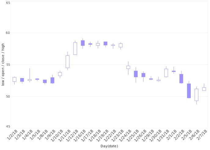
An InetSoft generated candlestick chart
Enter the candlestick chart. Thought to have been developed by Japanese trader Munehisa Homma, the candlestick chart is a modified bar chart which uses the top and bottom of each bar to indicate opening and closing price, and a line extending through each bar to represent the highest and lowest price. These charts are also commonly called stock charts, since tracking the performance of financial assets is their primary use. The example shown above underscores the utility of the candlestick chart, as with this method the daily behavior of the stock can be monitored over the course of an entire month without visual clutter or the need to drill down.
InetSoft’s visualization designer allows the creation of both “stock” and “candlestick” charts. The distinction is an aesthetic one, with the stock chart using horizontal lines instead of bars to represent the opening and closing price.
Keep following The Mashup for more ideas on how to effectively display your data.