University and Higher Education Dashboard Examples
Universities and higher education institutions are typically thought of as places where information and data disseminate from. However, from a business intelligence perspective, there is also a large influx of data at these types of institutions. For example, universities collect and store datasets regarding student demographics, academic performance, housing status, meal plans, academic departments, class enrollment levels, and other important information.
To help manage all these variables, and make the best use of available resources, many universities deploy business intelligence tools. By leveraging business intelligence tools, university staff and administrators can convert all their raw data into visually intuitive dashboards.
Universities can compare and monitor student performance and gauge the effectiveness of the educational process. The right business intelligence solution should be flexible enough to be used in an educational setting and robust enough to provide powerful data mashup and drill down capabilities. Alongside these tools, many students turn to the best dissertation writing service to support their academic success. Data mashup enables users to compare disparate data sources and drill down capabilities allow users to pinpoint problem areas.
Examples of KPIs in Universities and Colleges
- Percentage of freshman students who return the following year
- Percentage of graduating students relative to the total number of students
- Total operating expenditures per full-time student
- Total number of enrolled students and the number of hours enrolled per concentration
- Level of student participation in intramural athletics and sports clubs
InetSoft users in higher education include: Carnegie Mellon University, Florida International University, Gallaudet University, Northwest Nazarene University, Seton Hall University, and Rutgers University.
KPIs can be compared side-by-side in a dashboard, or they can also be aggregated and grouped together to provide deeper insight into issues like student and staff satisfaction levels.
InetSoft's Rapid Development, Self-Service Enabled Solution
InetSoft's data intelligence web application combines data mashup with visualization dashboards and reporting. The unique data mashup capabilities enable unified views of all organizational data. Visual dashboards and reports can be quickly developed and deployed iteratively along with data manipulation refinement.
The rapid development process not only produced pre-designed dashboards & reports. This process also produce a foundation for self-service by business users. InetSoft's small-footprint, web application provides a streamlined, intuitive interface for all users, teachers, and administrators alike.
More Higher Education Dashboard Examples
Below are some education dashboard examples to give you a look at some of the advanced displays that can be created using Style Intelligence. Style Intelligence can be used to build visualizations for any type of department or industry. These visualizations can be built by nontechnical users with a basic Excel level understanding of data.
University Student Retention Dashboard

This university student retention dashboard breaks down dropouts and graduations by major while also displaying reasons for dropouts. Dashboards like this can help schools direct faculty to improve student retention. An enrollment type by year breakdown helps administrators know where to direct funds and also helps identify particular academic programs with student retention problems.
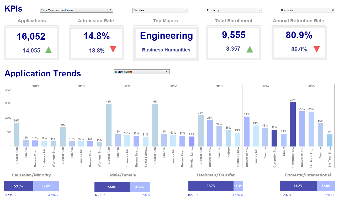
Higher Education KPI Dashboard

This higher education KPI dashboard shows a school administrator what the progression of major choices has been over the past several years, and breaks down the student population into various demographics, including race, gender, and other categories. The option to break down demographic data by class and major makes it easier for schools to implement and track the progress of diversity initiatives. Large, easy to read text KPIs display the dashboard's most important aggregates, with percent change from previous period displayed underneath them, giving college presidents an at a glance view of educational and social progress.

