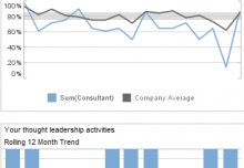
From traffic lights in our streets to penalty cards in our sports, color is a fundamental element of visual communication, and the use of colors in analytic dashboards is no exception. In addition to the general layout and placement of elements, the color scheme you choose for a dashboard will be the first thing a viewer notices when they view.
Along with making a dashboard more visually pleasing, you can use color to plot an extra data field on a chart, adding a third field to those already plotted by the x and y axis. The guidelines on how to do this effectively depend on whether the field you are plotting by color is a dimension or measure.
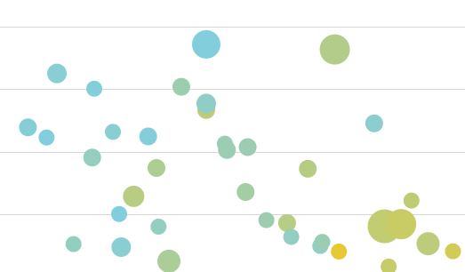 When a measure (a numerical value) is plotted by color it is displayed as a gradient of two colors, with one color representing the lowest value and the other representing the highest value, and all values in between displayed as a proportional blend of the two colors based on where the value falls on the range. For example, this bubble chart displays values as a gradient of blue and green.
What measures are good candidates for plotting by color? Any measures that do not contain strong outliers. A strong outlier will push the rest of the values into a narrow range of the color gradient, producing a chart in which most of the data points are about the same color.
Dimensions (distinct categories) can also be plotted effectively by color, with each category being assigned a specific color. This can be an effective communication tool provided the dimension does not have too many categories. For dimensions, too many categories means too many distinct colors for the viewer to keep track of; go past six and you are pushing your luck.
Stay tuned to The Mashup for more tips on using colors in a dashboard, from general guidelines on color selection to InetSoft specific features such as setting highlights on charts.