Stephen Few recently put up a new contest on his website to design the best dashboard possible; the prize being a spot in the second edition of his book Information Dashboard Design. This challenge is being touted by Stephen as the “most challenging event of this this type to date.” I haven’t been using dashboard software for all that long, and my skills are certainly outclassed by seasoned veterans, but I decided to give it a go anyway. Using InetSoft’s Style Intelligence, I produced the following dashboard:
Click for an interactive version
According to Few, the winner will be chosen on the basis of a single criterion: the degree to which the dashboard could ostensibly be used by an educator to quickly and effectively monitor the performance of his/her students in order to help them improve their mathematical skills. The data source was provided by Few; everything else was up to me.
So I set to work.
The focus of this contest is on design and not interactivity, with permission granted in the contest rules for the final product to be created entirely with image editing software. I, however, decided to use this opportunity to create something interactive that could be featured on visualizefree.com. You can see that the end result of this contest is currently available for manipulation by clicking the screenshot above.
Choosing to only use the dedicated dashboard software, as well rounded as it may be, put me at a disadvantage when you consider the magic of Photoshop. If you can do this to a person:

Photo courtesy of funrocker.com
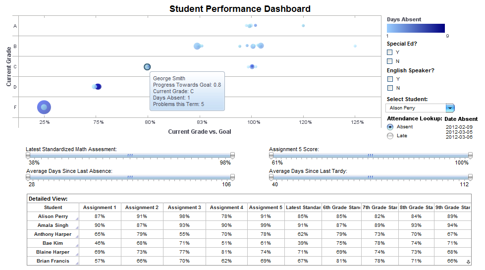
Just imagine what you could do with a dashboard! But I digress… Because this visualization was created to identify students in need of assistance, I chose to use a bubble chart. Bubble charts are highly effective tools when it comes to spotting outliers in a data set.
Each bubble on the chart represents a student. The darker the color, the more absentee days they had. The size of each bubble increases based on how many behavioral problems that student has had this term. The location of the bubble represents a student’s current grade and how close that grade is to their personal academic goal.
The chart and “Detailed View” crosstab can be filtered by specific elements using selection lists and sliders (“average days since” metrics are calculated fields derived from the original data). If the teacher wants to identify exact dates that a student was late to class or not present, he/she can view that information from a quick dropdown menu.
The aforementioned crosstab gives a quick overview of a student’s academic career. Using this scrollable menu, the teacher can see how well as student has performed not only in his/her class, but also all the way through middle school.
The results won’t be in until October 10th at the latest, so wish me luck!
 About the Author:
Michael Schiff is a Marketing Associate at InetSoft Technology