The mashup post on dual axis charts showed how an extra axis is useful for compare two metrics of different scales (such as a quantity and a percent). But what if there are more than two distinct variables that you want to compare? You could use text elements KPIs, but what if you wanted to break your variables down by a dimension? You need a radar chart!
Also called a spider chart, a radar chart plots different variables on distinct axes at different angles in a 360 degree rotation. With this method, in theory, an unlimited number of axes could be included, and an unlimited number of variables simultaneously plotted. However, it’s recommended that you stick to using no more than 5 or 6 variables and distinct categories.
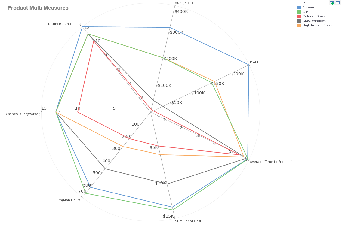
The radar plotting shown above compares items across a range of related variables. The strength of this kind of comparison is the ability to notice outliers across different variables and correlations across variables. This enables insights that would not be easy to discern when comparing a collection of single variable charts. For example, in this chart we notice that while C pillars have a high cost to produce, their medium price generates profits in about the middle of the range.
While A beams have similarly high requirements in terms of labor, their higher price creates enough of a margin to produce high profits. Perhaps the price of C pillars should be raised? Glass windows are on the higher end as far as labor cost and time to produce, yet their low prices are generating low profits, perhaps they should be deprioritized as a product offering? These are the kinds of more advanced comparisons that radar charts enable.
Keep reading The Mashup for more ideas on how to make better dashboards.