Data visualization has been quite the hot topic in the past several years, and for good reason. Presenting aggregate data in the form of multicolored bar, map, and pie charts communicate data relationships and proportions in a way that numerical aggregates do not. This visual, intuitive approach has brought many people into the world of BI who would have otherwise found business reporting to be too cold and analytical. But the focus on multidimensional charts and other graphical presentation elements has caused many report designers to forget the utility of good old fashioned text KPI’s (key performance indicators). While charts are indispensable to most analyses, balancing charts with simple aggregates can help add context to those charts, improving the readability and adding a high level view to data breakdowns.
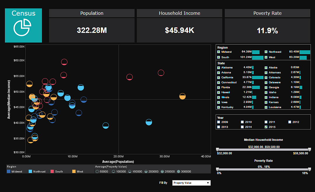
The dashboard of U.S. census data pictured and linked to above shows how adding some large, easy to read aggregates in text form can provide this high level view. The aggregates of national population, average income, and poverty rate provide much needed context for viewing those metrics on a state by state level. Putting these aggregates in large text and at the top of the dashboard ensures that they will be the first thing noticed and read, and provide an easy reference for the viewer to glance back at. Also, these general aggregates will update based on filter selections, so when the viewer drills down into the data the KPI’s will still be relevant to the data visualized.
Keep following The Mashup for more ideas on how to improve your dashboards and reports.