Data tips are a nice feature that provides additional information to the viewer whenever they hover over a data point. Additionally, information is instantly filtered based on the data point that is being highlighted. In this example, I’ll walk you through the process of creating a data tip from start to finish.
To start, I’ve created a simple chart that displays a typical call center performance management dashboard – Number of calls broken down by call type. By default, the tooltip summarizes the information I’ve already added to the chart whenever I hover over a data point.

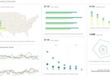
This dashboard neatly displays a typical call center performance management metric – Number of Calls by Call Type.
But, since I’ve already set the plot to display values, there’s not much of a point in summarizing the same data. So Instead, I’ll create another element to use as my data tip. This new element typically takes the form of a chart, table or crosstab that’ll provide more detailed information about the data point.
Here I’ll create a crosstab analysis that summarizes the number of calls and call time minutes, and provides the percent of successful calls by call handler. I’ve also made it so that the crosstab displays information for the top five representatives by success rate.

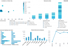
This crosstab allows the viewer to break down the first chart by call representative, and provides other critical metrics like success rate.
The final step involves simply designating the crosstab as the data tip for the chart. To do this, I’ll go back to the chart, right-click and select ‘Properties’. From under the General tab, I’ll click the Data Tip View option, and select the name of the element I just created.

Dashboard data tips are enabled from the chart properties.
Although the crosstab remains viewable in design mode, once in preview mode, the crosstab is only visible when I hover over a data point. Additionally, the information shown in the crosstab changes based on the data point I am hovering on at that moment. As you can see, crosstabs are a great way to provide an additional layer of information for performance management, without making the visualization any harder to follow.

Dashboard data tips add valuable information without sacrificing clarity.