The Washington Post recently published a rather thought-provoking article examining a study performed by two Swedish economists. Discontented with the amount of information provided in the final research paper, the Washington Post reexamined the data and created a data analysis visualization, mapping the least to most racist countries on a color scale from blue to red.

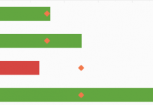
While certainly an improvement over the original text, this map fails to tell the whole story of the study. For instance, where is any information regarding economic freedom? InetSoft has decided, in order to present the most useful view of this data, a dashboard is required. Using freely the freely available Web-tool at www.visualizefree.com, InetSoft created this:

Click for an Interactive Version of This Dashboard
This dashboard is fully interactive, allowing users to see how dimensions such as economic freedom, population density, and GDP per capita affect racial tolerance. It takes static information and turns it into self-service data exploration, telling a more complete story.