In a recent post, we discussed good guidelines for plotting an extra dimension or measure by color. In this post, we’ll go over some general guidelines for color selection.
The right color selection can really make or break a dashboard, both in its aesthetic appeal and its clarity. While on the one hand, a dull lifeless color scheme will make the dashboard unappealing, going to far in the other direction with bright loud colors will end up distracting the viewer from what the dashboard is supposed to communicate. A selection of several distinct colors in a sensible pastel palette is a good middle ground when building dashboards.

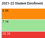
The screenshot above is a good example of this kind of color dashboard design, using soft pastels of distinct, mostly primary colors.
The uses of red and green on this dashboard are also take advantage of the natural associations we have with certain colors. Red is often associated with an undesirable outcome, and when green is paired with the red it implies a positive. So having calculated KPI’s automatically display as red or green immediately let the viewer know whether a metric has improved or worsened, and the red bar indicating that salesperson Eric is behind quota would immediately catch any executive’s eye.
Stay tuned to The Mashup for more dashboard ideas and tips on effective and clear analytics dashboard design.