Whether comparing bar sizes, slices of a pie or the varying height of a line, the main advantage of data visualization dashboards is that it makes comparing different metrics easy and intuitive. Seeing different quantities side by side communicates proportions to the human mind in a way that reading numbers on a report simply don’t. Now while standard chart types will break down a single measure by dimension, what if you would like to compare multiple measures? Using two or more side by side charts is an option, but for the sake of visual comparison, nothing beats having multiple measures plotted on a single chart.
If both measures are within the vicinity of each other numerically and are the same unit (such as dollars, people, etc) than plotting both measures on the same axis will do just fine. However, for apples to oranges type comparisons, it’s best to plot one of the measures on a second axis. Take this data visualization chart for example.
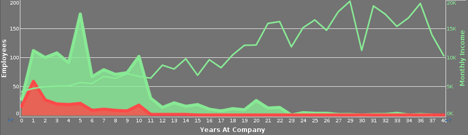
This chart is taken from the HR Employee Attrition Dashboard, which can be found at https://www.inetsoft.com/business/solutions/hr_dashboard/. This chart attempts to pinpoint the causes of employees leaving the company by measuring attrition compared to overall employment and number of years spent at the company, with employee salary rates also plotted for comparison. Comparing these metrics could help one to identify compensation factors that might be contributing to employees leaving, e.g. raises dropping off after a certain number of years. But comparing the number of employees to average salaries is an apple to oranges comparison. As one figure is less than a hundred across all data points and the other is in the thousands, plotting both figures on the same axis would make the employee numbers a flat line against the x-axis with no discernible quantity. But put employee income on a second axis and you have a clear comparison between employee income, age, and attrition rates.
Follow The Mashup for more business intelligence strategies for effective ways to visualize and analyze your data.