Multidimensional charting can increase the potential for discovering data relationships among different dimensions and measures. But how much is too much?
If you show any person on the street a simple line or bar chart, they’ll already understand how the x and y-axes are being used to display data. Take a bar chart and subdivide the bars by color and your average non-analytical person will still be able to plainly discern data relationships across the three dimensions. But what if you were to also plot another dimension by size? What if you took advantage of InetSoft’s advanced multidimensional data visualization dashboard to also plot by shape, add a measure to an additional text label, and then split both the x and y-axis by additional measures and dimensions? At a certain point, the chart will stop being communicative and start devolving into a meaningless jumble.
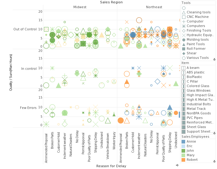
Just because you can plot so many dimensions doesn’t mean you should!
So where is the point of diminishing returns? It depends on the dataset and what type of insights you’re looking to glean from your dashboard design tools. However, a good rule of thumb to start out with is one or two extra dimensions, such as a color division on a bar chart, or a bubble chart with dimensions plotted by size and color. Go beyond and you are entering the danger zone.
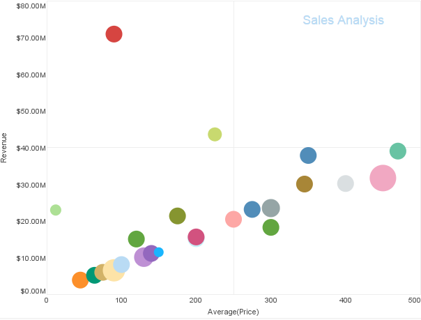
A bubble chart can have extra dimensions plotted by color and size, while still being easy to read and aesthetically pleasing
What about stacking multiple dimensions/measures on the x and y-axis? While this is less likely to become overwhelming, it is less effective for actually noticing patterns across different dimensions.
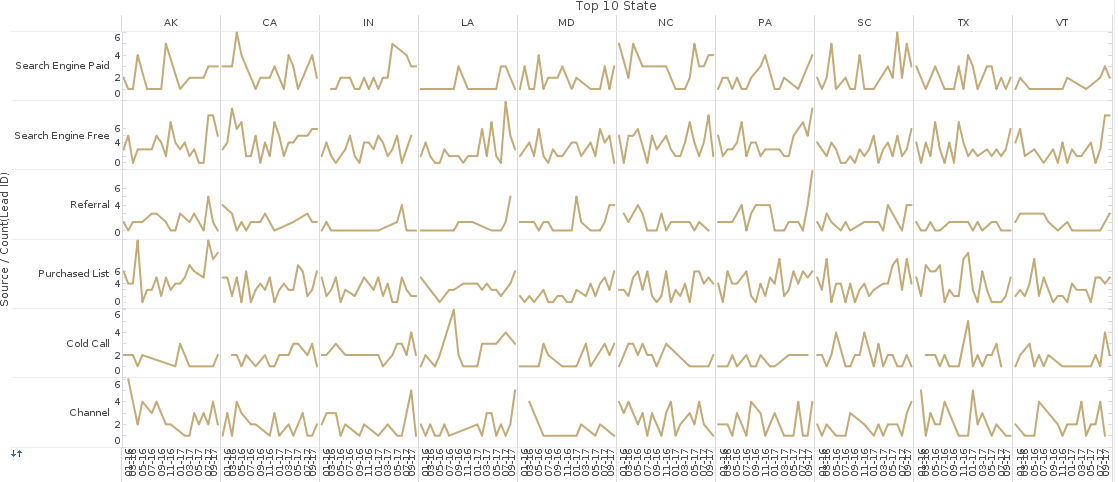
Try comparing the same date across multiple states and you’ll see the issue with using stacked dimensions to show data correlations.
So if you’re considering adding more than two extra dimensions to a chart, ask yourself, are you actually hoping to find patterns in the data across that many dimensions? Or are you just trying to save screen real estate? Screen space is often the reason why charts end up becoming too cluttered. But we have good news! There are actually many other ways to maximize screen real estate and dashboard effectiveness that don’t involve overloading charts, and these will be the subject of future Mashup posts.