In last week’s post, we discussed how overloading a chart with extra dimensions, including adding extra dimensions to the x and y-axis, can make a dashboard more difficult to understand and is also a poor way to maximize screen space. However, in certain dashboard use cases this can actually be an effective strategy, provided the chart is combined with the right filters.
For an example let’s take a look at the Mortality Analysis dashboard, found here in the InetSoft Visualization Gallery. This dashboard breaks down the frequency of various causes of death among different racial groups, age groups, and genders using a series of pie charts, with each cause of death getting its own color, and the age category of each racial group getting its own pie chart. As you can see, the dashboard with all ages and races selected is a bit much.
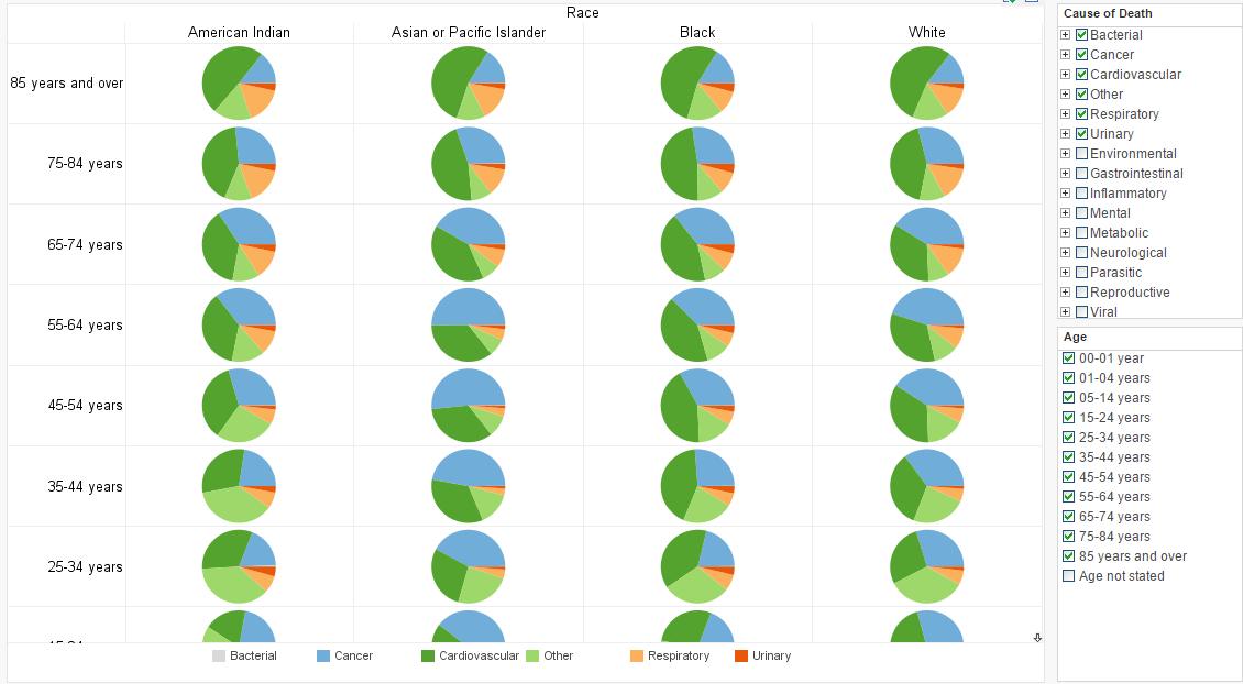
The number of pie charts displayed in this view far exceed the ideal for comparison
If you wanted to notice correlations across many different age groups and/or racial groups, this design of dashboard would not be a good choice; more effective would be using a chart more conducive to extra dimensions, such as a bubble chart with size and color variance. But does that mean that a dashboard of this design has no practical use? Not at all!
A broader point of data dashboard design that we’re touching on here is that the intended use of a dashboard is just as big a factor in design as the dimensions and measures of the dataset. While this dashboard would be a poor choice for searching for correlations across many groups, it is an excellent choice for drilldown, that is, asking specific questions of the data regarding the afflictions of particular age ranges and racial groups. It’s also ideal for comparing these particular subcategories to each other.
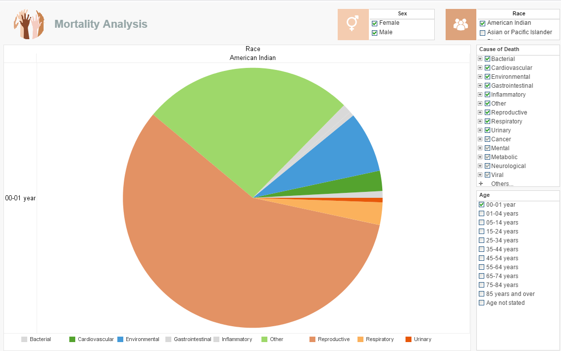
Let’s say you were doing pediatric research related to genetics and you wanted to know, “What are the leading causes of infant mortality among those of Native American descent?” Simply select those boxes and you have your answers in a large display that makes it easy to see the proportions of each cause of death.
We can make an exception to the “no more than 4 colors on a pie chart” rule on charts of this size.
Let’s say your curiosity was related to how different common afflictions affected different groups. You could ask, “How do black and white populations of middle to old age compare in mortality causes?” The number of pie charts needed to answer this question lies well within the range of clear comparisons.
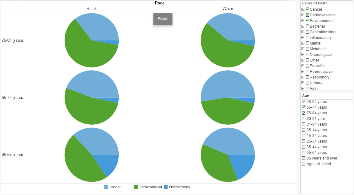
For the sake of clarity, we want to select only the most common causes of death for comparison
As you can see, best practices vary greatly depending on the dashboard’s intended use. In future Mashup posts, we’ll be discussing strategies for maximizing screen real estate in use cases where stacked charts such as these would not be appropriate.