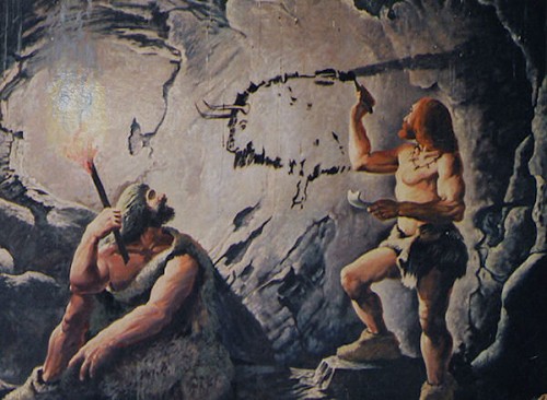
“We seem as a species to be driven by a desire to make meanings: above all, we are surely Homo significants – meaning-makers” – Daniel Chandler
In order to design better reports and dashboards, one must be aware of the two parts of a sign: 1) The signifier – The forms the sign takes (i.e. words, numbers, images, sounds, etc.), and; 2) The signified- The concept that the signifier represents (i.e. the sound of a car horn during your morning commute could signify anger, hastiness, that it’s time to step on the gas, or that it’s the start of a bad day). And logically, without both parts, a sign couldn’t exist at all.
A designer of reports and dashboards is a creator of signs and is charged with establishing both the signifier and the signified for the audience. As an example, the designer’s creation – a KPI dashboard or scorecard – serves as a signifier for the concept of: How the organization is performing; the signified.
So for the designer, an important aspect of creating an accurate sign is to have a clear understanding of the message that should be transmitted. This requires both a clear understanding of the information itself and preconception of how the measures and dimensions at hand will transmit the intended message as accurately as possible.
This also requires that the designer consider the modality and medium of the information that is being encoded. Given typical business intelligence practices, the medium is nearly always visual – as opposed to auditory, olfactory, or tactile. However, one might consider business intelligence to be multi-modal since most reports and dashboards rely on a combination of text, numbers, symbols, images, maps, charts, graphs, and diagrams.
So ultimately, a BI designer must consider how multi-modal signifiers can be assembled to accurately convey the signified through a visual medium. While these business intelligence practices may sound too abstract or complex to be practical, they actually offer great insight into how we might improve the reports and dashboards that we create.
In the last part of this series, we’ll discuss how to use multi-modal signifiers like text, numbers, symbols, images, maps, charts, graphs, and diagrams to most accurately communicate their intended meaning.


