We’ve covered questions such as what kind of color palette to use in dashboard creation, how many colors to use, and how to pick colors that communicate effectively. But there’s another color selection guideline that should be followed for BI dashboard design that communicates most effectively.
As previously discussed, a dimension plotted by color will produce a distinct color for each category, whereas a measure plotted by color will produce a gradient. Since this is standard, when viewers of a dashboard see a gradient, they will most likely assume that the value being plotted by color is a measure, not a dimension. For this reason, it’s advisable that when you plot a dimension by color, you choose a palette of distinct colors that do NOT suggest a range. Below is an example of a good choice and poor choice of palette.
A good color palette for plotting a dimension
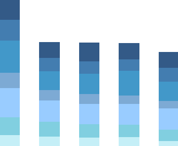
A not so good color palette for plotting a dimension
Stay tuned to The Mashup for more weekly tips on using visualization software to communicate data relationships more effectively.