Making the right choices when it comes to colors, chart types, filters, and layouts are common considerations when discussing effective dashboard design. But there’s another aspect of designing dashboards that’s often overlooked: using labels and titles effectively. Poor choices in labeling can make an otherwise effective dashboard confusing or unclear. And while proper labeling may seem self-explanatory, some factors are often overlooked.
On the more obvious end, a happy medium needs to be struck regarding the size of text on your dashboard. Users should never be squinting or straining their eyes to read the labels, but at the same time, labels with unnecessarily large text can crowd out other dashboard elements and make the design cluttered. It’s also important to pick communicative labels for charts and axes. It’s often better to swap out a technically accurate label for a more colloquial one, such as replacing COUNT(customerID) with “number of customers”.
As important as it is to choose clear labels, it is possible to overlabel a dashboard. The necessity of axis labels and of chart titles can be determined on a case by case basis. In some instances, a chart’s title will make axis labels unnecessary, and in other cases, axis labels will make a chart title unnecessary. These choices are about striking a balance between clarity and brevity.
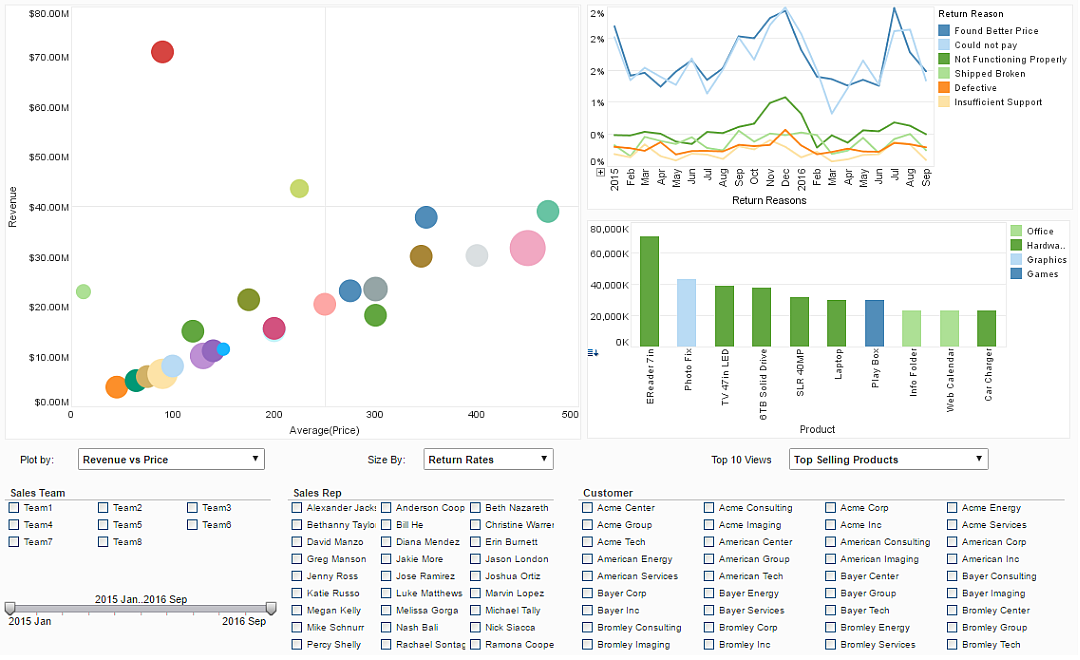
The Sales Analysis data dashboard example pictured above illustrates this. In the “Return Reasons” chart, a user can guess by the title that the dates listed are order dates, hence an axis label is unnecessary. Likewise, in the “Product” chart, a viewer can guess that the numbers on the Y axis are sales revenues, given the overall theme of the surrounding dashboard.
Keep following The Mashup for more tips on creating dashboards.