The pie chart has long been the standard way to show different categories of data as proportions of a dataset; in fact, it’s so common that the image has made it’s way into popular idioms, such as someone speaking of their “slice of the pie”. But this old standard has its limitations. First, once you go above four or five dimensions, a pie chart can become overwhelming and disorienting, with the comparative sizes of the different categories becoming less and less clear. Second, it’s been shown scientifically that viewers can discern slight differences in size more effectively when viewing bars on a bar chart then when looking at slices of a pie. But a bar chart lacks the clear display of proportion to the whole that a pie chart offers. So which should you use, bar or pie? What’s more important, comparison or proportion? The good news is that you don’t have to choose. There’s a lesser known chart that offers the advantages of both pie and bar chart: the waterfall chart.
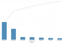
Waterfall chart from an InetSoft financial dashboard.
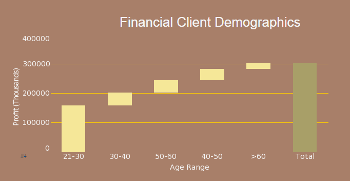
The waterfall chart is a bar chart with a twist. First, at one end of the chart is a bar representing the sum of all values visualized, giving the viewer a visual sense of the proportion of each category to the whole. Second, each bar occupies a distinct space on the x axis as well as the y, with the bars placed diagonally in an ascending pattern, hence the “waterfall” label. In addition to being aesthetically pleasing, this makes the proportion of each category to the whole even clearer to the viewer. In InetSoft dashboard products, the waterfall chart option can be found as one of the standard charts available in the Visual Composer chart menu.
Stay tuned to the InetSoft blog for more tips on making better, clearer dashboard data visualizations and reports.
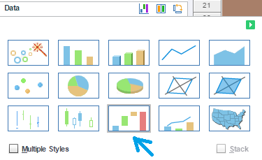
Waterfall is one of the many chart types available in InetSoft’s dashboard reporting products.