In a Mashup post last year, we discussed how using a waterfall chart instead of a pie chart can help you compare a greater number of distinct categories, while also giving the viewer a sense of the proportion of each category to the overall dataset. In this post we will talk about a chart type which conveys proportionality in more detail, and is also more aesthetically pleasing than a waterfall chart: a Pareto chart.
A Pareto chart is a dual axis chart which consists of a bar chart and a line chart. The bar chart aspect is fairly standard except it is always sorted so that the chart displays the highest amount, or tallest bar, on the left and the lowest amount on the right. The line chart that is displayed over the bar chart displays the total proportion of the dataset represented by the bar below it combined with all larger bars to the left. This may sound a bit esoteric but take a look at the Pareto chart below for a clear picture.
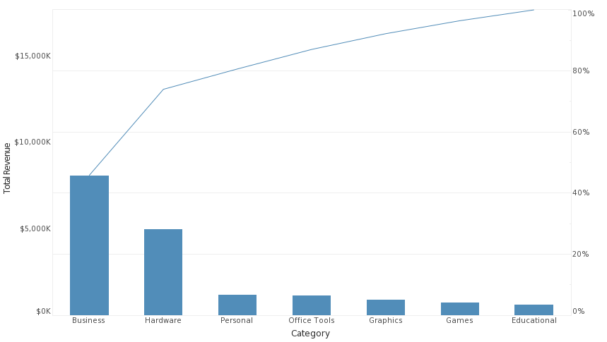
The cumulative-percent-of-total line can help give insights into what areas of a business sector to focus on. Ever hear of the 80/20 rule, the idea that in general, %80 of effects come from %20 of causes? Well it so happens that the 80/20 rule is also known as the Pareto Principle, and an inspection of this chart shows why the principle is relevant to the Pareto chart. Hardware may not look like a very important product category, but if we look at the line plot we can see that business and hardware combined make over %70 of all business. Thus, to improve revenue, it might be enough for a manager to focus on improving the numbers of these two important areas. On a more general note, unlike the staggered bars of a waterfall chart, the bars here all being level aid the viewer in making minute distinctions between categories of similar values.
Keep following the Mashup for more ideas on how you can make your dashboard and reports more unique.