In a previous post, we discussed how adding just a few aggregate KPI’s to your dashboards can provide much needed context to more complex elements such as charts. This week’s post discusses another basic, yet often overlooked strategy for designing a dashboard – using rankings and sortings to help break down datasets with many distinct categories.
The datasets that easily produce the most picturesque dashboards contain dimensions that contain somewhere around 5-10 distinct categories. Whether those categories will be shown as different colors or as bars in a bar chart, a number of categories around 5-10 gives a detailed enough breakdown to be visually interesting, but not so much as to be visually overwhelming.
However, datasets in the real world are not designed for good dashboard aesthetics, in fact, it’s very common for a particular dimension in a dataset to have 20, 30, or even a hundred distinct values. For a dashboard in which the main purpose is drill down, this is not necessarily a problem, as the user can simply adjust filter settings to display only the data for the distinct values she is interested in. But most dashboard requests are for a dashboard that gives a high level overview, while still allowing for drill down. So how does one display data with many categories in a way that is not overwhelming?
One strategy that can help add clarity if a bar chart has a few too many bars is to set them to sort based on values. When bar elements are sorted in this manner, the maximum and minimum values are obvious and the viewer gets a much better sense of the general distribution. This can add clarity to a bar chart with 10, 15, or even 20 values. But what about when the number of distinct categories is much higher than that?
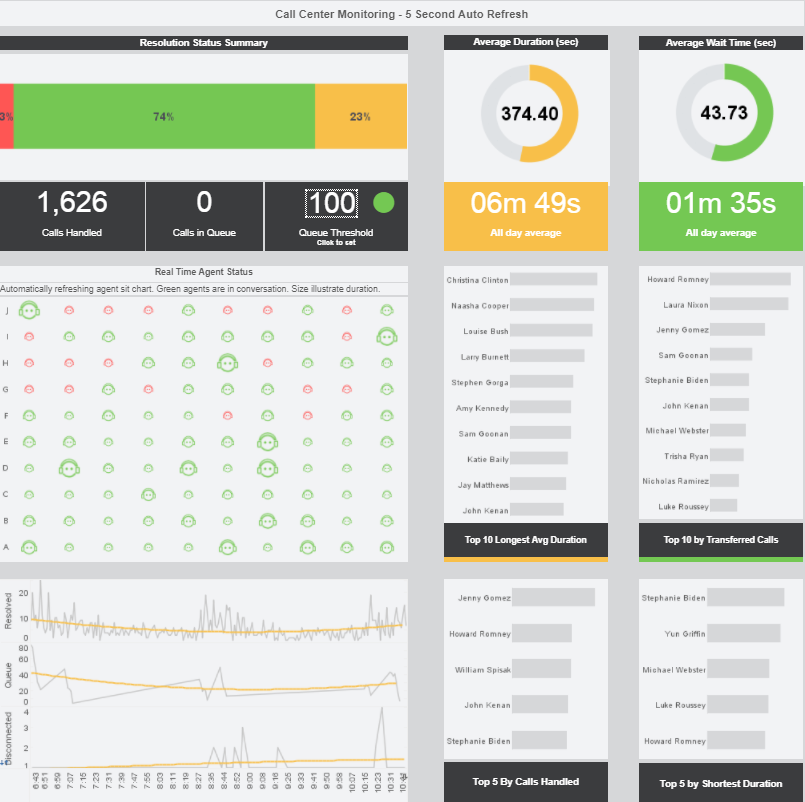
The above clickable Call Center Monitoring Dashboard illustrates how rankings can be used to help break down data with many distinct values. In this instance, rankings are being used for quality control. A quick glance at the various bar charts tells an executive whose calls are lasting the longest, who wraps up their calls the fastest, who handles the most calls and who has to transfer their call to another person the most often.
Other common examples of important outliers that rankings can be used to reveal is highest and lowest performing salespeople, highest or lowest selling products, and which employees receive the most praise or complaints from customers. There is no limit to the practical uses of top and bottom rankings charts, as long as you make sure to label each chart appropriately so that the viewer is well aware that they are not seeing the entire dataset represented.
Follow The Mashup for more advice on building clear, intuitive, and visually appealing dashboards and reports.