I work in the marketing department of a business intelligence software firm.
Somewhere inside of me, there’s a four-year-old who could only ever dream of growing up to become a firefighter, a lumberjack, and a stuntman. And he’s groaning all the time.
That’s not to say I don’t enjoy my role. It’s just a lot more challenging than I could’ve anticipated. TV and movies abound with handsome men in tailored suits who merely pour themselves a tall glass of a single malt scotch, kick their feet onto a solid oak desk, and peer out from a corner office window to a frenzied city below.
“Hot damn! We’ll dress the pug up as the Easter Bunny and we’ll get Mel Tourmé to do the voiceover! Ms. Harris, are you writing this down?!”
Meanwhile, I stare out onto a dusty, windswept parking lot in the light commercial district of sleepy Piscataway, New Jersey.
“We should get the guy from the old spice commercials to demonstrate materialized views!”
My cubemate momentarily nods and smiles, barely managing to feign interest.
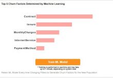
A few months ago, during one of our marketing brainstorming sessions, I did manage to come up with the semi-decent idea of placing interactive business dashboard design examples on our website. We’d already had our visualize free gallery up and running for some time, but I thought it’d be pretty cool if someone who came to the site looking for an industry-specific solution had a chance to toy around with something that was immediately relatable.
So for the next dozen weeks, I strove to become a self-made expert, seeking out the most important key performance indicators by industry. Although this was the most difficult part of the assignment, I was fortunate to have a website like the KPI Library at my disposal along with input from several colleagues who at one point had done some technical consulting for a company within a given industry.
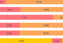
Next, I tried to show interesting views by creating fictional datasets or using real datasets whenever possible and then presented them in a unique dashboard layout each time. Depending on the example, you’re able to filter by dimension, measure, or date range and view results on charts, geographic maps, gauges, or tables. In some cases, you can drill down deeper with data brushing.
While they’re only simple examples of the kinds of dashboards you’d be able to create with our software, I feel they do a good job of drawing to the forefront the kind of exploratory work you’re able to do with dashboards. They also do a good job of illustrating some of the design possibilities at your disposal, from color schemes to fonts to element layouts.
So check out my interactive examples and let me know what you thought. Don Draper be damned!