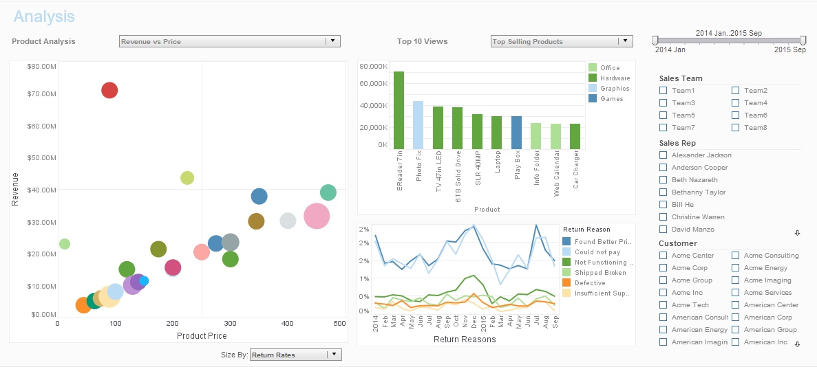
Interactive Executive Dashboard Examples with KPIs
Below is the continuation of the transcript of a Webinar hosted by InetSoft on the topic of New Features in Version 11 of InetSoft's StyleBI BI Software. The presenters are Mark Flaherty, CMO at InetSoft, and Amanda Pleasant, Product Manager at InetSoft.
Amanda Pleasant (BI): Currently I am showing date and total in this line graph. Notice because of the ups and downs in the data, how it’s hard to see some trends or patterns over time, the general up or down trend. One of the new features we have added here is ability to do common calculations on measures in charts. So for instance, you can change this to be the percentage of a grand total, change in values from previous periods, and also a moving average.
Let me apply this moving average, and this smoothes out the curve basically incorporating some of the prior months and subsequent months in the current value. So it makes a little bit easier to see some of the general trends or seasonal effects over time.
I am also going to go here to the Design tab and open up my Visual Composer to remind you this is the design interface for creating both data mashups and interactive visualization dashboards. So in here, I am going to create a new dashboard. Now dashboards in version 11 can either be used on top of a data mashup, or we have also added the ability to use it directly on top of a query or model.
Creating this dashboard directly on top of the model, I have all of the entities and attributes available to me on the left hand side from this data model. I am just going to add a couple of components from my toolbox like a gauge over here, maybe a thermometer over here. Then I anticipate people wanting some selection lists, which I will add over here, and maybe I will add a chart as well.
Now to display some information in these components, all I have to do is drag and drop. So that simply displays the count of all companies in thermometer. Let’s say, we want the total quantity purchased in the gauge. Notice it detected that this choice could be resulting in double-counting. I am going to choose to continue. There it inflates the value of the count of companies. I can also come in here and override the aggregation option instead of count to a distinct count, so that handles that double-counting for me.
Similarly, I will add states over here, that’s also filtered by companies over here. And then in the charts, let’s show the Customer States on the X axis and we can show the Products Total on the Y axis, so it defaults to a nice bar graph for me and I can continue. And again, I can do special operations in the chart binding, so for instance doing a change or running totals. I can also define custom calculations choosing from any of the values here, sliding like a moving average, running totals, deltas, or percentages.
There, I’ve completed an interactive executive dashboard with some very useful KPIs.

