Flight Control Operations Dashboard: A Deep Dive into Real-Time Airspace Intelligence
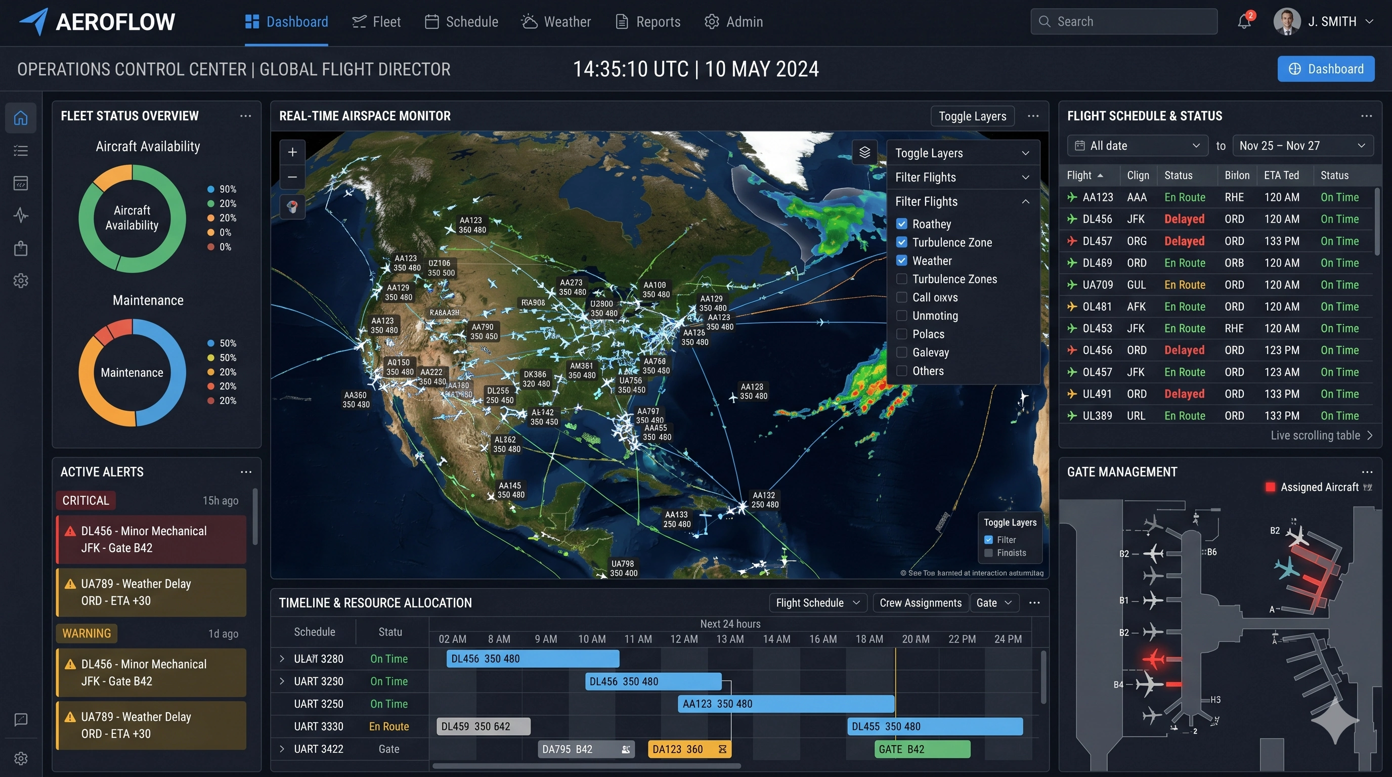
Modern flight control management depends on the ability to synthesize massive volumes of real-time data into a clear, actionable interface. The dashboard presented here reflects a highly evolved approach to air traffic visualization, combining operational awareness, predictive analytics, and system health monitoring into a single, cohesive environment. Designed for use in high-pressure control centers, this interface prioritizes clarity, responsiveness, and layered intelligence, allowing decision-makers to interpret complex airspace dynamics at a glance.
At the core of the dashboard lies an interactive geospatial map, which functions as the central nervous system of the visualization. This map displays active flight paths across a wide regional airspace, with each aircraft represented as a dynamic icon moving along predefined routes. The density of traffic becomes immediately apparent through the clustering of these icons, while color-coded trajectories differentiate between altitude levels, flight types, or operational statuses. This layered visual encoding reduces cognitive load while preserving detail, an essential requirement for managing congested skies.


Weather Overlay and Environmental Awareness
Overlaying the flight paths are weather systems rendered in vivid radar-style coloration. Areas of precipitation, turbulence, or storm activity appear as shifting gradients of green, yellow, and red, offering immediate insight into environmental hazards. The integration of meteorological data directly into the traffic view eliminates the need for cross-referencing separate systems, allowing controllers to anticipate disruptions and reroute traffic proactively. This tight coupling of weather and movement data reflects a broader trend in aviation analytics toward unified situational awareness.
Network Performance Indicators
Surrounding the central map is a series of high-level performance indicators that provide a snapshot of network conditions. Metrics such as total traffic volume, cumulative delay, weather-related disruptions, cancellations, and sector load are displayed prominently at the top of the interface. Each metric includes not only a current value but also a comparative trend against previous periods. This contextual framing transforms raw numbers into meaningful signals, helping operators quickly identify anomalies or emerging issues.
Delay Analysis and Root Cause Identification
The delay metrics are particularly significant. By separating network delay from weather-induced delay, the dashboard allows managers to distinguish between controllable inefficiencies and external constraints. This distinction is critical when allocating resources or communicating with stakeholders. A spike in network delay may indicate congestion or staffing limitations, whereas increased weather delay points to unavoidable environmental factors. The ability to parse these causes in real time enhances both operational response and post-event analysis.
On the right-hand side of the interface, a dedicated panel highlights the top delaying factors affecting the system. These factors are ranked and quantified, offering a prioritized view of operational challenges. Weather, airspace constraints, airport capacity, and traffic volume are all represented, each with a proportional bar indicating its contribution to overall delay. This visualization supports rapid decision-making by directing attention to the most impactful variables rather than overwhelming users with secondary data.
Below this, a delay distribution chart breaks down delays into time-based categories, such as short, moderate, and severe delays. Presented as a circular or segmented visualization, this chart conveys the overall health of the network in a compact form. A predominance of short delays may be acceptable within operational thresholds, while an increase in longer delays signals systemic strain. This type of distribution analysis is particularly useful for identifying patterns that may not be evident in aggregate metrics alone.

Sector Load Analysis
The dashboard also includes a sector load analysis, which ranks airspace sectors by their current utilization levels. Each sector is accompanied by a percentage value and a directional trend indicator, showing whether the load is increasing or decreasing. High-load sectors are visually emphasized, enabling controllers to redistribute traffic or adjust routing strategies before bottlenecks occur. This forward-looking capability is essential in maintaining safe separation standards while maximizing throughput.
Airport Status and Traffic Trends
In the lower portion of the interface, additional panels provide deeper operational insights. The airport status table lists key hubs along with their arrival and departure counts, capacity utilization, and average delay. This tabular format allows for quick comparison across multiple locations, highlighting airports that may be under stress. By integrating this data with the broader network view, managers can coordinate interventions that address both local and systemic issues.
Adjacent to the airport table is a traffic trend chart that visualizes flight volume over a 24-hour period. This line graph includes historical comparisons, such as the previous day or a rolling average, enabling users to assess whether current conditions align with expectations. Deviations from these patterns can indicate unusual demand, operational disruptions, or data anomalies. The inclusion of temporal context transforms the chart from a static display into a predictive tool.
Another key component is the demand versus capacity chart, which illustrates the balance between scheduled traffic and available infrastructure. Represented as a combination of bar and line elements, this chart highlights periods where demand exceeds capacity, creating potential for delays. Negative gaps are particularly important, as they signal the need for intervention. By visualizing this relationship in real time, the dashboard empowers proactive management rather than reactive problem-solving.
Extended Meteorological Intelligence and Alerts
A secondary map panel provides a focused meteorological overview, offering a broader perspective on weather systems beyond the immediate airspace. This supplementary view helps contextualize localized disruptions within larger atmospheric patterns, supporting strategic planning for rerouting or delay mitigation. The inclusion of SIGMETs and AIRMETs further enhances this capability by flagging officially recognized hazards.
The interface also incorporates a live alerts feed, which serves as a communication channel for critical updates. Alerts are categorized by severity, ranging from informational notices to major operational warnings. Each alert includes a timestamp and a brief description, ensuring that users remain informed of evolving conditions. This feature reinforces the dashboard’s role as a central hub for both data and communication.
Dashboard Design and Interactivity
From a design perspective, the dashboard employs a dark theme with high-contrast elements, a common choice for control room environments. This aesthetic reduces eye strain during extended use while allowing bright colors to stand out more effectively. Neon-like accents are used sparingly to highlight key data points, guiding the user’s attention without overwhelming the visual field. The layout follows a logical hierarchy, with the most critical information positioned centrally and supplementary data arranged peripherally.
Interactivity is another defining characteristic of the visualization. Users can zoom into specific regions of the map, filter data by flight level or sector, and toggle various overlays on and off. This flexibility ensures that the dashboard can adapt to different operational roles, from high-level management to detailed tactical control. The ability to drill down into specific data points enhances both situational awareness and investigative analysis.

Integrated Data Architecture and Scalability
The integration of multiple data sources is perhaps the most impressive aspect of the system. Flight tracking, weather data, airport operations, and network analytics are all seamlessly combined into a unified interface. This convergence eliminates silos and reduces the need for manual data reconciliation, a common source of delay and error in traditional systems. By mashing up these diverse streams into a coherent visualization, the dashboard exemplifies the power of modern data platforms.
Scalability is also evident in the design. The dashboard can accommodate varying levels of traffic and complexity without sacrificing performance or clarity. Whether managing a regional airspace or a continental network, the interface maintains its usability through intelligent aggregation and filtering. This adaptability is crucial in an industry where demand can fluctuate dramatically.
Ultimately, this flight control dashboard represents a sophisticated fusion of data engineering, user experience design, and operational expertise. Every element serves a specific purpose, contributing to a holistic view of airspace activity. By transforming raw data into actionable intelligence, the system enables faster, more informed decisions, enhancing both efficiency and safety in one of the most complex environments imaginable.