About Building a Dashboard Using InetSoft’s Free App
Open the Free InetSoft App Connect to Your Data Source Use the Visualization Recommender Save the Dashboard Edit the Dashboard Edit a Chart Add Components to a Dashboard Use the DashboardOn this page, we’ll show you how to get started building dashboards with InetSoft’s free individual account using Google Sheets as a data source. It’s quick and easy. Just follow the steps below using your own data.
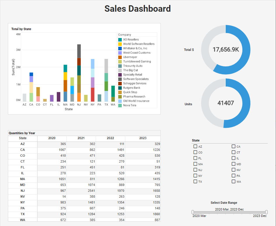
Open the Free InetSoft App
To use the free InetSoft app, go to www.inetsoft.com and press the Start Free button at the top. Then select the Free Individual option. Proceed to register and login as instructed on the screen.

If you already created an account, press the Sign In button, and then press Open the App.

Connect to Your Data Source
On the Getting Started screen, you can choose to upload a file to provide the data to your dashboard, or you can connect to a cloud data source. If you want to start building the dashboard using a data source that is already connected, press Create Dashboard with Sample Data.
However, in this case, we will connect to a Google Sheet data source. To do this, follow the steps below:
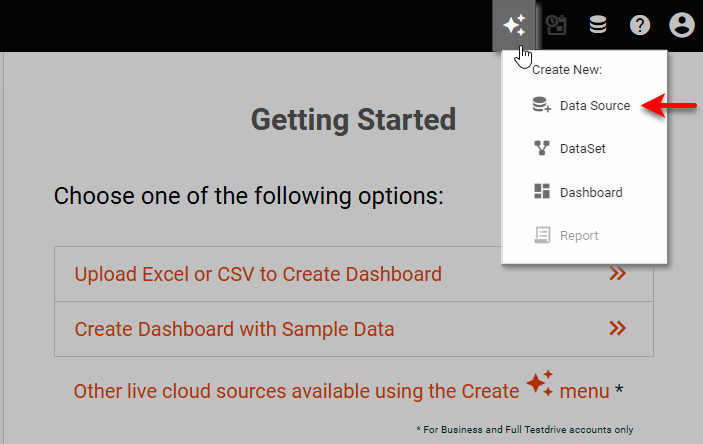
- Press the Create button at the top right, and select Data Source.
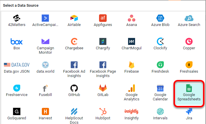
- Choose the Google Sheets data source, and press Create.
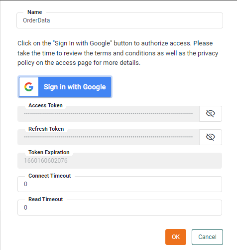
- Follow the prompts to enter a name for the data source and log into your Google account.
- Press OK. This creates a new Google Sheets data source. Press the ⋮ button next to the data source name, and choose New Query from the menu.
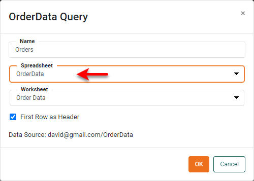
- Provide a name for the query, choose the desired sheet, and press OK.
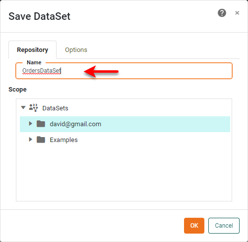
- Provide a name for the new Data Set, and press OK. This will prompt you to use either the Visualization Recommender or Data Worksheet.
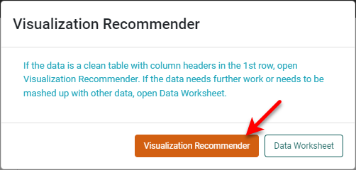
- A Data Worksheet allows you to transform and manipulate your data, but in this case we do not need to do any data operations, so select Visualization Recommender.

Once you are in the Visualization Recommender, you can begin building your dashboard.
Use the Visualization Recommender
The Visualization Recommender is an optional step that can help you get started with building a dashboard. Let’s use the Recommender to create a Chart to get things started:
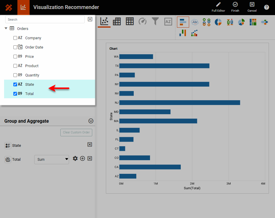
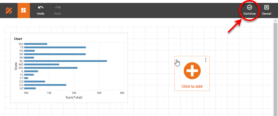
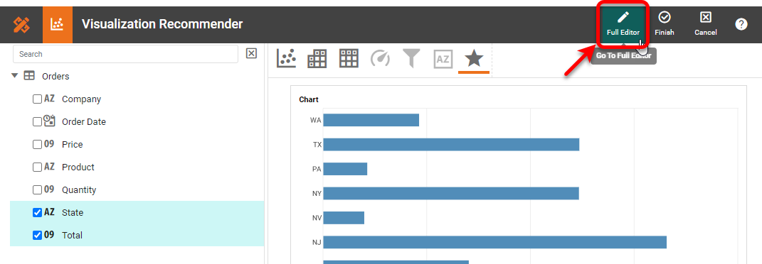
- Select State and Total in the left panel. This suggests a bar chart, which seems appropriate to the data, so press Finish to leave the Recommender.
- You can press Click to Add to add another component in the same way, but instead let’s click Finish to proceed to Visual Composer, where we will construct the rest of the dashboard.
Save the Dashboard
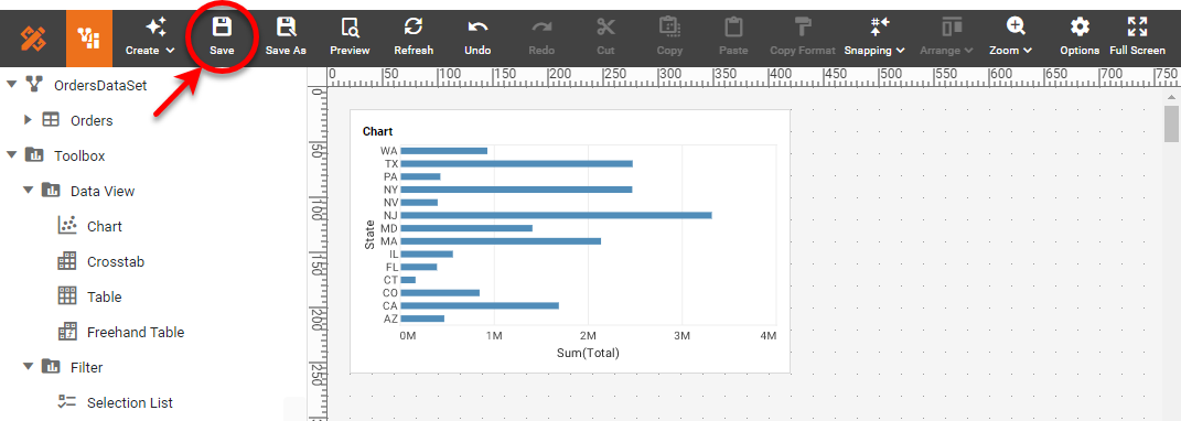
Before we proceed to add more components to the dashboard, press the Save button and give the dashboard a name. Then press OK. The dashboard is saved on the server.
Edit the Dashboard
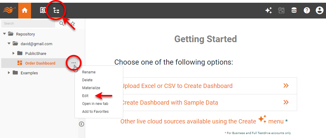
To return to editing the dashboard, press the Repository button, and then press the ⋮ button next to the dashboard you saved, and press Edit.
Edit a Chart
Let’s see how we can edit the Chart to look a bit different and provide some additional information. Follow the steps below:
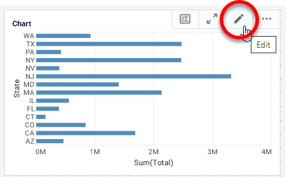
- Press the Edit button on the Chart to open the Chart Editor.
- This opens the Recommender again, but we’ve already done what we can there, so let’s go to the full editor. Press the Full Editor button.
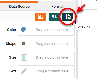
- Press the Swap XY button to switch to a vertical bar chart.
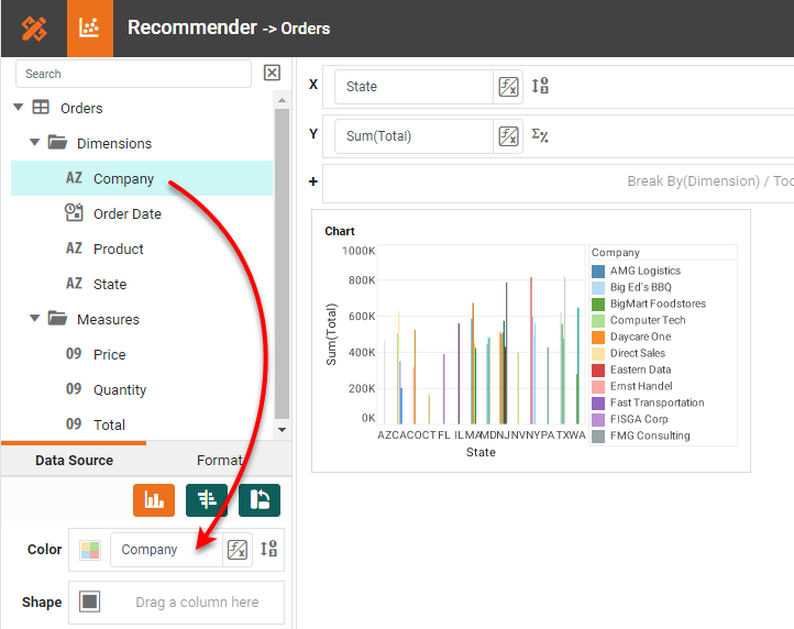
- Drag the Company field to the Color region to add Company as a dimension.
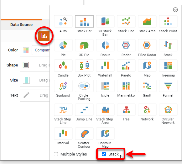
- Press Select Chart Style and enable the Stack option at the bottom. Then press the Apply button. Press the Finish button to exit the Chart Editor.
Add Components to a Dashboard
You can drag and drop many kinds of components onto your dashboard. The following sections show how to add some common dashboard components.
Add a Crosstab
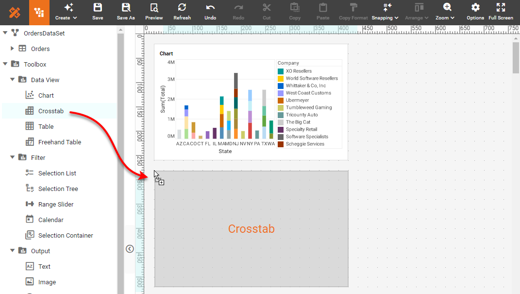
Add a Crosstab table below the chart. To do this, follow the steps below:
- Drag a Crosstab component from the Toolbox folder into the Dashboard.
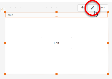
- Press the Edit button at the top right of the crosstab to open the Crosstab editor.
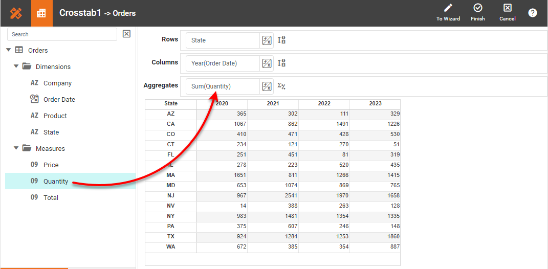
- In the Crosstab Editor, drag the State field to the Rows tray, drag the Date field to the Columns tray, and drag the Quantity field to the Aggregates tray. Press Finish.
Add KPI Gauges
Follow the step below to add KPI Gauges for Total and Quantity:
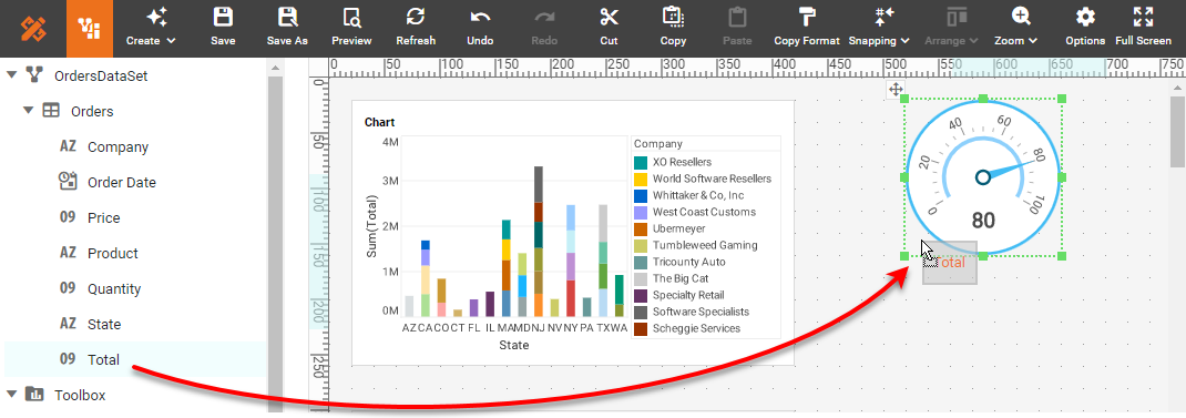
- Drag a Gauge component from the Toolbox folder into the dashboard.
- Drag the Total field from the data source at the top of the left panel onto the Gauge.
- Repeat the above steps to add another Gauge that displays the Quantity field.
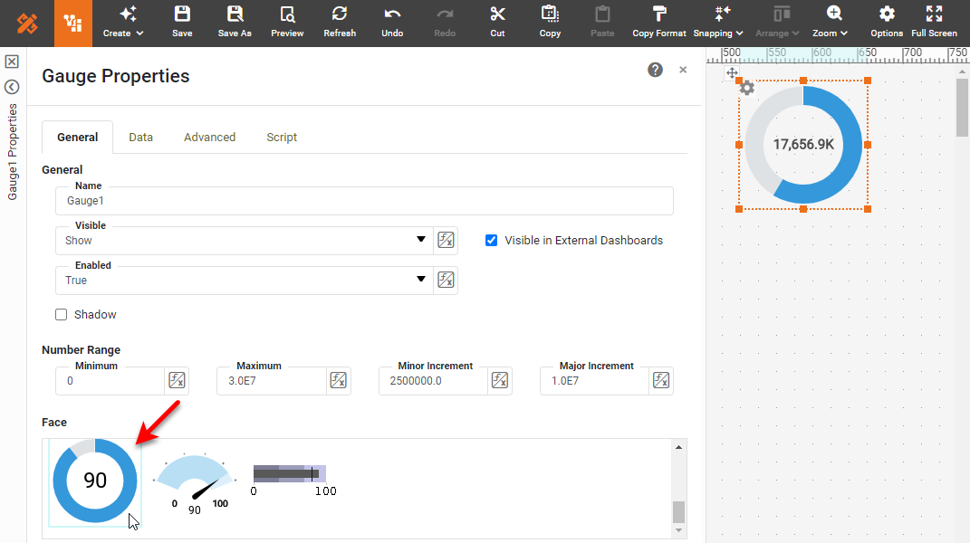
- To set the Gauge faces, right click on a Gauge, and select Properties. In the Gauge Properties dialog box, choose the desired face, and press OK.
Add Filter Components
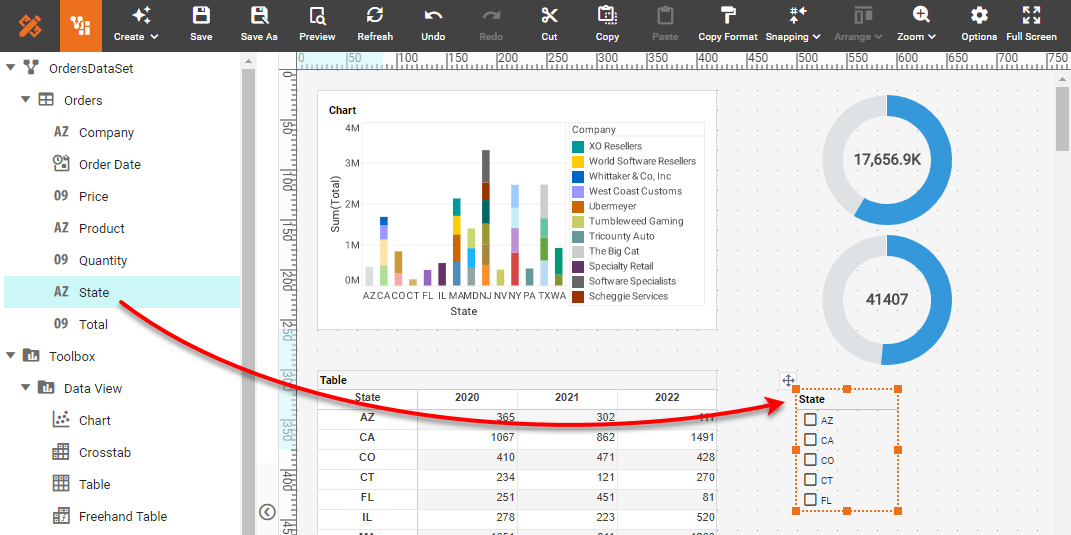
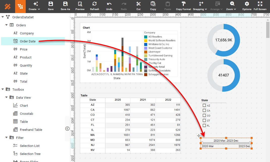
Now let’s add a Selection List and a Range Slider to help filter the data. Follow the steps below:
- Drag the State field from the data source to an empty region of the dashboard. This creates a Selection List.
- Repeat the same procedure using the Order Date field. This creates a Range Slider for selecting dates.
Add Labeling
You can now add labeling to describe the components on the dashboard. Follow the steps below:
-
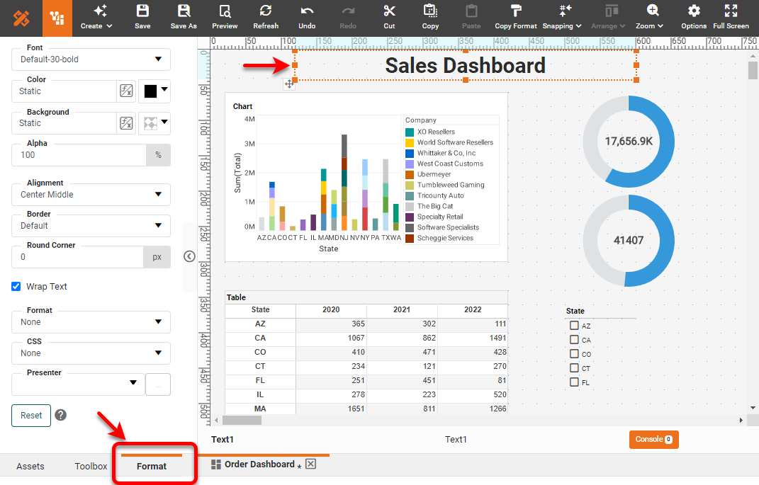
Add a title. To do this, make some space at the top of the dashboard by selecting all the components and dragging them down a bit. (You can select multiple components by Ctrl-clicking them, by lassoing them, or by pressing Ctrl-A to select all.) Then drag a Text component from the Toolbox into the top of the dashboard.
-
Double-click on the Text component and enter the following label: “Sales Dashboard”. Click the text to select it, and then press the Format tab at the bottom of the left panel. Style the text as desired. Resize the Text component to fully display the text by dragging on the handles as needed. You can resize any other components the same way.
-
Edit the Chart and Table titles by double-clicking them and adding the desired text.
-
Add text labels next to the Gauges and Range Slider as well.
Use the Dashboard
To begin using the dashboard, follow the steps below:
- Press the Save button in the toolbar to save the dashboard you created.
- Return to the Portal, and click on the dashboard you saved.
- Use the Selection and Range Slider and observe how the dashboard updates to show you the specific slices of data you want to see.
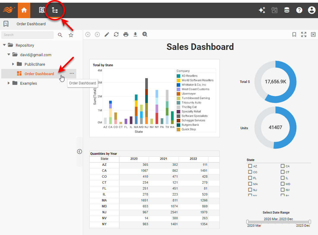
There are many additional features of dashboards that make data exploration quick and easy. You can rapidly build much more complex and interactive dashboards by selecting from dozens of different chart types, displaying multiple dimensions and measures, adding conditional formatting, hyperlinks, tooltips, drill-downs, and tailoring the display to devices of various sizes including tablets and phones. See the Documentation for a full description of all the available features.