Best Dashboard Design Examples
Why is it important to find out what makes the best dashboard design? A well-designed dashboard is easy on the eyes and allows users to quickly observe trends and correlations in their data. While designers can often fall for the temptation to overload their dashboards with too many elements, a crisp and efficient organization of KPI's will save the end users time and reduce mental strain in performing data analysis.


What Makes the Best Dashboard Design?
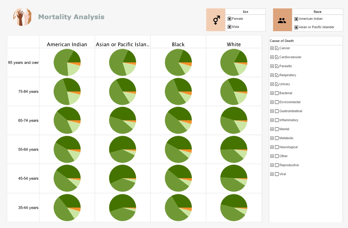
It is important for dashboards to maintain a balance of being both simple and informative. This balance can be attained within a dashboard design by using a variety of different components. The best dashboards have aggregated their data into charts, tables, gauges and text KPI's in a way that is comprehensive but still not overwhelming. For instance, InetSoft’s dashboard building software offers several components for an end user to analyze data. Such elements include line graphs, bar charts, pie charts, and other visual displays to choose from.
Color is also another dashboard design factor that makes a significant difference in how a dashboard is consumed. It's crucial to bear in mind what certain colors are commonly associated with. For instance, if a dashboard were to have a green colored negative profit line, that could be confusing to the viewer, since green is usually associated with a desirable outcome.
By setting a condition on a chart that would turn the color from green to red once the profit line dipped below zero, a designer could ensure that anyone who viewed the profit margin chart would instantly know what it's meaning was. InetSoft's dashboard builder let's designers add these kinds of conditions easily.
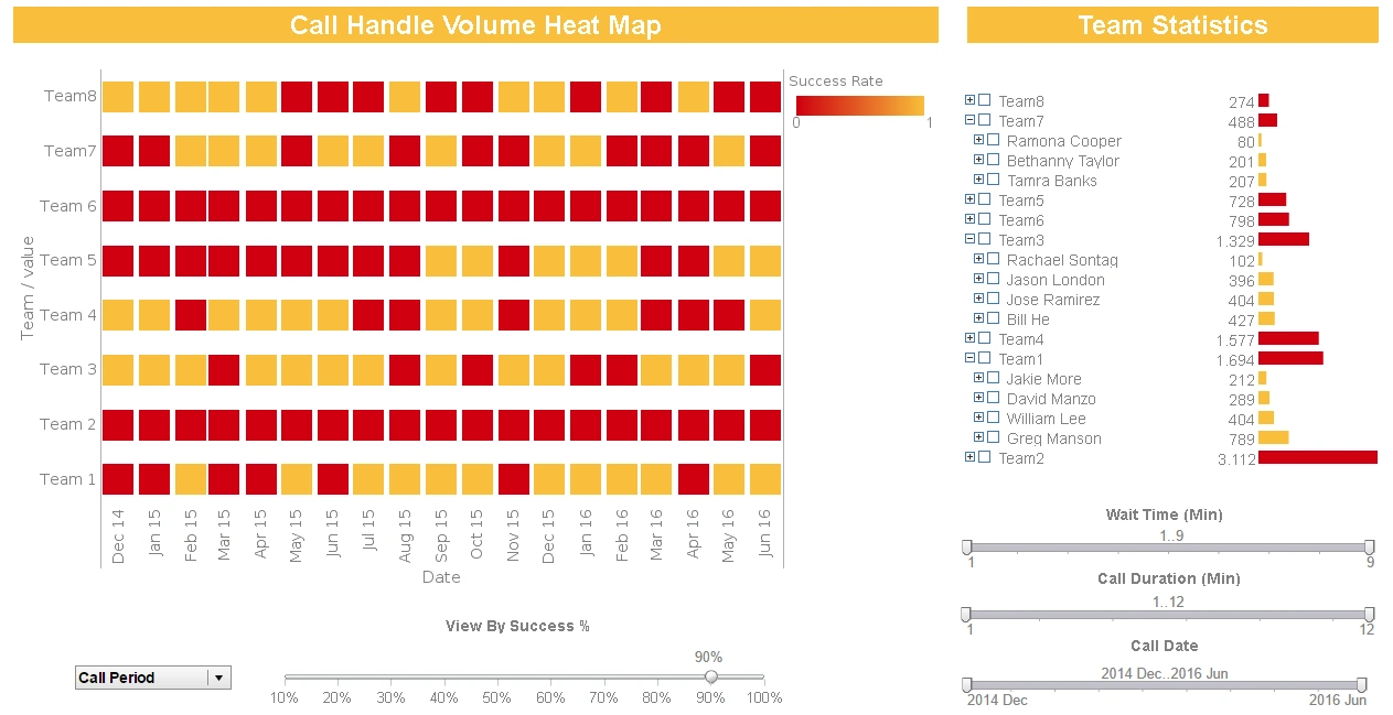
Using a range of colors to break down data by category is an effective strategy, but only when it is not overused. A range of colors too broad or too bright and loud can actually distract the viewer from the meaning of the dashboard. Choosing a scheme of several colors that are noticeably different from each other, but not too high in contrast can make a dashboard’s charts easy to interpret.
InetSoft’s visualization software comes complete with a library of popular color palettes and styles that include both solids and gradients. For those who are very particular about their colors, existing color palettes can be tweaked, color codes can be manually added, and custom color palettes can be saved for use across many dashboards.
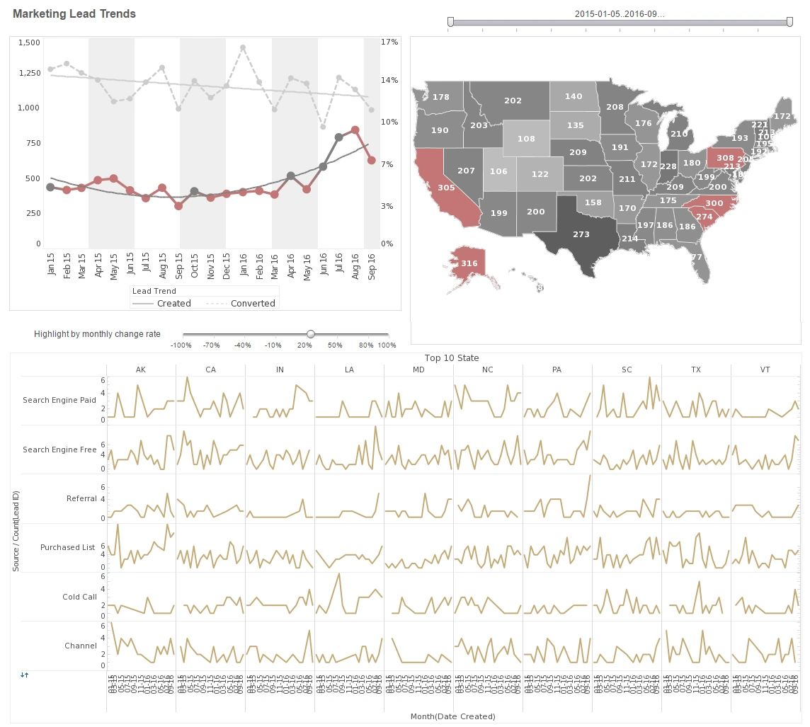
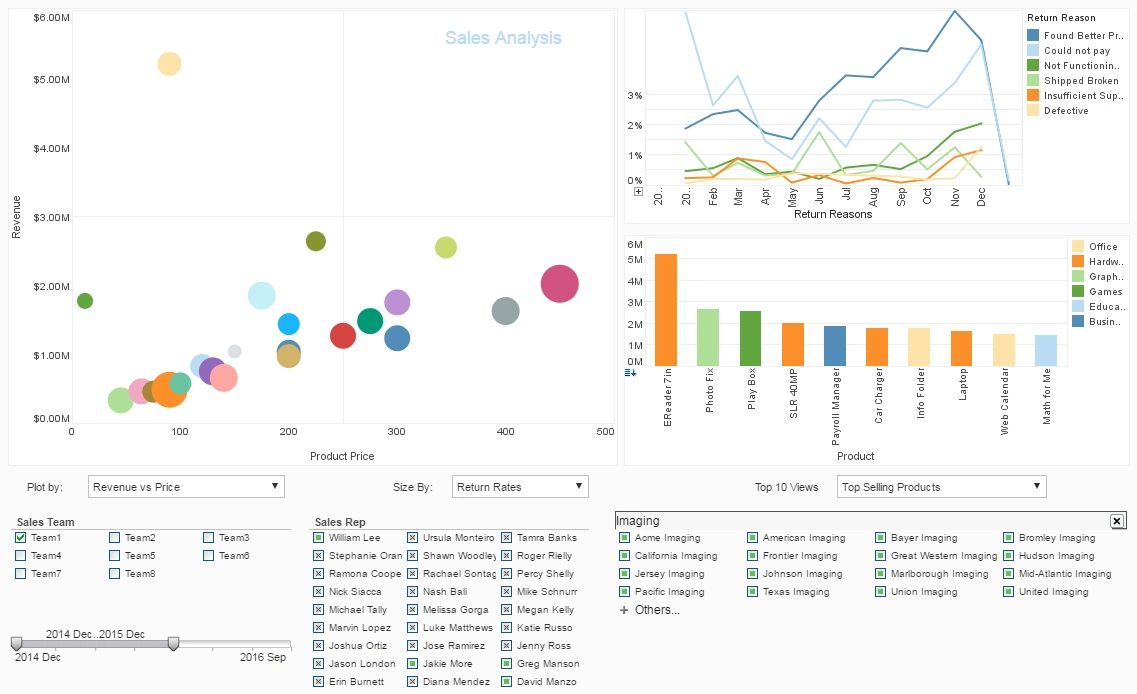
Exploring the Enrollment Trends Dashboard
The Enrollment Trends dashboards pictured to the right are examples of this kind of clear, concise design. (Click the dashboard to expand.) There aren't too many elements in the dashboard, which makes it easier for the viewer to understand. And while the charts are broken down by color to add an extra dimension, the simple color scheme keeps it from being overwhelming.
This dashboard uses only bar charts as a style choice. While bar charts are recommended as the clearest way to plot data by category, InetSoft’s dashboard designing software is versatile and easily customizable with a broad array of different charting options, including line charts, pie charts, and bubble charts. For more examples of InetSoft constructed dashboards built according to best practices, and to see a variety of different dashboard styles, click the link below.
These well-designed dashboards can provide inspiration for how you can organize and portray information clearly.
Visit the InetSoft dashboard gallery


Best Dashboard Design Practices Enable Better Data Exploration
A well constructed dashboard makes spotting trends and predicting future ones easy. One aspect of the InetSoft data exploration tool that helps display trends is brushing. With brushing, when a segment of data on any chart on a dashboard is selected, that data segment's proportions are highlighted on all other charts in the dashboard. Brushing helps users see how any specific segment of data relates to other segments of data.
Data exploration can also be encouraged by adding filters to a dashboard. Filters narrow the range of data that is visualized, by selecting a date range, a range of dollar amounts, or selecting any particular category of data.
When a user would like to study a specific event or phenomenon and would prefer to only see that specific piece of information presented to them, filters are quite useful. InetSoft's dashboards can be built with a range of filters, including range sliders, calendar date selectors, selection lists, and radio buttons.
In addition to regular filters, InetSoft's flyover viewing tools filter information displayed when a user puts the mouse over various regions over a chart, table, or crosstab. This allows the data points on a chart to behave like a selection element, greatly expanding the potential for exploring data.
The ability to depict more than two dimensions on a graph is another useful way to get more insights out of a single dashboard. This feature is called multi-dimensional charting and the InetSoft, tool can make chart elements adjust their size, color, shape, and fill to reflect different dimensions and measures
Having multiple dimensions allows for a deeper look into rising and falling trends by adding a third dimension to determine “why” things are happening. While the InetSoft tool can theoretically plot data by seven dimensions/measures at once, in most cases it is recommended that you keep the number down to several, to enable easy viewing.
If the above best practices for dashboard design are followed, your dashboards will be both communicative and aesthetically pleasing, while offering the option of deeper exploration for those who desire it.
Register now to try InetSoft's dashboard building software for and to follow the models here.