Compound Growth Dashboards and More
This is part two of a transcript of a webinar hosted by InetSoft demonstrating the new features of its 2023 release. The speaker is Katie Roussey, an InetSoft systems engineer.
Part One can be found here
We've been highlighting a lot of these new features around charts. So even though compound growth is supported for charts as well as cross tabs, we're gonna take a look at compound growth within a cross tab. So in my particular cross tab here, I've already set up a compound growth calculation. I have a couple of dimensions, so years and quarters broken down by a region along the top here.
The key thing when you're working with your metrics is first you have to have the starting value that you want to work with. So you would drag out your starting metric and then you would select to edit measure. You could do an aggregation of compound growth for your sales or for am interest percentage or for discount percentage. What is it going to be based off of?
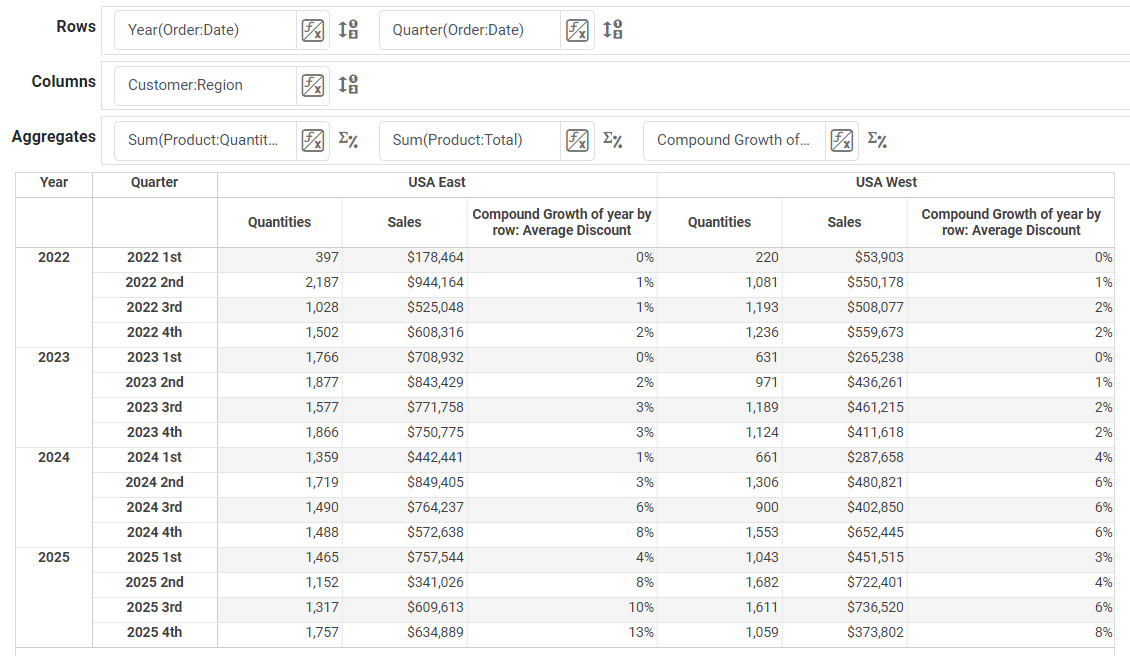
Are you looking to base it off of an overall sum or maybe an overall average of something like a discount percentage? So you would make that selection first before selecting for trend comparison, you'd select the custom option where when you set edit. This custom option will allow you to select compound growth.

Time Series Chart Updates
When users are dealing with time series, running total has been the most popular so far, but there have been requests to support the compound growth as well. So compound growth, when you're working with it within a cross-tab, you actually would set what you want to break the compound growth down by, because you can have multiple levels of summary within your cross tabs.
So because I have year broken down by quarter, but maybe I also want to have some dynamic binding in there where I'm going to break it down by month, working within a hierarchy, I can choose an inner dimension versus the explicit quarters in my date binding that I have. And just like with the running total, you're going to have the options to set whether or not it does a reset. So it's going to provide you with a lot of the same flexibility you have with the running total, but instead you apply it for a compact.

Data Worksheet Updates
Before we take a look at things more from the user portal's perspective, we're going to go ahead and jump right over to our worksheet area.
There have been a couple of different enhancements within the worksheet area, but one of the ones that I'm most excited for is for managing many columns at once.

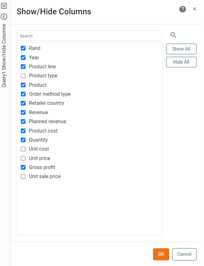
Show/Hide Data Worksheet Columns
For those that are dealing with larger mashups, that are dealing with rest APIs that return a lot of columns, you might find that you need to hide a lot of columns and maybe you then think I really shouldn't have hid that column, so you're constantly scrolling left and right to unhide it.
Instead, now you can just pull up the quick-show hide-columns dialog box, rapidly change the visibility of any of these columns, even full all, hide all to kind of clear out and make your minimal selections so you're not necessarily selecting 20 columns or 30 columns when you're dealing with those wider datasets that have quite a few columns to them.
So it's great to have this quick dialogue just like we had for sorting and for changing the column orders, we now have one also for the show hide visibility column.
New Date Range Comparison Features
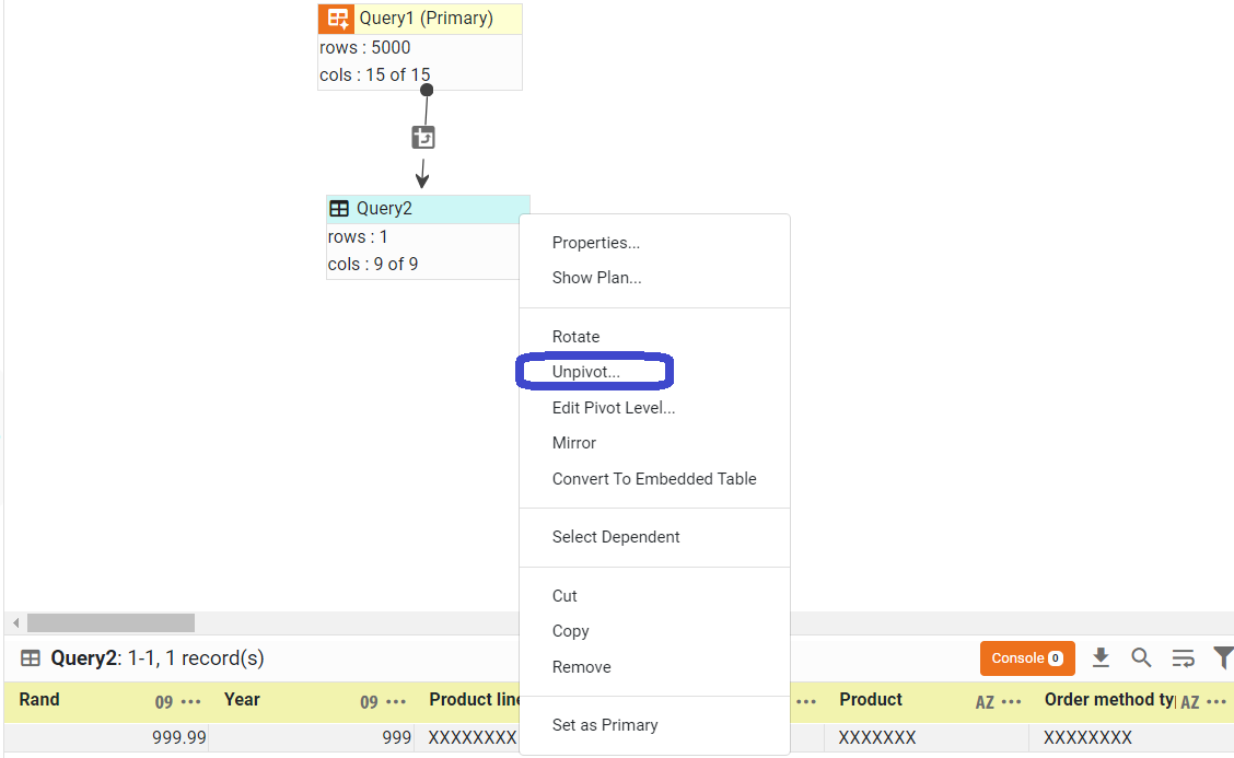
For those that have worked with our unpivot option that we've had within our worksheets for forever, you might have found that if you ever introduced additional dimensions that you wanted to have included in the row headers that you're keeping, that in the past you would need to actually do an unpivot step again. You would need to change your level of headers appropriately.
And then you would get your replacement data block. Once you had your replacement data block, if you happen to have it flowing through to other joined situations, mashup situations, you would have to remap to the updated data block, there were a lot of steps. And then sometimes this would cause problems with your data.
We wanted to simplify that. We wanted to remove that issue. And so now when you have an unpivot situation, you can just select under the actions and edit your pivot level and make the adjustments to the level of row headers you have for ease of adjusting your design. Also in some cases, because of long running queries and what we're reading from the data set and the sampling that we do,when we do the unpivot and we have our dimension and our measure, sometimes your measure field is not automatically categorized for the continuous, such as if they were all actually integers, or, they were all doubles, or at least a mixture of numbers.
Maybe it thinks that there was some string content in there and it's defaulting it to string and making it difficult for you to then use this measure's field in charts and summary situations. So if you happen to have that mismatch when you do the unpivot, you can now easily do a right-click column type and actually explicitly adjust the column type to appropriately match what the data is so that way you can ensure that we are applying the formatting and the automatic behavior of treating it as a measure versus as mentioned when you're then, say, designing a dashboard going forward off of this dataset. There's some really nice enhancements around the worksheet on pivot feature.