Dashboards Can Serve a New User Population
This is the continuation of the transcript of a Webcast hosted by InetSofton the topic of "Faster Business Intelligence: Visual Reporting" The speaker is Mark Flaherty, CMO at InetSoft.
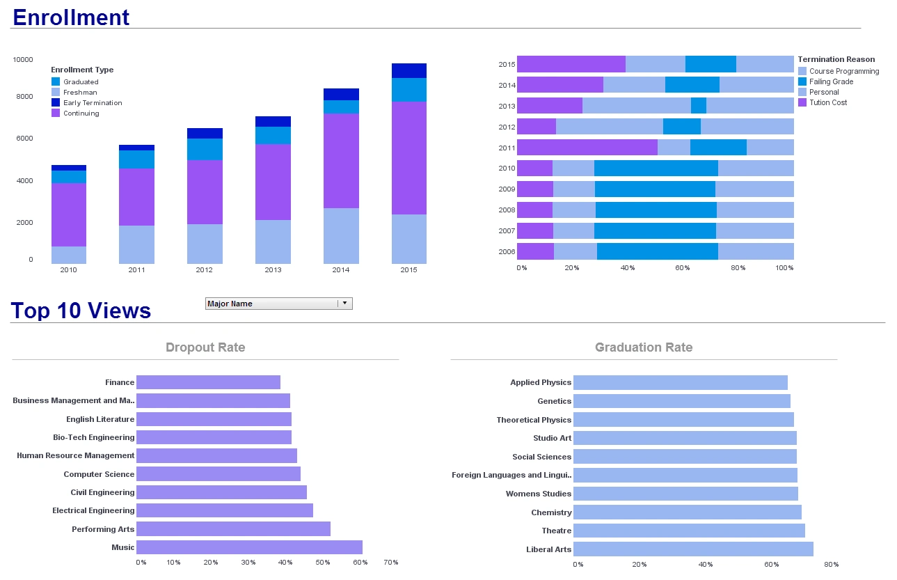
Another interesting thing about these use cases is that the dashboards can serve a user population who had never had access to a BI system before. Previously, these people have only been supported with static reports which are largely insufficient to their needs. Operational reports containing huge amounts of data have been the primary means of distributing operational data, but they provide little insights because they are so big. It’s almost impossible to find or compare interesting data items because very interesting comparisons are separated by many pages.
In contrast, traditional dashboards are much easier to use and consume, but because they have no detailed data. They are practically useless to operational workers who need more than trend information. Interactive dashboard combine the best characteristics of operational reports with the best characteristics of dashboards. They embed all the data of traditional operational reports into small micro databases that are embedded inside the dashboard app. We call them data grid caches.
These data grid caches can easily contain many megabytes of data representing tens or hundreds of thousands of rows of data mashed up from many different data sources. Dashboard apps also contain hundreds of different views of that data arrayed in dashboard like layers and panels riding on top of the data grid cache.
Powerful Onboard Dashboard Controls
Users can flip through the many different views using simple but powerful onboard controls. Navigation is done using selective controls like tabs, drop down boxes, radio buttons, and sliders that are accessed directly on the dashboard screen. Workers instinctively know how to use a dashboard app, they just begin clicking. InetSoft dashboards can contain standard tables and graphs of data, but they also be made even more powerful through the use of advanced visualizations like heat maps, animated bubble grafts, micro charts, gauges and bullet charts.
Let’s take a look at a real dashboard application. This dashboard app was created for a casino operations manager, and it replaces almost a dozen other operational reports that were not only unwieldy but also reduced productivity because of the time it took to analyze them. The casino operations manager for a global casino and gaming organization used to receive 100s of pages from five different operational reports which contained a great deal of information across 100s of pages.
All that great data is now easy to analyze with the dashboard application. The summary page includes information covering performance yesterday and the past week, month, and quarter. The most important KPI is the EBITDA earnings metric for the previous day, and it is prominently displayed. Below are the weekly trends for important gaming KPIs. It is easy to see from the micro charts which way each KPI is trending, and this helps to focus on problematic areas first.
In the gaming industry nothing single handedly impacts my earnings more than two things, the weather and hotel events. Whenever I see a date, I also see the weather. The more detailed chart below also displays events that occurred on that day. Selecting month adjust all the views in the dashboard app to display monthly data. This shows that a vast amount of data is available in the dashboard without compromising the ease of understanding.
Easy KPI Year Over Year Comparison
On the right is a comparison of the same key performance indicator as comparing this month to the same month last year. In addition, different groups of KPIs can be selected. Selecting hotel displays a view that uses an interactive time series graph. Key performance metrics can be added and removed and the range of dates displayed can be adjusted. The slots page gives me a personalized view of how the slot machines are performing with the summary of the last days totals.
Selecting a slot time from the chart changes the data in the other charts. The micro chart view shows the year-to-date trend and the performance versus target. Once again, selecting a slot type updates the quarterly performance by game charts below. I can review each machine individually to find out if there is a single machine giving out too many cash prizes or jackpots. The table’s page shows similar information to the slot’s page and the area chart changes according to the selection made on the bar chart.


