Evolution of BI Solutions with Mobile Devices
This is the continuation of the transcript of DM Radio’s program titled “The Consumerization of Business Intelligence: How and Why.”
Tracie Kambies: And it's going to be a constantly evolving adoption and adaptation of using those devices. There is a study that was done recently, and it was looking at the consumerization of general IT and technologies, but it was looked at across three countries, US, Japan and Germany. And of the 600 respondents, 56% of those respondents said that they favor their personal handheld devices, their mobile phones and their iPads, their Galaxy devices whatever they have to do their work on, like in meetings and travel, rather than using their standard technology tools that they have at their desk.
Or even compared to traveling with their laptops, no one wants to be weighed down with that when they are moving around and making decisions on a real time basis. So I think that’s where BI is going and has to continue to go, and we are going to have to continue to keep up with the pace of the business user and the consumer of the data who is making the day-to-day decisions. We can no longer let the organization sit -- we can't sit still as an IT organization.
A Portfolio of BI Solutions
We have to look at the BI platform and solutions that are out there as more of portfolio of BI solutions to deliver capabilities to the business, versus it just being a standard BI platform or BI set of tools that’s going to deliver all reporting. It's going to need to be more flexible and have a list of capabilities in the BI space to deliver out to the business user.
Eric Kavanagh: Yeah, absolutely.
Justin Kern: Mobility aside, are you seeing more aspects of, you know we certainly hear it from the vendors but, in practice, are you hearing more business users really kind of take on those emerging, those changing BI tools, especially when it comes to something like customizable dashboard or analytics, that type of thing? Are you seeing that resonate with more and more business users?
Tracie Kambies: Yeah.
Justin Kern: In what ways?
Tracie Kambies: Well, I mean for example, a user who is surfing the net or who is connected to the media, they go out and they can do any kind of search on Google, they can search IMDb or whatever they are looking for, for their favorite TV show. Well, they want to be able to come into the office and do a quick search and know what the net sales are over the last quarter, and not have to login to their laptop and login to a portal and go that direction. They want to be able to pull that up pretty quickly. And I think that if they have a report, being able to visualize it differently and tailor their visualization to who they are meeting with, to really build their case or sell whatever,to persuade their audience through their decision.
We are seeing that happening in and across all the industries. I think a great example would be AT&T, right, I mean for a sales associate to be able to show the customer what their usage could look like, what their data plan can look like overtime and how it can save them money. That’s an applicable user experience for not just the consumer, but also for the store associate. The same thing applies across the board. We are seeing the retail industry starting to change by using more information and putting it out into the store’s hands so that they can influence consumer buying behavior. Same thing applies internally to the IT organizations trying to offer their business users better tools and capabilities to do their job faster. There is no longer the patience to read a manual and learn how to do a BI report. I think people want to be learning in real time.
What Are the Ways Writing a BI Report Can Be Intuitive?
Writing a Business Intelligence (BI) report that is intuitive involves presenting complex data and insights in a clear, understandable manner. There are several ways in which writing a BI report can be intuitive, ultimately enhancing its effectiveness and usability.
Firstly, organizing the report in a logical structure helps readers navigate through the information effortlessly. This involves starting with an executive summary or introduction that provides an overview of the key findings and conclusions. Subsequent sections should be arranged in a cohesive manner, with each section focusing on a specific aspect of the data analysis. Clear headings, subheadings, and bullet points can further aid in guiding the reader through the report, ensuring that they can easily locate the information they are interested in.
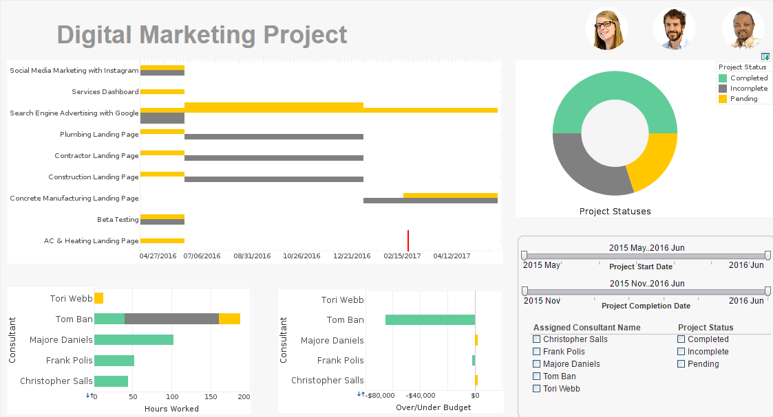
Secondly, using visualizations such as charts, graphs, and tables can make complex data more digestible and intuitive to comprehend. Visual representations help to convey trends, patterns, and relationships within the data more effectively than text alone. Choosing the most appropriate type of visualization for the data being presented is essential to ensure clarity and accuracy. Additionally, using color coding, annotations, and legends can enhance the visual appeal and interpretability of the charts and graphs, making it easier for readers to grasp the insights being communicated.
Thirdly, incorporating contextual explanations and interpretations alongside the data helps to provide meaning and relevance to the findings. Instead of presenting raw numbers or statistics without context, BI reports should include explanations of the methodologies used, the significance of the findings, and any implications for decision-making. Providing real-world examples or case studies can further illustrate the practical implications of the data analysis, enabling readers to better understand its relevance to their business or organization.
Fourthly, utilizing interactive features in the report can enhance engagement and facilitate deeper exploration of the data. Interactive dashboards, drill-down capabilities, and filters allow readers to customize their viewing experience and focus on specific aspects of the data that are most relevant to their needs. By empowering users to interact with the data dynamically, BI reports become more intuitive and user-friendly, enabling stakeholders to extract actionable insights more efficiently.
Lastly, ensuring that the language and terminology used in the report are accessible to the intended audience is essential for promoting understanding and engagement. Avoiding jargon and technical language that may be unfamiliar to readers outside of the BI or analytics domain helps to make the report more inclusive and accessible to a wider audience. Using plain language, defining terms where necessary, and providing explanations of complex concepts can help to bridge the gap between data experts and non-experts, making the report more intuitive and informative for all stakeholders.


