Fund Raising Dashboard Example
This is the continuation of the transcript of a Webinar hosted by InetSoft on the topic of "What are the Benefits of a Visual Reporting Solution?" The speaker is Abhishek Gupta, product manager at InetSoft.
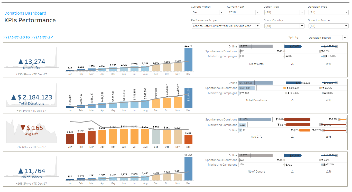
I am opening up a fund raising dashboard example, and this is the disguised data. It's not their actual data, but the story is very similar. The dashboard comes up with a set of charts. Here we’re looking at a chart of data on the prospects. It’s got a list of all the prospects. There are 93,743 of them. There is some information like their name, how much they’ve given, some descriptive characteristics about how they are affiliated with the school.
For instance, this could be anything. You could have phone numbers and emails, and then there are some filters up here so you can chop the data down. Maybe you are only interested in alumni and so forth. Then a project that would typically have a set of pages like this, these are pages that describe the people, how they’re affiliated where they live, what degrees forth and there are some giving history over on the right. So let’s work out a scenario here, what do we want to do?
Well the question I asked just a few minutes ago was do we have top rated prospects who are not giving, and who are they? So let's try answer that one. We want ratings so there’s a page on ratings. This is going to take this list of 93,743 people and show different attributes about how they are rated and at the top is a bar chart. It's showing us a visual report.
It’s showing the number of people by rating level, so of the 15 million or more people, there’s the 166 people. Then it goes on down to the one on the right, the nine rating, $25 to $50,000. There’s 18,949 people. It’s a big group on the left who are unrated. It’s is 38,000, or roughly 41% of the population who actually don’t have a rating. So this is the visual report.
It's taking that same data we saw on the first page, but it’s weighting it out so you can actually see graphically the relative magnitude. We’re using color consistently. We’ve colored the ratings. The hotter colors are always the higher ratings, and the cooler colors are the lower ratings, and the purple are unrated. And then there’s a visualization principle, balance graphics with text and details, so on right we actually have a list of everybody with the tally of how many there are.
Great, so I want to look at my top rating prospects. As I see there are several different categories. I think we’ll definitely start at the top of the 50 million. Let’s go down all the way down to 500,000 and up. So there are five different categories there. Okay so we have a visual report. Now we’re going to make a selection on it.
The way we do that is we just take the mouse and drag is across the five categories in the bar chart we want. And we then selected 6,306 people who are in those five rating groups, and there, the lists have changed. The names of those people and the other charts have updated as well. Let’s just get rid of everybody else and clean the charts up. I can go up here and exclude the unselected, and it drags them out of the population.
Okay so the first things that jumps out immediately to me as I am looking at my top rated prospects is on that primary staff chart in the middle there, a big null bar. I can't help it notice it. So those are the top rated prospects. That's actually a good example of a visual discovery. So you might not have known how big this was if you saw this in a report, but when you see it in a chart, it jumps right out.
When you put the mouse on the bar, there are 1,567 top rated prospects, or 24.8 % who aren’t staff, and these others are the staff. Let’s look at those that aren’t staff. Can we drill down into that group? Let’s do the visual selection again. I’m going to just click on the bar and get rid of everything else. Exclude from up here. I’m down to 1,500 and 67 un-staff top rated prospects, and here is the list of who they are.
When I look at that list, we see some pretty large donors in that list looks. Sarah Foster has given over 40 million. There is another one, Elizabeth Hammonds who has given 4.4 million. There are several, at least 10 or 15, who have given over a million, so these are major donors that are not bad.
Why Choose InetSoft?
Open source StyleBI is an excellent choice for a fund raising management dashboard because it allows organizations to centralize and visualize all aspects of donor engagement, contributions, and campaign performance in one place. With its intuitive drag-and-drop interface, development teams can quickly build custom dashboards that track key fundraising metrics such as donation amounts, donor retention, campaign ROI, and event participation. The flexibility of StyleBI means that non-technical staff can generate ad hoc reports and perform data exploration without relying on IT for every update, accelerating decision-making and responsiveness to donor trends.
Another advantage of StyleBI for fund raising management is its ability to integrate diverse data sources, including CRM systems, email marketing platforms, and payment gateways. This unified data approach ensures that fundraisers can correlate donor behavior with campaign outcomes, uncovering insights that inform strategy and optimize targeting. Additionally, as an open source solution, StyleBI provides transparency and adaptability, allowing organizations to customize the platform to meet evolving reporting needs without incurring costly licensing fees, making it especially attractive for non-profits and fundraising teams operating on tight budgets.


