Intuitive Data Exploration
A visually interactive and user friendly BI platform, InetSoft's StyleBI can extract data from both small and large sources, to create a single source of actionable information. InetSoft's intuitive interface makes it easy for both executives and everyday users to get the most insights from their organization's data.
This robust BI software is designed designed with the end-user in mind. InetSoft's aim is to make it easy for organizations to integrate advanced BI into their day-to-day operations, at all levels. Data sources can be easily added and converted into statistical representations, even by users who are not technically inclined.
As a BI industry leader, InetSoft has developed a platform which gives the end-user the ability to comfortably navigate complex datasets, without help from IT. This helps in developing an efficient and productive organization where employees are equipped with the most sophisticated tools for the industry.
How InetSoft Enables Intuitive Data Exploration
- Easy to operate without extensive statistical or technical knowledge
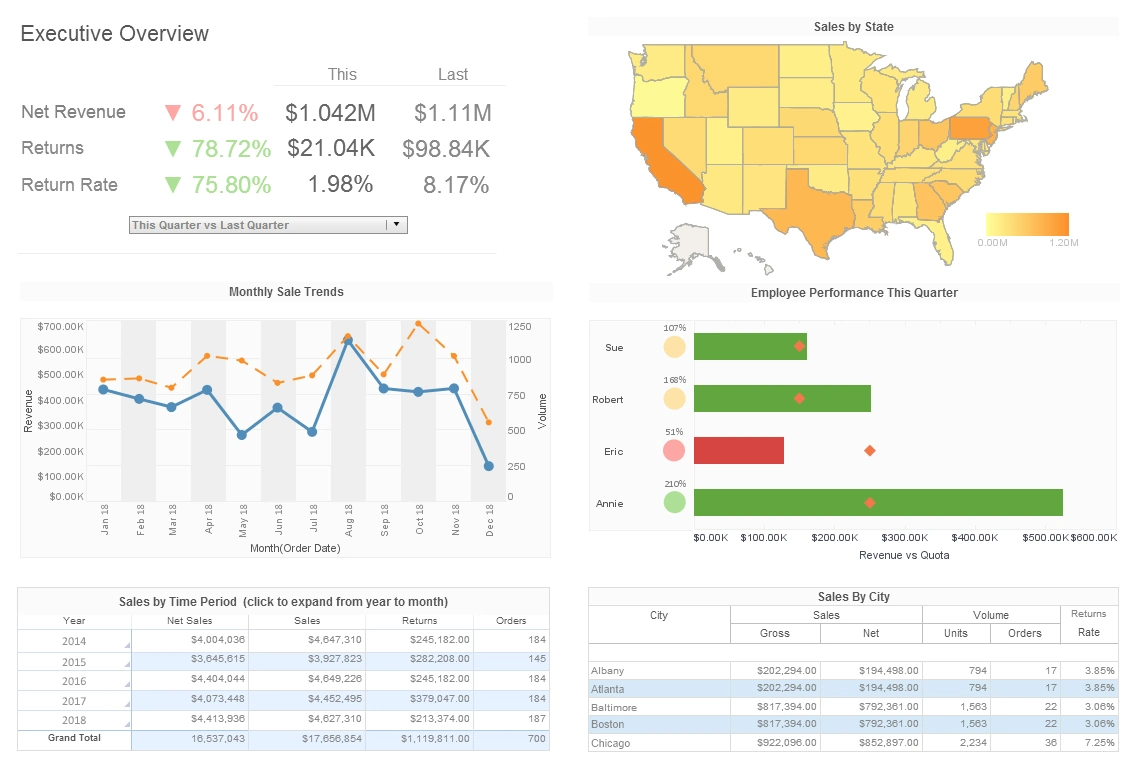
- Data relationships can be explored with multiple measures displayed on a single dashboard
- Visualization gives non-technical users a way to glean insights from datasources, allowing the use of BI to be pervasive across your organization
- InetSoft's dashboards can be viewed and manipulated on mobile devices and tablets, giving your employees access to the intuitive platform whenever and wherever they need it
- Dashboards can be modified for use by different departments, as well as individual users
- Insights gained in real-time increases the overall efficiency of your organization

What Makes InetSoft's Data Exploration App Intuitive to Use?
InetSoft’s data exploration app is designed for both business users and analysts who need to explore and visualize data without deep technical expertise. At the core of its intuitive design is a drag-and-drop interface with live previews, allowing users to create charts, pivot tables, and dashboards by simply selecting fields and dropping them onto the canvas. Users can immediately see how the visualizations change with each interaction, reducing the trial-and-error cycle and enabling faster insight discovery.
Another key factor in making the app intuitive is guided data blending with automatic join suggestions. When users select fields from different data sources, InetSoft intelligently detects potential relationships and suggests joins based on matching field names and data types. This feature removes the complexity of manually defining database relationships, which can often be a barrier for non-technical users who want to combine data from sources like CRM, ERP, marketing automation systems, and spreadsheets.
InetSoft also provides smart data profiling during exploration, where users can see distributions, min/max values, and missing data patterns for any selected field, helping them understand data quality before building visuals. This immediate visibility reduces the need to switch between tools or depend on IT to check the health of datasets.
Interactive filtering and drill-down capabilities are seamlessly integrated into the exploration workflow. Users can apply filters using visual widgets like sliders, checkboxes, or dynamic date pickers, instantly seeing how their charts respond to new criteria. The drill-down functionality lets users click on a segment in a chart to explore deeper layers of data, moving from summary-level KPIs to granular transactional details in just a few clicks without leaving the exploration view.
Another reason InetSoft’s app feels intuitive is its consistent design language across devices, enabling the same exploration patterns whether the user is on a large desktop monitor or a tablet in a meeting. The user experience is designed to minimize unnecessary pop-ups and distractions, focusing on the data and the visuals.
For users who wish to move beyond basic visuals, InetSoft’s app offers advanced features such as calculated fields, custom expressions, and conditional formatting, all accessible via guided wizards. Users are not required to know SQL to create these calculations, as the app provides step-by-step builders with validation, ensuring formulas are correct before applying them to visuals.
Additionally, reusable components and templates help users save time by enabling them to create exploration views once and apply them across different datasets or projects. This supports organizational consistency while maintaining flexibility for personal analysis.
The app’s responsive performance, even with large datasets, also contributes to its ease of use. Users do not experience slowdowns when exploring millions of rows because of InetSoft’s in-memory processing and optimized query generation, allowing them to interactively sort, filter, and drill down without lag.
How a Marketing Manager Used StyleBI to Discover an Insight
A marketing manager at a mid-sized e-commerce company discovered a critical business insight using StyleBI while analyzing campaign performance across email, social media, and Google Ads. Initially, the marketing team struggled to understand why their email campaigns, which had high open rates, were not translating into conversions at the expected rate. Using StyleBI, the marketing manager began by connecting data from their email automation platform, Google Analytics, and Google Ads, blending these sources easily using StyleBI’s guided data preparation interface without needing IT intervention.
She created a dashboard that included funnel charts displaying the journey from email opens to site visits, product page views, and ultimately to checkout completions. Using StyleBI’s interactive filtering, she segmented the data by campaign type, day of the week, and user demographics, allowing her to explore patterns in real time. It was during this exploration that she noticed a trend: email campaigns sent on Thursdays had higher click-through rates but significantly lower checkout completions than emails sent on Mondays.
To investigate further, she utilized StyleBI’s drill-down capabilities, which allowed her to click directly on the Thursday campaign data segment to view session duration and bounce rates by device type. The drill-down revealed that a large percentage of Thursday traffic came from mobile devices, and those sessions had higher bounce rates and lower time on page. She then added a heatmap visualization within StyleBI to track user interactions on the landing pages linked from the emails and noticed that a promotional banner placed at the top of the page was covering the main call-to-action button on certain mobile devices.
This was a revelation for the team, as they had previously attributed the lower conversions to audience fatigue or email content, not realizing that the landing page design was inadvertently blocking users from progressing through the checkout process. Using StyleBI’s annotation and sharing features, the marketing manager quickly shared this insight with the design and web teams, complete with screenshots and a link to the live dashboard, enabling immediate collaboration.
Once the design team adjusted the mobile layout to ensure that the call-to-action button was visible on all screen sizes, the marketing manager continued to monitor the funnel charts in StyleBI. Within the following week, they saw a 25% improvement in mobile conversion rates on Thursday campaigns, aligning them more closely with Monday performance. Additionally, the manager set up a threshold-based alert within StyleBI to receive notifications if bounce rates or checkout completions deviated significantly on mobile traffic, ensuring that similar issues could be caught early in future campaigns.
Through this process, the marketing manager appreciated how StyleBI enabled her to move seamlessly from high-level KPI monitoring to detailed interaction analysis, all within a single platform. The ability to explore blended data, visualize funnel drop-offs, and identify actionable insights without waiting for reports from the IT department allowed her to react swiftly to issues affecting revenue.
This discovery highlighted the power of combining data visualization with interactive exploration, demonstrating to the marketing team the tangible benefits of using StyleBI to improve campaign effectiveness, enhance customer experience, and directly impact the bottom line.


