StyleBI Remote Work Dashboards
The shift from traditional office settings to work-from-home (WFH) arrangements has transformed the workplace landscape. Many companies have adopted remote or hybrid work models, allowing employees to balance their personal and professional lives more flexibly.
While WFH brings benefits such as reduced commuting time, better work-life balance, and potentially increased efficiency, it also presents challenges like communication barriers, collaboration issues, and difficulties in monitoring productivity.
The Need for StyleBI Work From Home Dashboards
With this evolving work dynamic, organizations need data-driven insights to measure and compare employee productivity in different work settings. Without clear metrics, businesses risk making assumptions about performance that could lead to inefficiencies, disengagement, or policy decisions that don't align with actual workplace behaviors.
Having access to real-time, dynamic productivity dashboards allows businesses to make evidence-based decisions, ensuring employees are empowered to work in the most effective environment. InetSoft’s Work From Home Dashboard provides managers with comprehensive visualizations, enabling them to track trends, identify bottlenecks, and optimize performance based on real-world data rather than guesswork.
The Value of Remote Work Analytics
Managing a distributed workforce require s understanding how employees allocate their time, where inefficiencies arise, and what factors contribute to higher productivity. A Remote Work Dashboard delivers crucial insights, answering questions such as:
- Do employees perform better in-office or remotely?
- How does time spent in meetings and collaboration tools affect productivity?
- Are there differences in response times between remote and office-based employees?
- How do breaks impact task completion rates?
Without accurate data, businesses risk implementing hybrid work policies that may not be optimized for efficiency. Tracking key performance indicators (KPIs) ensures that managers can pinpoint best practices and adapt workflows accordingly.
This data-driven approach helps organizations create an environment where employees can thrive, whether working from home or in the office.
Dashboard Overview: Measuring Remote Work Productivity Effectively
The interactive Work From Home Dashboard features several key charts that offer valuable insights into employee performance.
Workplace Activity Insights
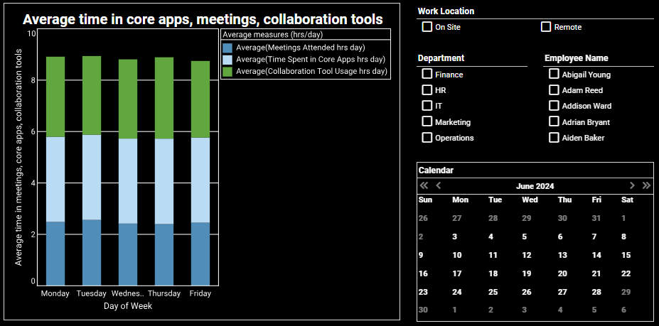
The "Average Time in" chart illustrates how time is allocated across meetings, core applications, and collaboration tools during the workweek. A visualization like this can help organizations uncover how digital work habits evolve throughout the week—whether in-office or remote.
By analyzing time distribution, companies can identify potential inefficiencies, optimize meeting loads, and ensure employees have enough focus time. It also supports data-driven decisions around workflow design, tool investment, and flexible work policies that promote productivity and well-being.
Response Time by Department and Work Location
This chart compares average response times across departments, segmented by on-site and remote employees. A breakdown like this helps leaders assess how work location may impact internal communication speed across different teams.
Organizations can use these insights to identify bottlenecks, uncover which environments foster faster collaboration, and make informed decisions on hybrid policies, staffing models, and support structures that ensure responsiveness isn’t compromised.
Breaks Taken vs. Task Completion
This chart visualizes the relationship between the number of breaks taken and tasks completed per day, helping teams understand how break habits influence productivity. By spotting patterns in performance relative to rest, businesses can support healthier work routines and strike a better balance between focus and recovery.
These insights can guide policies around microbreaks, employee well-being initiatives, and workflow optimization—ultimately driving both performance and satisfaction.
Daily Task Completion Trends
This chart compares average tasks completed each weekday by on-site versus remote employees. A breakdown like this gives organizations visibility into how work cadence may vary based on location and time of week.
It can inform scheduling strategies, meeting placement, and resource planning to better align with peak productivity times, especially in hybrid environments where rhythm and focus may differ across settings.
Departmental Productivity by Work Mode
By visualizing total tasks completed by department and work location, this chart helps teams understand how output varies between remote and in-office setups. It empowers department heads to assess performance patterns, identify support gaps, and explore whether certain roles thrive better in specific environments.
These insights enable more tailored workforce strategies, ensuring teams are equipped and structured for maximum efficiency—no matter where they're working from.
Dynamic Filtering for Deep Insights
The dashboard is fully interactive, allowing managers to filter data by:
- Month or specific day
- On-site vs. remote work
- Department
- Individual employees
These customizable filters enable decision-makers to drill down into data at various levels, helping to create targeted strategies for performance improvement.
How Managers Can Use These Insights
- Optimize work schedules: identify the most productive work arrangements and adjust hybrid work policies accordingly.
- Enhance collaboration strategies: address communication gaps by analyzing response times and time spent in collaboration tools.
- Improve employee well-being: monitor the impact of breaks on task completion and encourage healthy work habits
- Increase accountability: use data-driven insights to support performance evaluations and productivity goals.
Why Choose InetSoft’s StyleBI?
InetSoft is a leading provider of Business Intelligence and Data Visualization solutions, offering powerful analytics tools tailored for modern workplace needs.
InetSoft’s BI platform – StyleBI – offers a powerful combination of scalability, flexibility, and ease of use. It enables businesses to create interactive dashboards, perform real-time analytics, and visualize complex data with ease.
With seamless integration capabilities and a self-service drag-and-drop interface, InetSoft’s analytics solutions are ideal for enterprises looking to empower teams, improve decision-making, and stay agile in a data-driven world.
InetSoft’s BI solutions empower organizations with:
- Scalable dashboards that adapt to company needs
- Seamless integration with existing business systems
- Real-time data analytics for actionable insights
- User-friendly, interactive interfaces
Take Control of Workplace Productivity Today
Equip your organization with the Remote Work Dashboard to gain valuable insights into remote and on-site performance. Make data-driven decisions that enhance efficiency, streamline workflows, and maximize workforce potential.
Contact us today for a demo today and see how our BI solutions can revolutionize the way you manage productivity!


