Superstore Dashboard
In this dashboard, we focus on the operational data from a superstore that has many branches all over the United States. Superstore is a small retail business. They produce Technology products, Furniture, and office supplies. Their customers are mass consumers like corporations and home offices.
The data set consists of sales detail, customer detail, and store detail, it contains over 9000 rows of data. This dashboard can help the business with decision-making and answering some of the following questions:


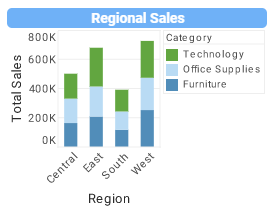
- The Profit, Sales, and Discount amount in each region
- The Shipping details of sold goods
- The Sales map which shows the overall view of sales in each state
- The generated profit of each category and sub-category of products
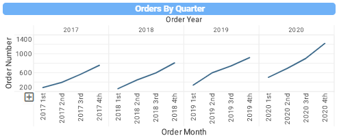
- The number of orders in each quarter and each year
- The details of each order
Superstore Analytics
The dashboard provides a variety of filters to drill down and up for different granularity. The users can also filter the visualizations in the dashboard by region, state, category of products, sub-categories, and customer segments. It is also possible to filter the dashboard with 3 sliders which can determine the total amount of sales, and the amount of profit and one slider to choose the upper bound and lower bound for the order date. The dashboard is dynamic, and the filter will be applied to all the visualizations available in the dashboard.
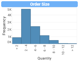
In this dashboard, superstore managers can see the total profit, total sales, and the total discount of each region, they can also see details of each state by simply drilling down to the state view in each chart. This allows them to plan for each region/state inventory based on the sales number to avoid the cost of warehousing. The order size chart depicts the distribution of items in each order. The business owners can see the popular shipping mode of their goods with a quick glance at the shipping modes chart. These two charts can help the business to optimize its dispatch and logistics accordingly. The sales map chart is a valuable visualization that can provide an overall view of the sales amount of each state.
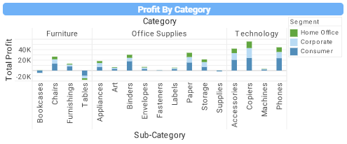
The profit by category chart gives managers the ability to have a wide range of information in just one chart, by drilling up they can have information about the overall profit of each product category and by drilling down they can find the most valuable products and the slow-mover ones. This can help production to put their resources into producing profitable goods and perhaps stop the production of goods with little to no profit. The orders by quarter chart generate information about the number of orders in each quarter of the year.
This information can be valuable to the marketing department for deciding about future promotion and discounts and also the logistics and dispatch teams to prepare for changes in demand accordingly. The top 10 customer list can come in handy if the business decides to consider special discounts or services for its loyal customers. The variety of filters provided by the inetsoft platform can help enrich the dashboards. The slider filters on the top of the Super Store dashboard will enable the end users to filter all the charts by sliding the handles to pinpoint the high-end and low-end sales and profit amounts in the dashboard. This can help clear out the unwanted information and only focus on the required data for better analysis. The date slider helps focus on a specific date for a better view of the superstore's status. The list boxes at the bottom of the dashboard can be utilized to filter any part of the data desired for analysis. The combination of state, category, sub-category, and customer type can filter the dashboard to show a high granularity of information about each section or an executive summary to present to the high-level managers of the superstore business. The ability to filter each state and each product can lead to a detailed report to analyze the performance of managers in each region or state.
For years, analytics has been at the core of performance improvement. Regardless of the industry, finding the patterns of what works has helped so many entities improve in ways that were not even imagined 50 or 60 years ago. In today's world, has and will continue to help the retailers gain an edge in the competitive market environment. For example, many retailers have implemented the use of analytics to predict future sales. Whether it's identifying the best time, place, or advertising methods to sell products, having a leg up on the competition is becoming more of a need than anything else due to changing customer requirements and the amount of stock needed for different products. While analytics has rapidly evolved over the last decade, there are so many different analytical techniques, resources, and methods that got us here today.
Researchers found that there was statistical evidence to back the idea that retailing firms implementing data warehousing achieve better nonfinancial performance, including promotional performance analysis, vendor analysis, customer analysis, and market segmentation analysis. An excellent example of this was how Walmart used data warehousing to keep up with the abundance of data that was coming in as the company grew. With all that said, seeing how data warehousing and data analytics can lead to high-quality visualizations inspired us to create this dashboard to show a small portion of the power of visualization. This type of dashboard can help mid and top-level management with decision making specifically in marketing, sales, and production. The filtering feature can help with a broad scope of view on the business status. It can help with pinpointing each part of the business with needed details.
InetSoft's versatile solutions helped many businesses in different industries achieve their desired performance. These solutions are included but not limited to Analytics and Reporting, Data Warehousing, BI solutions, and data preparation. For this dashboard, we used the InetSoft platform to prepare our data source using the data worksheet capability built in the InetSoft web application platform. The process of creating the visualizations and the dashboard was straightforward since the InetSoft platform offers intelligent suggestions to start the dashboard based on the existing data. The complete toolbox provided by inetsoft helps with formatting and filtering the dashboard easily. This toolbox consists of charts, filters, outputs, buttons, and different shapes.
StyleBI provides the best solution for businesses like the superstore. Rapid data preparation allows us to easily connect to existing data sources and mashup the data quickly to generate smart visualizations. The InetSoft platform provides a wide range of cloud sources and supports many data source formats. This platform is 100% self-service and easy to use, developers and end-users like data visualization experts and managers without a technical background can use inetsoft to create advanced data transformations and mashups without writing SQL queries and generate dashboards fast and professionally.
All the dashboards and reports are interactive and customizable and since the platform is a web application it is accessible via different devices so no matter who and where the superstore end-users are located they can access the data easily. The machine learning capability of the inetsoft platform helps with generating reliable insights fast and easily without requiring to transform business needs into data scientist language. The high-performance acceleration and scalability features can help the superstore business to develop data warehouses for analytics use with the need to implement the hardware infrastructures.