2021 Business Intelligence Product Release Highlights
Support for Clustering Options Using Docker and Kubernetes Added
Leading the many feature additions and customer-driven improvements of the 2021 product release is adding support for clustering options using Docker containers and Kubernetes. The combination of these two infrastructure technologies makes managing InetSoft deployments even more efficient.
As Kubernetes is a container orchestration system it provides the following benefits:
1. Automated, consistent, and repeatable deployment of containers
2. Automatic scaling of containers
3. Automatic system and resource management, including storage, networking, and security
4. Automatic failover as non-responsive cluster nodes are automatically restarted
This advance supports DevOps teams employing continuous integration and continuous delivery (CI/CD) pipelines. Furthermore, the Docker and Kubernetes technologies are supported by many popular cloud infrastructures, including Amazon (EKS), Azure (AKS), and Google Cloud (GKE).


Advanced Data Visualization Types Added
With addition of the following chart types, InetSoft offers as wide an advanced data visualization library as any analytics solution available.
Tree
Step Line
Step Area
Jump Line
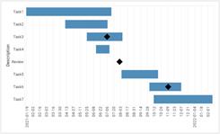
Gantt
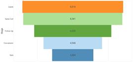
Funnel
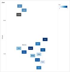
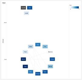
Network
Circular
Enhancement for Using R Data Sources
Among many user-driven improvements to administrative functions, users of external version control systems get more efficient access to the changes on InetSoft platform assets that concern them.
Security management gets additional capabilities including SSO login defaults and user/role/group lookups.
Dashboard and Chart Features
Tooltips offer more options such as displaying more data point details than just the one selected and the ability to provide more information about a field, including name, alias, and description. Radar charts can now display in pivoted orientations.
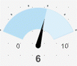
A new gauge type provides a colored sweep area based on desired data ranges. For example:
Facebook Ad Insights Enhancement
Advertisers can better report on their Facebook performance statistics with the ability to use all of the available data parameters.
User Portal Functionality
Foldering has been added for data asset organization, and intelligent search makes finding dashboards, reports, and worksheets easier
For the Full Release Notes
To review the complete list of new features and improvements, please see:
https://inetsoft-cdn.s3.amazonaws.com/literature/2021_Minor_Features.pdf

The 5-Second Rule for Dashboards
What Is the 5-Second Rule?
The “5-second rule” for dashboards is a straightforward but demanding design principle: within five seconds of viewing a dashboard, a user should understand whether performance is on track and where attention is needed. The dashboard must immediately communicate status, direction, and priority. If the user is still scanning, interpreting, or guessing after five seconds, the dashboard is not functioning as an effective decision tool.
This rule exists because dashboards are used in fast-paced environments where time and attention are limited. Executives, managers, and frontline operators need instant clarity, not a puzzle to decode. The 5-second rule forces designers to prioritize clarity, hierarchy, and signal over noise.
Why Dashboards Often Fail the 5-Second Test
Dashboards frequently fail this rule because they are built as data showcases rather than decision tools. Designers often include every available metric, chart, and color, creating visual overload. When too many elements compete for attention, users struggle to identify what matters most.
Another common failure is the absence of context. A number without a benchmark—such as revenue, uptime, or conversion rate—does not communicate meaning. Users must mentally calculate whether a value is good or bad, which slows them down. Without targets, thresholds, or comparisons, the dashboard forces interpretation instead of delivering clarity.

Designing for Instant Clarity
Dashboards that meet the 5-second rule rely on a strong visual hierarchy. The most important information belongs in the most prominent location, typically the top-left area where users naturally begin scanning. This is where key outcome metrics should appear, displayed in large, readable KPI tiles that immediately communicate status.
Supporting context—such as trends, comparisons, and breakdowns—can be placed in the middle of the screen. Detailed tables and granular diagnostics belong toward the bottom or in drill-down views. This layered approach ensures that the first five seconds deliver orientation, while deeper analysis is available for those who need it.
Reducing Cognitive Load
The 5-second rule is fundamentally about minimizing cognitive load. Humans can only process a limited amount of information at once, and dashboards that ignore this reality become exhausting to use. One effective strategy is to limit the number of primary metrics on a single screen. A focused dashboard might highlight five to nine key indicators, each clearly labeled and grouped logically.
Color usage also plays a major role. Colors should be functional, not decorative. A simple scheme—green for good, red for bad, and neutral tones for context—allows users to scan for exceptions instantly. When every chart uses a different palette, users must relearn the meaning of each color. Consistent, purposeful color reduces mental effort and speeds up interpretation.
Anchoring Dashboards to Decisions
Dashboards that pass the 5-second test are designed with decisions in mind. Instead of starting with available data, designers begin with the questions the dashboard must answer: Are we on target? Where are we off track? What requires action today? Every metric and visual element is chosen to support those decisions directly.
This decision-first approach clarifies which metrics deserve top placement. Outcome metrics that reflect success or failure belong at the top. Leading indicators that explain performance changes can sit just below. Diagnostic details can be available but visually secondary. When every element has a purpose, users can move from seeing data to knowing what to do next.
Practical Techniques to Apply the 5-Second Rule
Applying the rule begins with simplification. Remove charts that do not support a key decision. Combine related metrics into concise visuals. Use large KPI tiles with clear labels and directional indicators. Add comparisons to targets or previous periods so that “good” and “bad” are visually obvious.
User testing is also essential. Ask real users to open the dashboard and describe what is happening without clicking anything. If they hesitate or begin reading every label, the design needs refinement. Iteration—simplifying visuals, clarifying labels, and tightening color usage—helps the dashboard reach the 5-second threshold.

From Reports to Decision Instruments
The 5-second rule transforms dashboards from static reports into active decision instruments. When users can instantly see status, direction, and priority, they are more likely to rely on the dashboard daily. Meetings become more focused because everyone can see the same story at a glance. Instead of debating what the numbers mean, teams can focus on what actions to take.
The rule is simple, but meeting it requires discipline: fewer metrics, clearer hierarchy, purposeful color, and decision-driven design. When these principles come together, dashboards stop being data wallpaper and become the fastest way to understand the business in five seconds or less.