Advanced Enterprise Reporting Topic: Augmented Analytics Through AI-Driven Data Storytelling
Augmented analytics through AI-driven data storytelling represents a transformative approach in business intelligence and data reporting, shifting the paradigm from traditional dashboards and static charts to dynamic, intelligent narratives that guide decision-making. The essence of augmented analytics is the integration of artificial intelligence, machine learning, and natural language generation (NLG) into the reporting process, enabling systems to automatically analyze vast amounts of data, identify significant trends, detect anomalies, and generate human-readable explanations. This evolution allows business users, analysts, and decision-makers to understand complex datasets without needing advanced technical skills or deep statistical knowledge.
At its core, AI-driven data storytelling enhances traditional reporting by providing context and insight rather than mere presentation of numbers. Whereas a conventional report might display a sales chart or a revenue table, augmented analytics interprets the data, highlights what is most important, and explains why certain patterns or anomalies have occurred. For example, instead of showing a dip in regional sales for the last quarter, the system can indicate that the decline correlates with a supply chain disruption or increased competition, providing a narrative that adds actionable intelligence. This capability transforms raw data into a story that is intuitive and immediately useful for decision-making.

Key Technologies and Implementation
One of the key technologies underpinning augmented analytics is machine learning. Machine learning algorithms analyze historical and real-time datasets to detect patterns that might not be immediately apparent to human analysts. These algorithms can identify correlations, trends, and outliers across multiple variables, predicting potential outcomes or highlighting areas that require attention. When integrated into reporting systems, machine learning ensures that the generated narratives are not only descriptive but predictive, allowing organizations to anticipate challenges and opportunities rather than merely reacting to past performance. This predictive element is especially valuable in fast-moving industries, where timely insights can provide a competitive advantage.
Natural language generation is another critical component of AI-driven data storytelling. NLG transforms complex analytical results into human-readable text, creating narratives that describe patterns, anomalies, and trends in plain language. Users no longer need to interpret raw charts or tables; instead, they can read insights that are formatted like a written report, highlighting key findings and suggesting possible actions. NLG can generate summaries at multiple levels of detail, from high-level executive summaries to granular, line-by-line explanations, catering to different audiences across an organization. This reduces the cognitive load on users and ensures that insights are accessible even to those without specialized analytical skills.
Augmented analytics also emphasizes automation and self-service capabilities. In traditional reporting, analysts spend significant time preparing data, creating visualizations, and manually interpreting results. Augmented analytics automates many of these tasks, freeing analysts to focus on strategy and decision-making. Users can interact with dashboards and reports in a self-service manner, asking questions in natural language and receiving instant answers supported by AI-generated narratives. For example, a sales manager could query the system with, “What caused the increase in online sales last month?” and receive a concise narrative explanation that identifies relevant factors, trends, and outliers. This approach accelerates decision-making and reduces reliance on IT or data science teams for routine analyses.
Another advantage of AI-driven data storytelling is the ability to provide contextualized insights. Augmented analytics platforms do not just summarize metrics; they evaluate them in relation to historical trends, industry benchmarks, and external factors. This context allows users to distinguish between normal variations and significant deviations that require attention. For instance, a sudden drop in website traffic might seem alarming in isolation, but the system could indicate that the decline is typical for the season, preventing unnecessary concern. Contextualized insights help organizations make better-informed decisions and avoid misinterpreting data due to lack of perspective.
Data democratization is closely tied to augmented analytics. By generating narratives that are easy to understand, AI-driven reporting lowers barriers for non-technical users to engage with data. Executives, managers, and frontline employees can all access meaningful insights without requiring specialized training in data analysis. This democratization encourages a data-driven culture, where decisions across the organization are informed by evidence rather than intuition alone. When employees at all levels can interpret and act upon insights, organizations become more agile and responsive to market dynamics.
Implementation Considerations and Future Outlook
Integration with existing BI infrastructure is another hallmark of augmented analytics. Many organizations already use traditional dashboards, reporting platforms, and data warehouses. Augmented analytics can enhance these systems by overlaying AI-driven narrative capabilities on top of existing datasets. This means organizations can leverage their current investments while gaining the benefits of automated insight generation. For example, a company using a conventional dashboard tool can integrate AI algorithms that continuously analyze data and generate explanations in real-time, providing users with both visual and narrative insights simultaneously. This integration ensures a smooth transition from traditional reporting to a more advanced, insight-driven approach.
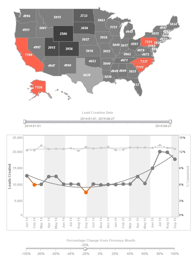
Interactive visualizations complement AI-driven narratives, providing users with both explanations and the ability to explore the underlying data. While narratives summarize key findings, interactive dashboards allow users to drill down, filter, and manipulate the data to validate or investigate further. This combination of storytelling and interactivity empowers users to ask deeper questions and uncover insights that automated narratives alone might not fully capture. For instance, a financial analyst can read a narrative about budget deviations and then interactively explore specific expense categories to pinpoint the underlying causes.
Augmented analytics also enhances collaboration within organizations. AI-generated narratives can be shared easily across teams, providing a common understanding of key findings. Reports can be distributed with explanations that ensure all stakeholders interpret the data consistently, reducing the risk of miscommunication. Collaboration is further improved when interactive elements allow multiple users to explore scenarios together, with the AI narrative updating dynamically based on their interactions. This collaborative insight generation supports consensus-driven decision-making and fosters alignment across departments.
Security and governance are integral to augmented analytics platforms. As AI analyzes sensitive data and generates narratives, it is essential to maintain appropriate access controls and compliance with data privacy regulations. Advanced platforms implement role-based access, ensuring that users only see data and insights for which they are authorized. Furthermore, auditing capabilities track AI-generated insights and decision histories, providing transparency and accountability. By combining intelligent storytelling with robust governance, organizations can confidently rely on AI-generated narratives without compromising security or compliance.
Real-World Applications and Business Impact
Practical applications of AI-driven data storytelling span industries and use cases. In retail, augmented analytics can generate narratives explaining customer purchasing behavior, predicting trends, and recommending inventory adjustments. In finance, it can identify unusual transactions or flag deviations from budget forecasts, providing actionable explanations for auditors or management. In healthcare, AI-driven reporting can summarize patient data trends, highlight anomalies in treatment outcomes, and suggest areas for intervention. Across all sectors, augmented analytics transforms raw data into insights that are timely, relevant, and actionable, helping organizations respond to challenges and opportunities more effectively.
Future developments in augmented analytics point toward even more sophisticated applications. Integration with conversational AI allows users to interact with data through voice or chat, asking questions and receiving narrative responses in real-time. Predictive and prescriptive capabilities will continue to evolve, enabling systems not only to describe trends but also to recommend optimal actions based on simulations and scenario analysis. Furthermore, as machine learning algorithms become more transparent and explainable, users will gain deeper trust in AI-generated narratives, ensuring that insights are both accurate and actionable. Organizations that adopt AI-driven data storytelling early can gain a significant competitive advantage, as decision-making becomes faster, more precise, and more data-driven.


