The Best Dashboard Graphics for Clear and Actionable Insights
Dashboard graphics are the visual backbone of any effective business intelligence solution. While data powers decisions, it is the graphics that determine whether those insights are understood quickly or missed entirely. The best dashboard graphics do more than display numbers.
They reveal patterns, highlight performance, and guide users toward action.
This guide explores the most effective types of dashboard graphics, when to use them, and how real-world examples from InetSoft dashboards demonstrate their impact.


Why Dashboard Graphics Matter
Well-designed dashboard graphics transform complex datasets into intuitive visuals that support faster decision-making. Instead of scanning spreadsheets, users can instantly identify trends, outliers, and performance gaps.
InetSoft dashboards emphasize this principle by presenting KPIs through dynamic visual displays that make critical metrics easy to interpret.
Bar Charts for Comparisons
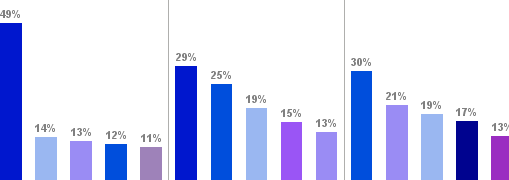
Bar charts are one of the most widely used dashboard graphics because they make comparisons simple and clear. They allow users to evaluate differences across categories such as product lines, regions, or teams.
- Comparing discrete categories
- Highlighting rankings or performance differences
- Displaying relatively small datasets
Line Charts for Trends Over Time

Line charts are essential for visualizing trends and changes over time. They help users understand whether performance is improving, declining, or remaining stable.
- Time-series data
- Identifying patterns and seasonality
- Monitoring continuous performance metrics
Heatmaps for Patterns and Intensity

Heatmaps use color intensity to represent data values, making them ideal for spotting patterns and anomalies quickly.
- Visualizing density or concentration
- Comparing performance across multiple dimensions
- Identifying outliers at a glance
Tables for Detailed Data
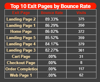
Tables remain essential for displaying precise values and detailed information, especially when paired with drill-down capabilities.
- Exact numbers are required
- Comparing multiple data points in detail
- Supporting information complements visual summaries
KPI Tiles for Quick Insights
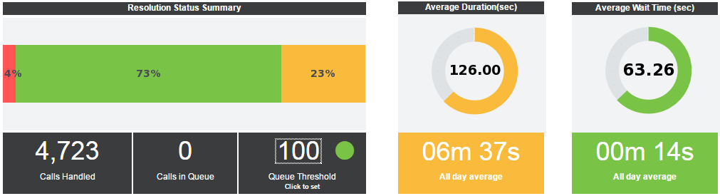
KPI tiles display key metrics in a compact format, allowing users to assess performance instantly.
- Highlighting critical metrics
- Providing quick performance snapshots
- Using color indicators to show status
Maps for Geographic Insights
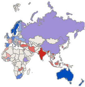
Maps are powerful for visualizing geographic data and identifying regional trends.
- Regional performance analysis
- Market expansion planning
- Logistics and supply chain tracking
Combining Graphics for Maximum Impact
The most effective dashboards combine multiple graphic types to provide a complete view of performance. InetSoft dashboards often integrate bar charts, line graphs, tables, and maps into a unified experience that supports both high-level insights and deep analysis.
Common Dashboard Graphics Mistakes
- Using the wrong chart type
- Overloading visuals
- Lack of context
- Poor color choices
- Ignoring interactivity
Best Practices for Choosing Dashboard Graphics
- Match the graphic to the data
- Prioritize clarity
- Use color strategically
- Enable interactivity
- Provide context
The Role of Dashboard Graphics in Decision-Making
Dashboard graphics are essential tools for communicating data effectively. When designed properly, they reduce complexity, highlight what matters, and support faster, more confident decisions.
InetSoft’s dashboards demonstrate how strong visual design and the ability to mash up data into meaningful views turn analytics into action.