When To Use a Dashboard Slider
A dashboard slider is one of the most effective interactive controls in modern BI design because it lets users manipulate a variable dynamically and instantly see how the dashboard responds. You use a slider when you want to give users continuous, intuitive control over a value—typically a range, threshold, or scenario parameter—without forcing them to type numbers or navigate complex filters. Sliders shine in dashboards where exploration, experimentation, and rapid comparison matter more than precise numeric input.
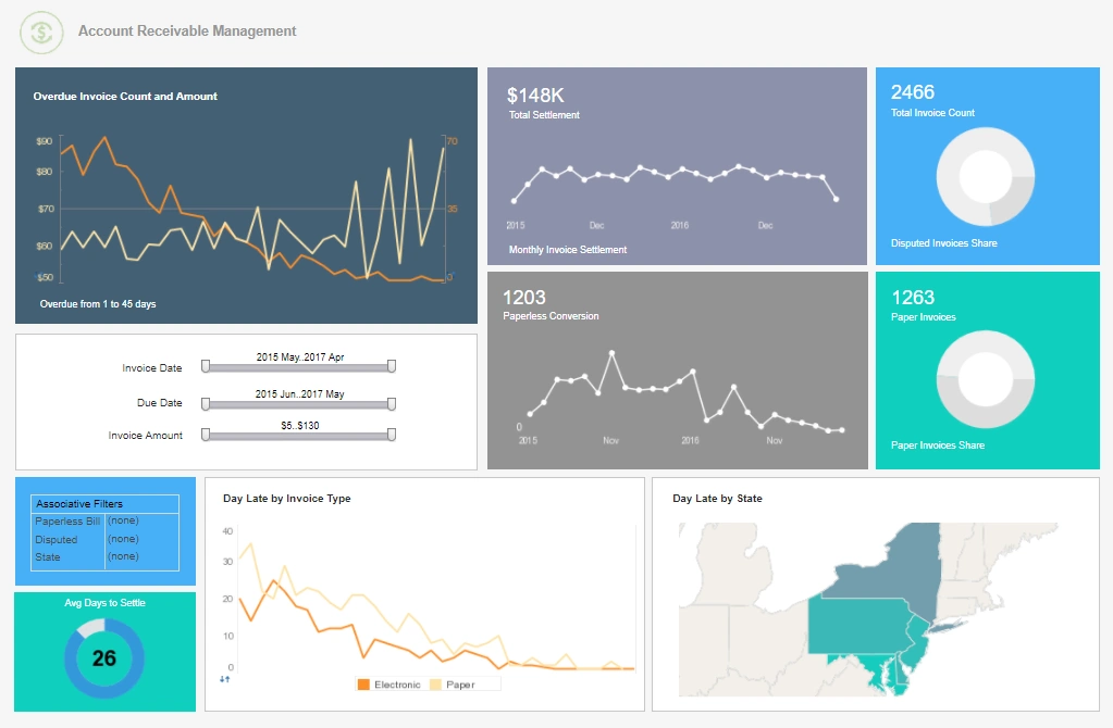
A slider is ideal when the user needs to adjust a value repeatedly to observe patterns. For example, adjusting a date range day by day, changing a revenue target to see how close the team is to hitting it, or modifying a forecast assumption to understand sensitivity. In these cases, a dropdown or text box would slow the user down, while a slider encourages fluid exploration.
Sliders are also perfect for scenario modeling. When a dashboard includes what-if analysis—such as changing discount rates, inventory levels, staffing counts, or budget allocations—a slider becomes the most natural control. It turns the dashboard into a simulation tool, allowing users to test multiple outcomes in seconds. This is especially useful for finance, operations, and planning teams who need to evaluate different scenarios quickly.


Another strong use case is when the underlying data is continuous rather than categorical. If the user is filtering by a numeric field like age, price, temperature, or utilization percentage, a slider provides a visual sense of scale. It helps users understand the range of values and choose a point or interval without needing to know the exact number beforehand.
Sliders also help when the dashboard needs to highlight trends over time. A time slider can animate or scrub through historical data, showing how metrics evolve. This is common in dashboards for logistics, IoT, environmental monitoring, and any domain where time-based patterns matter. Instead of jumping between static time periods, the user can glide through the timeline and watch the visuals update.
A slider is also appropriate when you want to reduce cognitive load. Numeric inputs can intimidate non-technical users, but a slider feels approachable and playful. It lowers the barrier to interacting with the dashboard, making it more likely that users will explore and discover insights on their own.
Finally, sliders are useful when the dashboard is displayed on a touchscreen or wallboard. Touch interactions favor large, simple controls, and a slider is easier to manipulate than a dropdown or multi-select filter. In environments like manufacturing floors, hospitals, or retail stores, where dashboards may be used quickly and casually, sliders improve usability.
In short, use a dashboard slider when you want to encourage exploration, support continuous values, enable scenario modeling, simplify user input, or enhance time-based analysis. It is a control that transforms a dashboard from a static report into an interactive analytical tool, empowering users to engage deeply with the data and uncover insights that would remain hidden with more rigid filtering methods.
Examples of Dashboard Slider Use Cases
-
See What's Going On In Your
Organization
This article showcases how executives and sales leaders can monitor performance across multiple sales teams from a single interactive view. It explains how selection trees and filters let users focus on specific teams or individuals without being overwhelmed by data. The piece highlights commonly reported sales KPIs such as year-to-date performance, pipeline size, and close ratios. It also emphasizes drill-through capabilities that reveal detailed opportunity and lead information. Overall, it positions KPI dashboards as a way to transform complex sales data into clear, actionable insights.
-
Deeper Understanding Of Where Their
Business Stands
This page explains how graphic KPI dashboards help organizations visualize their most important metrics in a dynamic, intuitive way. It describes how visual graphs and pictures reveal patterns, trends, and potential problems that spreadsheets often hide. The article discusses how different industries can track performance daily, monthly, or quarterly using tailored KPI views. It also covers how drag-and-drop design and real-time data mashups support self-service analytics. The result is a compelling case for using graphic dashboards to improve decision-making and organizational focus.
-
Bare Data Turns Into Actionable Information
This article focuses on KPI reporting tools that convert raw data into meaningful reports and visualizations. It explains how users can build customizable charts, tables, and crosstabs without deep technical skills. The content highlights interactive drill-down features that help pinpoint the root causes of performance issues. It also explores how KPI reporting tools support continuous monitoring of trends and exceptions. The article concludes by showing how better reporting can be the difference between business success and failure.
-
Adaptable To Changing Data
Configuration
This page describes KPI dashboard software designed specifically for analysts who need flexibility and power. It explains how dashboards can be deployed quickly and learned with minimal training, even in complex environments. The article emphasizes adaptability to evolving data structures and business requirements. It also shows how analysts can use dashboards for data exploration, visualization, and self-service analysis. The content underscores that the same platform can satisfy executives, power users, and large-scale deployments.
-
Robust Enough To Grab The Attention
Of Executives
This article presents KPI monitoring dashboard software that balances robustness, ease of use, and flexibility. It explains how organizations can deploy dashboards in weeks and empower end users with minimal training. The content highlights examples of executive marketing dashboards that consolidate multiple charts and employee views. It also discusses hierarchical selection lists and permissions that scale to large teams. The article positions the software as a small-footprint, cloud-flexible solution for enterprise KPI monitoring.
-
Powerful Interactive Dashboard For
Managers And Executives
This page focuses on a customer service operations dashboard that tracks service performance KPIs. It explains how managers can monitor response times, resolution rates, and workload distribution in real time. The article highlights interactive features that let users drill into specific agents, queues, or time periods. It also shows how visual alerts and trends help identify bottlenecks and service issues early. The dashboard is presented as a central tool for improving customer satisfaction and operational efficiency.
-
Track The Company’s Performance And
Identify Areas
This article describes how an analyst at a pet supplies company uses KPIs to manage business performance. It covers metrics related to sales, inventory, customer behavior, and marketing effectiveness. The content explains how dashboards help identify underperforming product lines or regions. It also shows how KPI tracking supports strategic decisions such as pricing, promotions, and stocking levels. The article illustrates how industry-specific KPIs align daily operations with long-term growth goals.
-
Improve Team Performance
And Player Development
This page explores how professional sports organizations use KPI reporting tools to gain a competitive edge. It discusses metrics such as player speed, distance covered, and positional data captured by tracking systems. The article explains how analytics software helps coaches refine game strategy and training programs. It also highlights how fan engagement and commercial KPIs are monitored alongside on-field performance. Together, these KPIs provide a holistic view of team success and organizational health.
-
Monitor Production Performance
And Identify Issues
This article examines how production analysts use KPI dashboards to oversee manufacturing and operations. It explains how metrics like cycle time, throughput, quality rates, and downtime are tracked visually. The content shows how dashboards help identify bottlenecks, equipment problems, and process inefficiencies. It also describes how analysts communicate performance trends and targets to stakeholders. The article emphasizes continuous improvement driven by data-informed decisions.
-
Measure Patient Flow And Clinical
Outcomes
This page outlines a healthcare KPI dashboard that supports hospitals and clinics in managing operations. It describes metrics such as bed occupancy, wait times, readmission rates, and treatment outcomes. The article explains how visual dashboards help administrators balance capacity and quality of care. It also highlights how drill-down views reveal performance by department, physician, or service line. The dashboard is presented as a tool for improving patient experience and regulatory compliance.
-
Monitor Enrollment Trends And Student
Success
This article focuses on a university KPI dashboard used by academic and administrative leaders. It covers metrics like enrollment, retention, graduation rates, and course completion patterns. The content explains how dashboards help identify at-risk student populations and program performance gaps. It also shows how financial and operational KPIs are integrated for a complete institutional view. The dashboard supports data-driven planning for recruitment, resource allocation, and academic strategy.
-
Track Plant Efficiency And Quality
Performance
This page describes a manufacturing KPI dashboard that provides real-time visibility into plant operations. It explains how metrics such as overall equipment effectiveness, scrap rates, and throughput are monitored. The article highlights how alerts and trend lines help supervisors react quickly to production issues. It also discusses how dashboards compare performance across lines, shifts, or facilities. The solution is positioned as a way to reduce costs, improve quality, and increase operational reliability.


