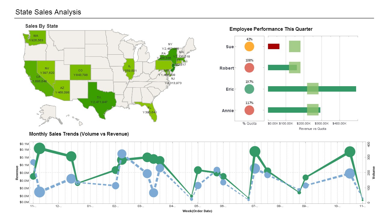
How Companies Are Using Dashboards
This is a continuation of a transcript of a Webinar hosted by InetSoft entitled "Designing a Good Dashboard." The speaker is Mark Flaherty, CMO at InetSoft.
Attendee: Are you noticing any change in how companies are using dashboards?
Mark Flaherty (MF): One interesting application of dashboards is displaying them on wall-mounted LCD’s such as in company lobbies or other private areas that employees walk by a lot. They really can draw attention to the KPIs that matter to a company and keep people focused on doing things that affect them. So they are not just seen on the desktop any more. Some companies project their KPI on the wall in a prominent location.
There are also some interesting productivity enhancing applications for dashboards. Take for instance, in hospitals, you have wall-mounted dashboard displays showing the status of cleaned rooms in the ER, because they have such a high pressure to turn rooms around to get next productivity.
These applications reflect the idea that the purpose of dashboards is not technology-drive, it’s adoption-driven. What gets look at, gets attention. It’s as simple as that. It’s a natural outcome to see improvements in these metrics.
Improvement at the Operation Level
No matter what you tracking, what context it is, whether it’s a warehouse or a factory, you start seeing improvement by the people are responsible for the job the operation level. They realize what they are doing has direct impact on that metric that they see displayed on the wall each day. It speaks to the internal competitive drive people have and how much they enjoy scorekeeping and seeing the results of their efforts. The more public, the better.
Another key development in dashboards is alerting. Users can create proactive alerts for when this metric exceeds a threshold, send them an email or send an entire group an email. That’s become an essential part of successful dashboards.
How Complex or Simple Should Dashboards Be?
In general dashboard should be simple. But the truth is matter is that people really don’t know what they want until the end. With data mashup, you can be flexible and deal with that inevitability. Start by giving them a general dashboard that meets what they said they wanted initially. But also give them the ability for them to modify it or create dashboards on their own, as well. So you get best of both worlds. They get the KPIs that they are really interested in, but also give them the ability to create on mashups. If they do change their mind, it’s there for them to go ahead and create their dashboard personalized for them.
How Does a Public health Service Use a Dashboard?
Public health services leverage dashboards as powerful tools to enhance their capacity for monitoring, managing, and improving population health. These dashboards are designed to consolidate and visualize a wide array of health-related data, providing public health officials with real-time insights and comprehensive overviews. One primary use of these dashboards is in disease surveillance, where they play a crucial role in tracking the spread of infectious diseases.
By aggregating data on reported cases, testing rates, and other relevant metrics, public health officials can quickly identify emerging health threats, allocate resources efficiently, and implement timely interventions to mitigate the impact of outbreaks. Another key function of public health dashboards is to support decision-making processes. Health officials can analyze trends, patterns, and demographic information to make informed decisions about resource allocation, intervention strategies, and public health campaigns.
For instance, dashboards may include vaccination coverage rates, enabling officials to identify areas with lower immunization rates and implement targeted outreach programs. Additionally, these dashboards contribute to evidence-based policymaking by providing a comprehensive view of the health landscape, helping public health agencies align their initiatives with the most pressing needs of the community. Moreover, public health dashboards enhance communication and transparency. By presenting complex health data in a visually accessible format, these tools facilitate communication with the public, policymakers, and other stakeholders.
Dashboards can be designed to display information on community health indicators, ongoing public health programs, and the effectiveness of interventions. This transparency fosters public trust, encourages community engagement, and allows residents to stay informed about the status of health initiatives and potential risks. Overall, the integration of dashboards into public health services represents a forward-looking approach that leverages technology to promote proactive health management and ensure the well-being of communities.

