Introduction to Data Visualization in Business Intelligence
Data visualization, according to Wikipedia, is the study of the visual representation of data. A closely related term, Information visualization, is defined as: visualization is a process of transforming information into a visual form enabling the viewer to observe, browse, make sense, and understand the information.
In the context of Business Intelligence (BI), data visualization is applied in two ways. First, data visualization is a discipline that covers a complete theory of how to visually represent data. The concepts and systems can be applied in the design of visual interfaces for communicating information.
Secondly, data visualization concepts and guidelines are realized through features in BI software, which makes it easy to apply the concepts. This is similar to the concept of Object Oriented programming. Object Oriented Programming is a concept that could be implemented in any programming language, such as C. But to do it effectively and in large scale, it’s best to have a programming language that provides direct support for the concepts, in the form of classes and inheritance.

Likewise, data visualization software provides features to easily create visualizations that effectively communicate information. More importantly, the software should guide and enforce the guidelines for effective visualization, so a casual user can still create satisfactory results.
Additionally, data visualization in the context of BI often implies the interactivities through the software. By enabling users to interact with data, the software opens tremendous opportunities to view data in many different angles. It transforms the data visualization from a presentation technology to an analysis process.
Data Visualization Concepts
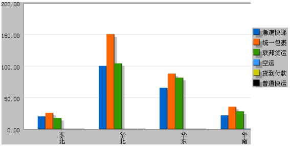
Data visualization is not a new discipline. The basic concepts of how to effectively present information through graphs have been well established in the 1970’s. In the simplest case, the principle of data visualization is about how to design graphs to communicate. Let’s illustrate this through an example. The graph on the left is an example from a reporting software vendor's site.
This graph looks innocent enough, and is probably very close to what you would get if you just throw the data into an Excel spreadsheet and create a default chart. However, the graph exhibits the common mistakes made through a lack of understanding in visual design.
Applying the basic principles of data visualization, we arrive at a vastly different graph, displayed on the right. The following changes have been applied to the graph to improve the communication:
1. The bar graph is changed to a stacked bar. A stacked bar allow the individual sub-components to be clearly discernable while make the comparison of graphs much easier. Try to compare 华北 and 华南. It would be difficult to tell which is larger in the original graph, but is very obvious in the new one.
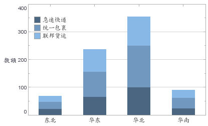
2. The background color of the axis and legend is removed. The background unnecessarily draws attention to the less important part of the graph and creates a distraction to the graph.
3. The label on the X axis is changed to be horizontal. There is really no reason to make the label vertical since there is plenty of space to display them, and vertical text is generally harder to read than horizontal text.
4. The colors of the bars are changed to use three colors with the same hue but different intensity. This may be a matter of taste, but the use of simpler color generally helps reducing distraction and make people focus better on the data.
5. A label is added to the Y axis. Without proper labeling, a reader can’t tell what data is plotted. The data should be labeled either on the axis, or as a graph caption.
There are undoubtedly many more improvements that can be made on the graph. But the few changes applied to the graph is sufficient to show that with careful design and application of good visualization principles, simple changes can vastly improve the communication.

Case Study: Enhancing Operations and Patient Care at Harmony Care Skilled Nursing Facility Using BI Data Visualization Software
Harmony Care is a leading skilled nursing facility located in the Midwest, providing long-term care and rehabilitation services to elderly residents. Established in 1998, Harmony Care serves approximately 200 residents, offering services that include physical therapy, occupational therapy, nursing care, and memory care for patients with Alzheimer's and dementia. With an aging population and increasing demand for high-quality care, Harmony Care aimed to improve operational efficiency, ensure regulatory compliance, and enhance patient outcomes.
However, the facility faced several challenges due to the complexity of managing patient care, regulatory requirements, staffing needs, and financial performance. Information was often siloed across departments, making it difficult for management to make timely and informed decisions. Harmony Care implemented Business Intelligence (BI) Data Visualization Software to integrate data from various sources, visualize key metrics, and drive data-driven decision-making.
Problem Statement
Harmony Care Skilled Nursing Facility experienced several challenges that hindered its ability to deliver optimal care and maintain operational efficiency:
- Fragmented Data Sources: Different departments (e.g., nursing, therapy, administration, and finance) used separate systems to track information, making it difficult to gain a comprehensive view of operations.
- Regulatory Compliance Requirements: The skilled nursing industry is highly regulated, with strict requirements for documentation, quality metrics, and reporting to government agencies. Compliance tracking was time-consuming and prone to errors.
- Patient Outcomes and Care Quality: Ensuring high-quality care for residents required continuous monitoring of various health metrics, such as fall rates, pressure ulcers, and hospital readmissions. Data on these metrics was often not available in real-time.
- Staffing Optimization: Staffing needs varied based on patient acuity levels, but the facility struggled to align staff schedules with patient demand, resulting in either understaffing or overstaffing.
- Financial Performance: Managing financial performance, including reimbursement rates, billing accuracy, and expense control, was a challenge due to the fragmented nature of financial data.
These issues prompted Harmony Care to seek a solution that would integrate data from different systems, provide real-time insights, and facilitate better decision-making across the organization.
Solution: BI Data Visualization Software
Harmony Care implemented a Business Intelligence (BI) data visualization software solution that integrated data from multiple sources, including electronic health records (EHR), financial systems, staffing schedules, and regulatory reporting databases. The software enabled the facility to visualize key performance indicators (KPIs) on interactive dashboards, providing management with real-time insights into operations, patient care, staffing, and finances.
The solution involved the following key features:
-
Centralized Data Integration:
- The BI software integrated data from disparate systems, including the EHR system, billing software, staffing platform, and regulatory reporting tools.
- This provided a single source of truth for decision-makers, allowing them to view comprehensive information in one place.
- Data from different departments was automatically updated in the dashboard, reducing the need for manual data entry and minimizing errors.
-
Patient Care and Clinical Outcomes Monitoring:
- The software provided real-time visualization of patient health metrics, such as fall rates, infection rates, weight loss, pressure ulcers, and hospital readmissions.
- Alerts were set up for critical metrics that exceeded thresholds, allowing nursing staff and management to take immediate action to address emerging issues.
- Dashboards displayed trends over time, enabling the identification of patterns in patient outcomes and facilitating continuous improvement in care quality.
-
Regulatory Compliance Tracking:
- The BI software included dashboards specifically designed to monitor compliance metrics required by state and federal agencies, such as Medicare and Medicaid.
- Real-time visualization of regulatory compliance data allowed the facility to prepare for audits and submit required reports more efficiently.
- Management could quickly identify any gaps in documentation or care standards, ensuring that corrective actions were taken before issues escalated.
-
Staffing Optimization and Labor Cost Management:
- The data visualization software enabled managers to monitor staffing levels in real-time, adjusting shifts based on current patient acuity and census.
- Staffing dashboards displayed labor costs, overtime trends, and staffing-to-patient ratios, allowing management to optimize schedules and reduce unnecessary labor expenses.
- Predictive analytics were used to forecast staffing needs based on historical trends, enabling proactive planning for high-demand periods, such as flu season.
-
Financial Performance and Revenue Cycle Management:
- The BI dashboards provided insights into billing accuracy, reimbursement rates, and outstanding payments, helping the finance team optimize revenue cycle management.
- Expense tracking was visualized in real-time, allowing management to identify cost-saving opportunities and monitor budget performance against financial targets.
- The software helped the facility improve billing processes, resulting in faster reimbursements and reduced denials.
Results
The implementation of BI data visualization software led to significant improvements in Harmony Care's operations and patient care outcomes:
- Enhanced Patient Care and Outcomes: Real-time monitoring of patient health metrics led to a 25% reduction in falls and a 30% decrease in pressure ulcer incidents. The facility also saw a 15% reduction in hospital readmissions, improving patient outcomes and reducing associated costs.
- Improved Regulatory Compliance: The ability to track compliance metrics in real-time helped Harmony Care reduce the time spent preparing for audits by 40%. The facility maintained higher standards of care documentation, reducing the risk of fines or penalties due to non-compliance.
- Optimized Staffing and Reduced Labor Costs: Staffing dashboards enabled more accurate alignment of staff schedules with patient needs, resulting in a 20% reduction in overtime expenses. Predictive scheduling minimized instances of understaffing, enhancing patient care while keeping labor costs in check.
- Increased Financial Performance: By streamlining the revenue cycle management process, Harmony Care saw a 15% increase in the speed of reimbursements and a 10% reduction in denied claims. Real-time expense tracking also helped the facility identify and implement cost-saving measures, leading to a 5% improvement in overall financial performance.
- Better Decision-Making Across Departments: Centralized data visualization broke down silos between departments, fostering collaboration and enabling data-driven decision-making. Management could make more informed decisions based on comprehensive, real-time data rather than relying on outdated reports.