BI Enterprise Solution Examples
Searching for the good BI enterprise solution examples? InetSoft, a pioneer in business intelligence, provides samples from its highly-rated, easy to use enterprise BI platform.
University Balanced Scorecard
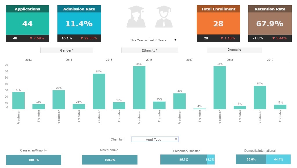
This university balanced scorecard breaks down admissions by various demographic and psychographic factors, such as race, gender, major type, transfers, and year. Large, easy to read text KPIs display the dashboard's most important aggregates, with percent change from previous period displayed underneath them.
Mfg Performance Metrics
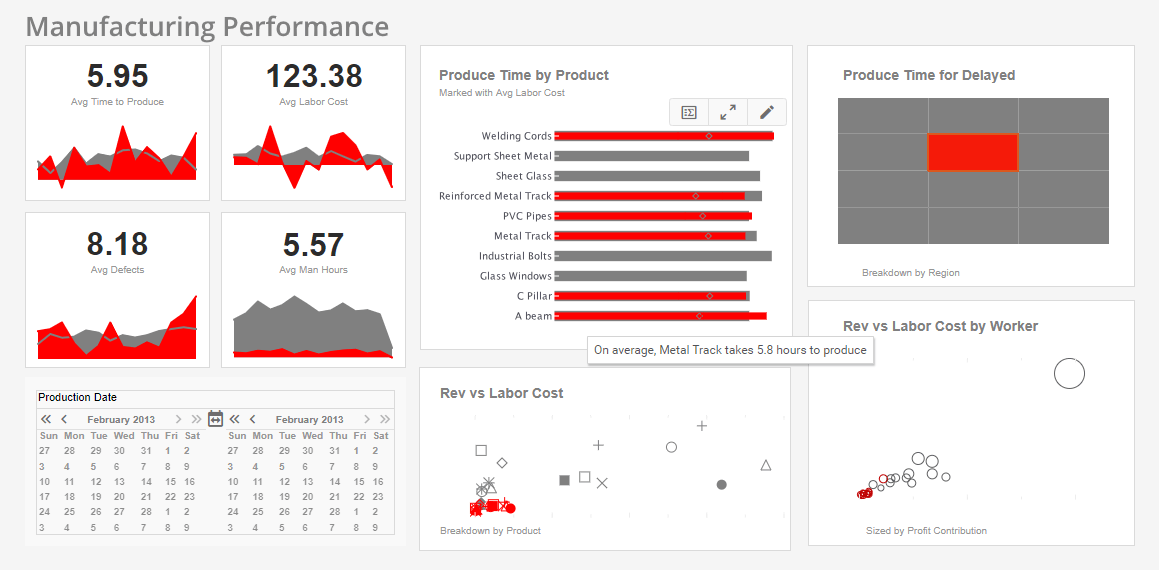
With this manufacturing performance metrics dashboard, manufacturing managers can monitor production times, errors, and production costs. Text KPI's in the top left corner give an at a glance picture of the factory's overall performance. In this brushed example, a particular delay reason is selected, highlighting the proportion of that delay on charts throughout the dashboard. The lower two charts reveal that the selected delay reason does not represent a large proportion of revenue or labor.
Project Management Office
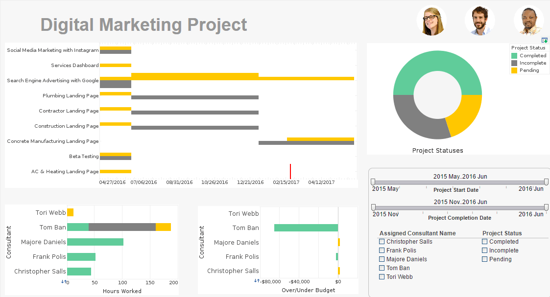
This project management office dashboard aids in the monitoring of various marketing initiatives and the start and end times of various project stages. This type of dashboard helps digital marketing agencies track the progress of their consultants on various initiatives. A Gantt chart tracks the start and end date of various projects, giving a visual representation of project durations. Gantt charts now comes as a standard option in InetSoft's visualization engine.
HR Scorecard
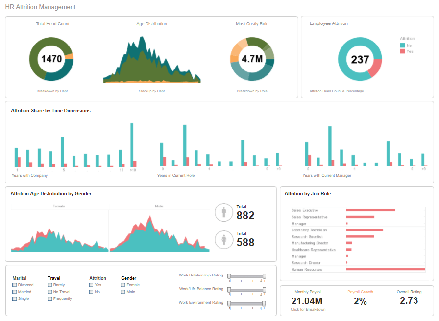
This HR scorecard breaks down the various factors involved in personnel turnover, helping HR managers identify factors in employee attrition. Attrition data is broken down by gender, department, marital status, and years worked. HR scorecards help give HR managers an overall picture of the factors that contribute to employees leaving the company.
Data Mining
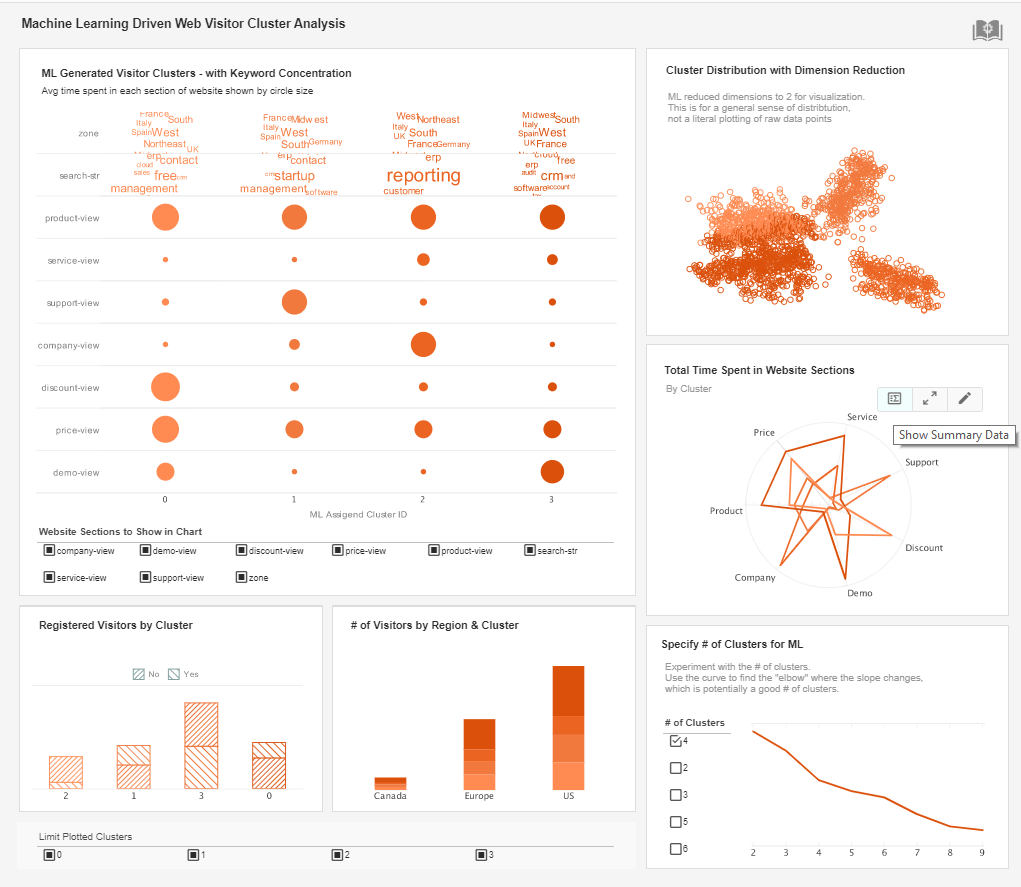
This machine learning driven data mining report breaks website traffic down into different clusters based on keywords, website section and region. The option to change the number of clusters analyzed by the intelligent algorithm aids in human analysis. When search engine marketers know what keywords are most engaging, they will make better keyword selections for future marketing content.
Java Developer
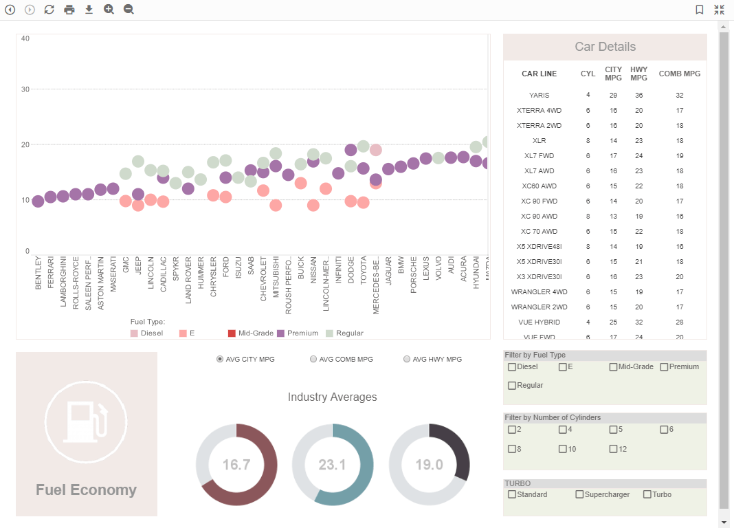
This java developed analysis example uses multidimensional charting and KPI guages to display the fuel efficiency of over 500 different vehicles. A detail table displays each vehicle's individual data, enabling brand outliers to be identified. A radio button changes the means by which efficiency is measured, enabling a simpler, clearer dashboard layout. Fuel type displayed using color helps add context to the comparison of different vehicle types.
Information Drill Down
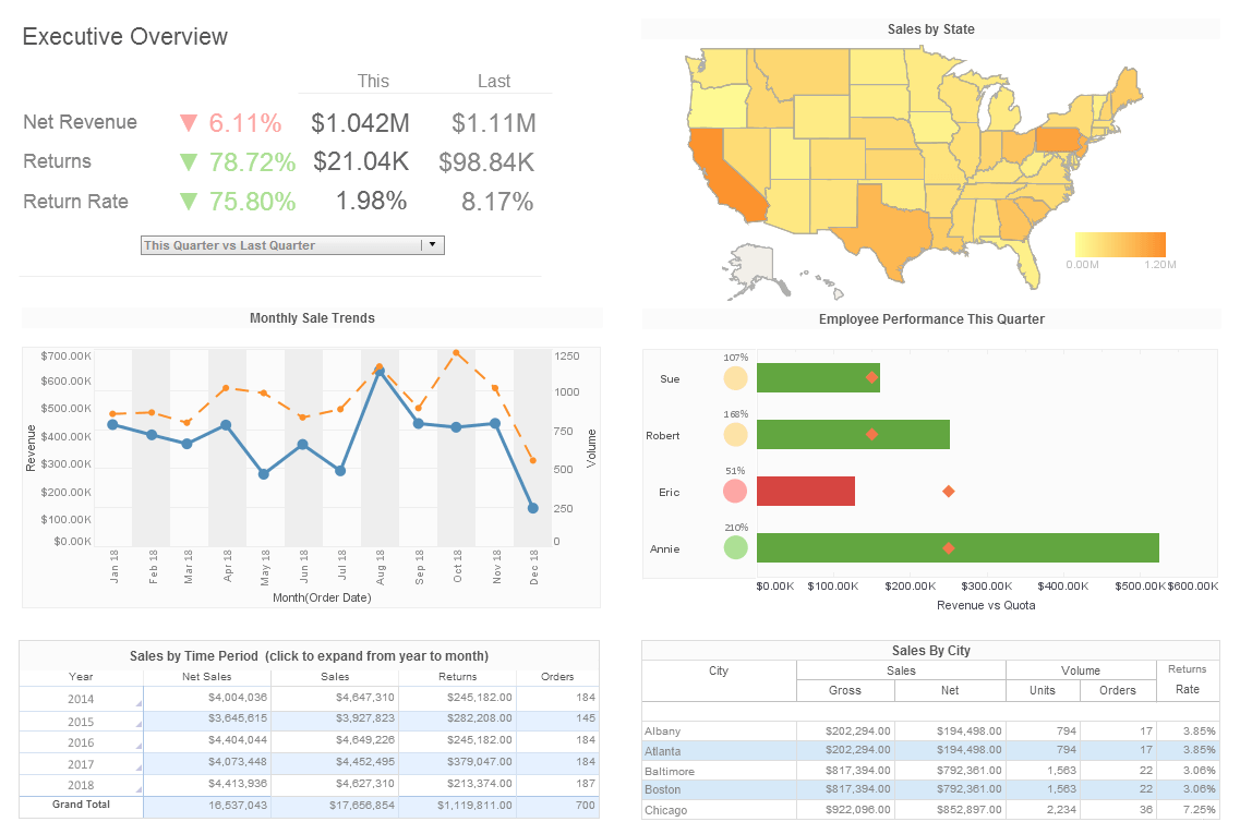
This sample sales analysis gives executives an informative drill down of sales by area, time period, and salesperson. The Employee Performance by Quarter chart displays employee sales relative to their quota, with bars turning red when performance lags behind the goal. Text KPI gains and losses are highlighted in red or green depending on whether they positively or negatively align with organizational goals.
Enterprise Dashboard
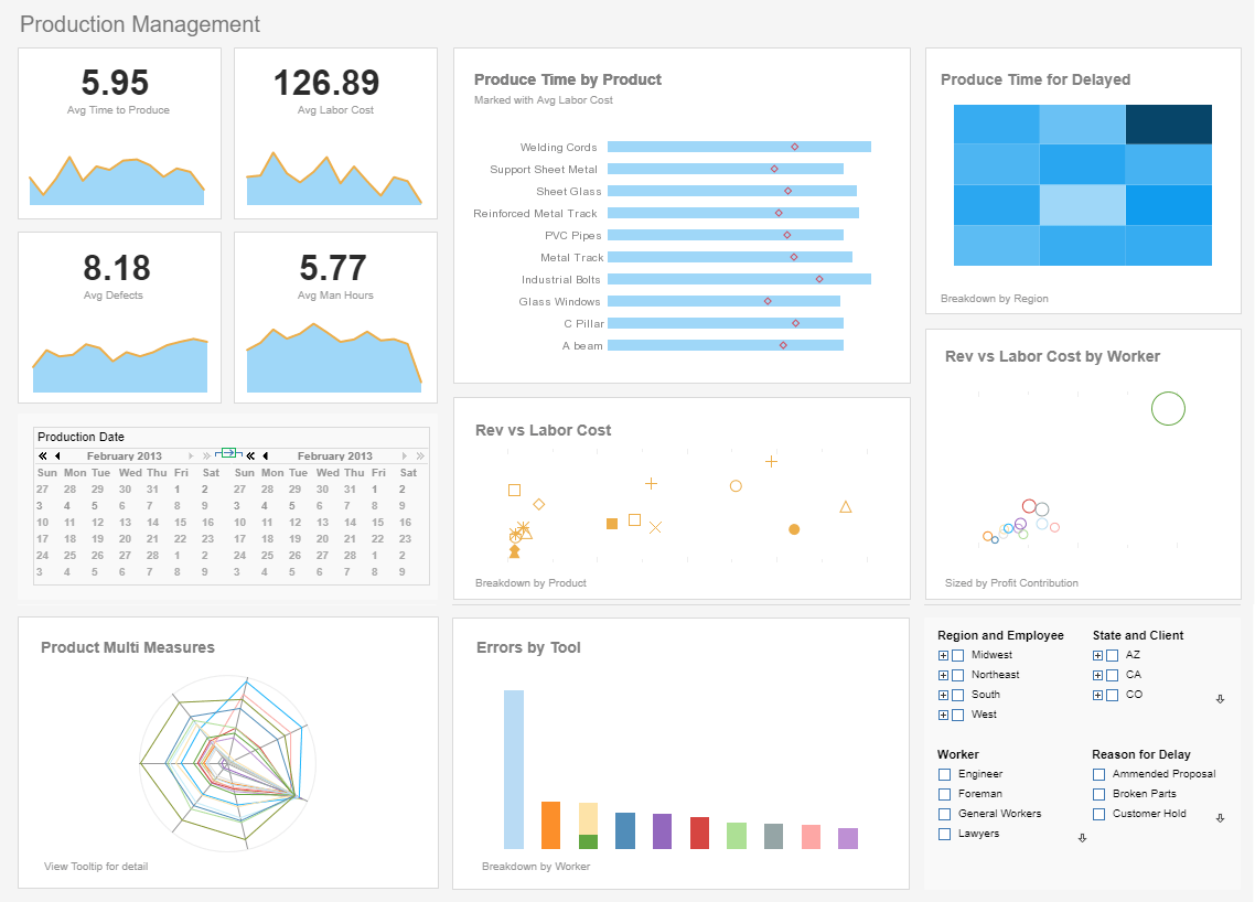
This enterprise dashboard gives an overview of production times, costs, and errors, displayed with a variety of charts and text kpis. The Produce Time by Product chart compares production times for each product to set benchmarks, helping managers to assess performance at-a-glance. A radar chart displays a variety of product measures.
Data Aggregation
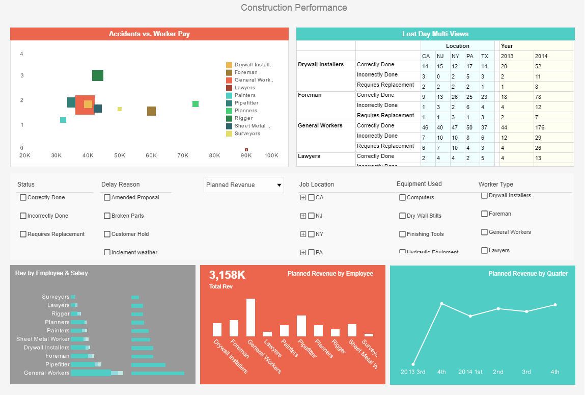
This construction data aggregation gives foremen a high level view of projects, costs and revenue, and worker safety. This dashboard gives property developers an overview of construction projects, including costs, timeliness, and worker safety. Drildown buttons on the Revenue by Quarter chart enables the user to pinpoint periods of high and low activity.