Free Business Intelligence Software - No Download Required
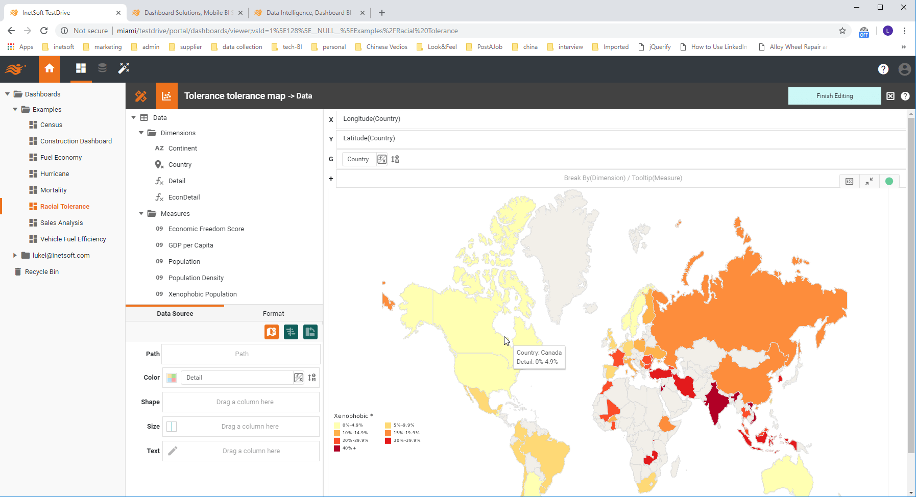
Are you looking for free business intelligence software? InetSoft offers a version of its commercial BI software that requires no download. This cloud-based BI tool is called Visualize Free. Upload your xls or csv file and use the intuitive BI analysis creator to make interactive visual analyses with advanced chart types.
Try InetSoft's Commercial Business Intelligence Software Download for Free
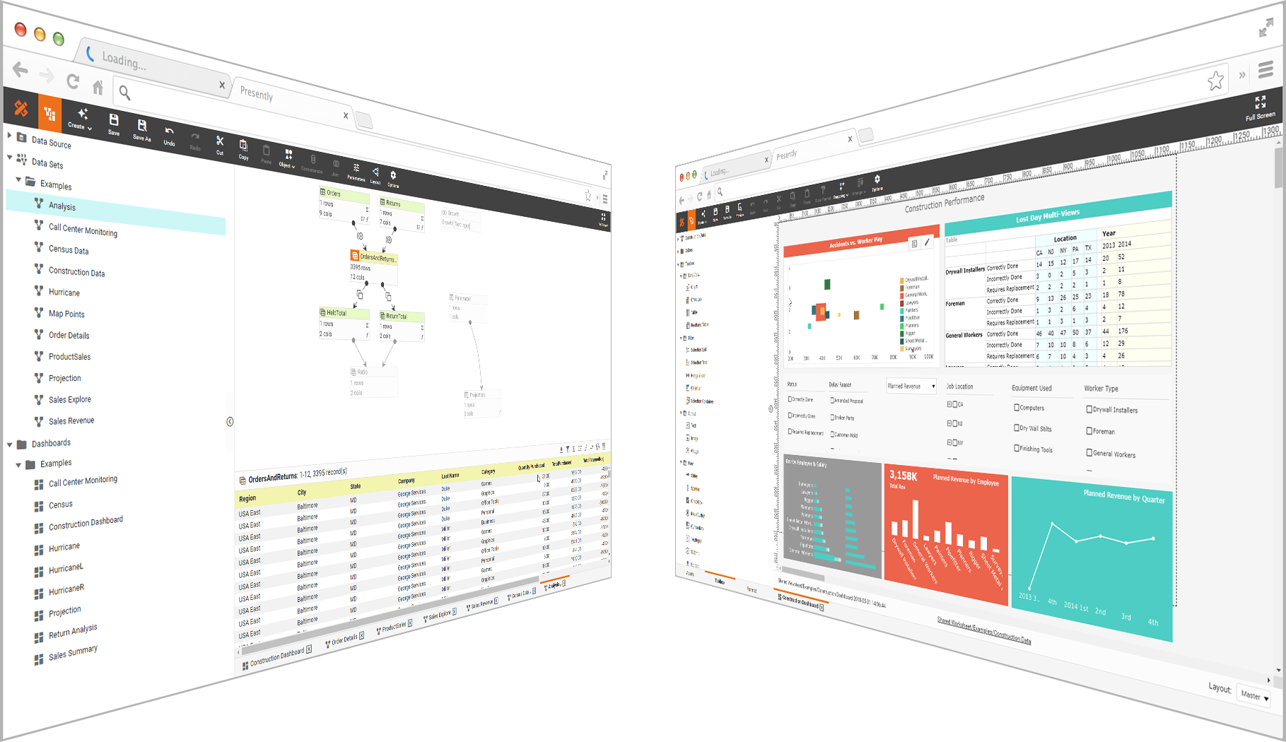
If you are looking for BI tools to download and install on-premise in your organization, Or if your data goes beyond uploaded spreadsheet data, InetSoft's offers a commercial solution. There are many capabilities included that are not found in the free version:
- Live connectivity to almost any enterprise or cloud-based data source
- Data preparation and mashup functions
- Integrated SSO and fine-grained user permission and security
There are two ways to try InetSoft's BI software for free:
- InetSoft provides you with a dedicated in-cloud instance customized with your data connections
- Download the software to install on-premise
About InetSoft
Since 1996 InetSoft has been delivering easy, agile, and robust business intelligence tools that make it possible for organizations and solution providers of all sizes to deploy or embed full-featured business intelligence solutions. Application highlights include visually-compelling and interactive dashboards that ensure greater end-user adoption plus pixel-perfect report generation, scheduling, and bursting. InetSoft's patent pending Data Block technology enables productive reuse of queries and a unique capability for end-user defined data mashup.
This capability combined with efficient information access enabled by InetSoft's visual analysis technologies allows maximum self-service that benefits the average business user, the IT administrator, and the developer. InetSoft solutions have been deployed at over 5,000 organizations worldwide, including 25% of Fortune 500 companies, spanning all types of industries.
Highly Rated By Customers & Award Winning
"There were a host of reasons for selecting InetSoft. Powerful data mashup capabilities were a pre-requisite. In addition, InetSoft's BI tool stood out from others in the area of ease-of-use. For end-users who are not business intelligence experts, interacting with, and even designing new report templates had to be intuitive and user-friendly, and InetSoft has accomplished that hands down." - Thomas H.
"We were very selective, having looked at about a dozen similar products. In the end, it was an easy choice because other offerings were unable to meet our fundamental requirements. Unique amongst similar solutions, InetSoft provides static as well as dynamic reporting, enabling our customers to investigate their data against pre-determined measurables." - Martin W.
More Articles About Performance Management
-
Offer A Simpler Performance Management System
This article defines what a performance management system is and outlines how organizations can simplify selection and implementation by choosing a solution that’s easy to deploy. It emphasizes the challenge of dealing with complex vendor stacks and argues for leaner, more integrated tools that cover scorecards, dashboards and monitoring in one platform. The article describes how real-time monitoring, metric consolidation and executive visibility are key to driving improved outcomes. It also highlights how a unified view of organizational performance enables faster, more strategic decision-making. Finally, it presents action-oriented steps for starting with dashboard proof-of-concepts before scaling across business units.
-
Empower Business Users With Intuitive Monitoring Tools
This piece explores how performance management tools and methodologies support operational and strategic improvement. It discusses monitoring dashboards, scorecards, and drill-down analytics as ways to surface issues and opportunities across processes and people. The article suggests that business users need self-service tools that enable exploration without heavy IT dependency. It also covers how frameworks such as OKRs and OGSM integrate with performance tracking to align metrics with strategy. Real-world examples show how monitoring tools improve accountability and visibility into performance gaps.
-
Advance A High-Performance Workforce Via Analytics
This article shows how data analytics empowers organizations to build and sustain a high-performance workforce by measuring skill gaps, productivity, and employee engagement. It outlines key factors such as clear goals, regular feedback, empowerment, and collaborative culture as enablers of productivity gains. The text cites research indicating analytics can boost productivity by around 10-11%. It explains how workforce dashboards and KPI tracking can drive targeted training and better talent management. The article wraps by recommending that HR and operations leaders adopt visualization and self-service analytics to make talent improvement data-driven.
-
Adopt Clear-Cut Charts For Performance Tracking Dashboards
This article focuses on chart types and design practices for dashboards that support performance tracking through shared metrics. It discusses how to choose visualizations (bar, line, gauge) that emphasize trend, variance or status across key indicators. It also highlights the platform deployment advantages: self-service analytics, rapid deployment and minimal training for users to adopt performance dashboards. Discussion includes embedded use cases such as network operations (NOC), ASP/SaaS embedding, and big-data performance views. The piece underscores that the right dashboard software should support agile adaptation, non-IT user empowerment and enterprise scale.
-
Explore Performance Dashboard Examples Across Industries
This article presents a series of sample dashboards built on their platform, tailored for different functions such as sales, service, education, marketing and manufacturing. It shows how a performance dashboard aggregates metrics, triggers alerts and enables root-cause exploration in multiple contexts. The piece emphasizes cross-functional relevance: you can monitor enrolments, call centre throughput, social media campaigns, or production efficiency all via the same approach. It illustrates that interactive filters, heat maps and drill-downs enhance insight beyond static reports. It closes by recommending starting with live templates and adapting them for your business domain.
-
Mash-Up Application Performance Metrics With Business Context
This article explains how application performance metrics (such as latency, throughput, users) can be mashed-up with business KPIs using dashboards to unify technical and business views. It describes how the drag-and-drop designer allows business users to join app monitoring data and business transactional data in one view. The piece highlights that by combining technical metrics with business impact you get a fuller picture of operational performance. Deployment guidance emphasises ease of use, fast time to value and minimal IT staffing required. The article also gives examples of gauge charts, top-10 lists, and interactive analytics for application performance monitoring.
-
Leverage KPIs And Analytics For Data Operations Performance
This article targets data operations professionals and the KPIs they use to assess performance: data accuracy, availability, processing speed, security and retention. It explains how analytics help data operations teams make wise choices and reveal patterns across data pipelines, warehousing, and governance. It shows how dashboards can visualize throughput, error rates, latency and data-monetisation metrics to drive continuous improvement. The piece stresses that aligning operations KPIs with business objectives helps raise performance across the enterprise. It ends with a call for self-service dashboards so data operations teams can act quickly and iterate their metrics.
-
Measure Key Performance Measures With Self-Service BI
This article describes how organizations track key performance measures (KPMs) with dashboards and visualization, not just financial metrics. It explains that any organization must measure operational performance across daily, monthly and quarterly horizons. The piece shows how a drag-and-drop dashboard tool allows business users to track production yield, quality, energy use, waste and resource efficiency indicators in real time. It emphasizes the importance of a unified platform that lets non-technical users build views, mash data and monitor performance across functions. Examples from manufacturing and operations illustrate how self-service BI tools improve visibility into performance drivers.
-
Create Interactive Charts To Support Performance Management
This article focuses on how to build effective interactive charts that support performance management by surfacing output performance and linking it to decision-making. It covers chart types like Pareto and radar charts and explains how they can illustrate root-cause and multivariate performance insights. It emphasizes that visual analysis enables interactive exploration rather than static reporting. The piece points out that enabling business users to create and modify dashboards accelerates performance improvement cycles. It concludes that evaluation of chart design and KPI alignment is crucial for driving meaningful performance outcomes.
-
Launch A Business Performance Dashboard Package For Tracking KPIs
This article discusses a packaged dashboard application designed for business performance monitoring—allowing tracking of KPIs and performance while minimizing development effort. It highlights the benefits of a rapid-deploy solution with drag-and-drop design, self-service analytics and unified views of corporate performance. The piece notes that the package supports executives and power users alike, enabling both overview and drill-down insight into performance metrics. It stresses that because it uses data mash-up capabilities and self-service design, organizations can adapt to new performance metrics without heavy IT involvement. Finally, it suggests this kind of package is suitable for organizations that want speed, flexibility and performance visibility without large BI teams.