Data Analytics Software Samples
Searching for the best data analytics software samples? InetSoft provides examples from its highly-rated, easy to use dashboard analytics software.
Revenue Analytics
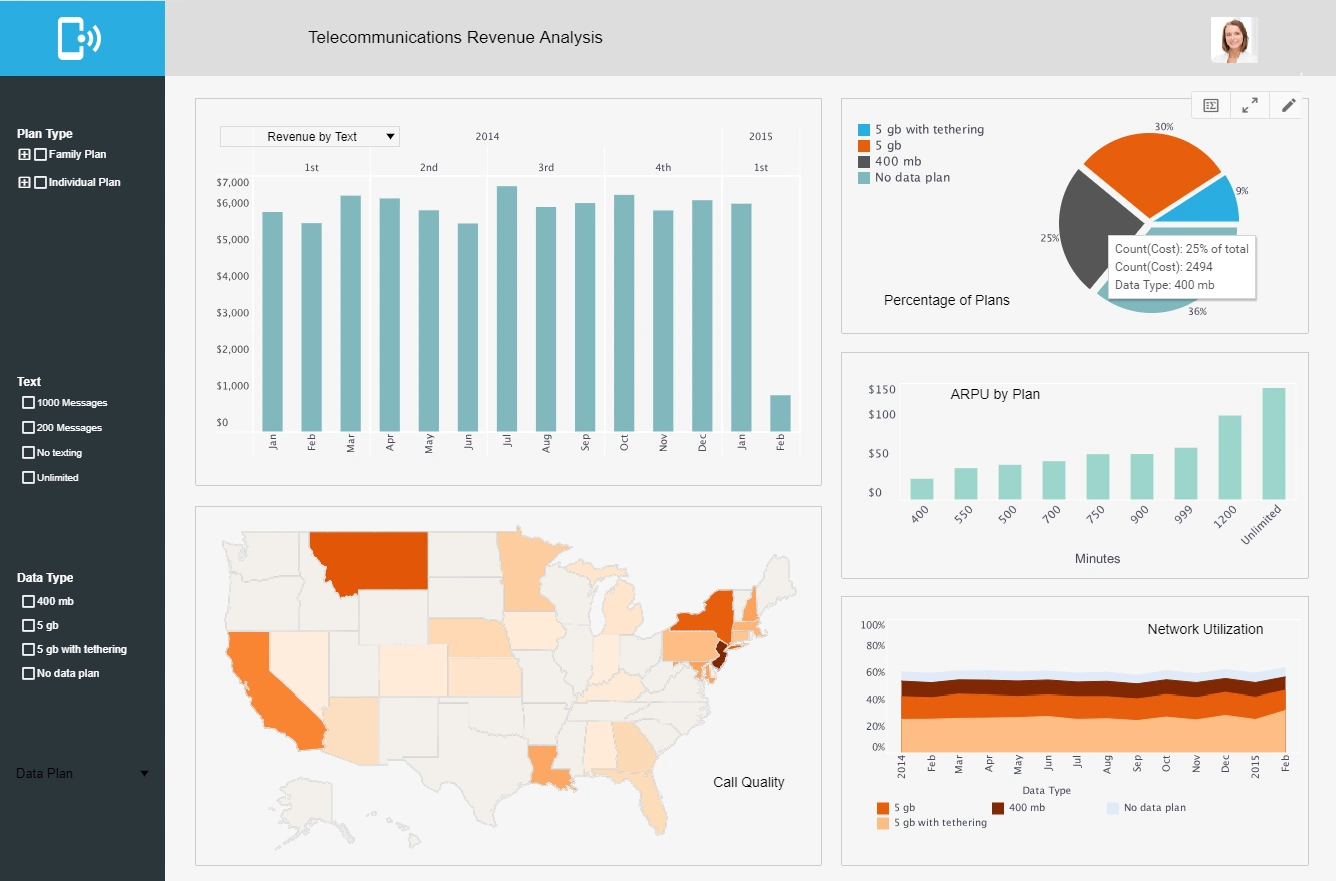
This revenue analytics sample breaks down revenue by plan type, state, and date. A dropdown selector changes fields displayed in the bar chart, helping to cut down on the overall number of elements in the dashboard.
Law Firm Analytics
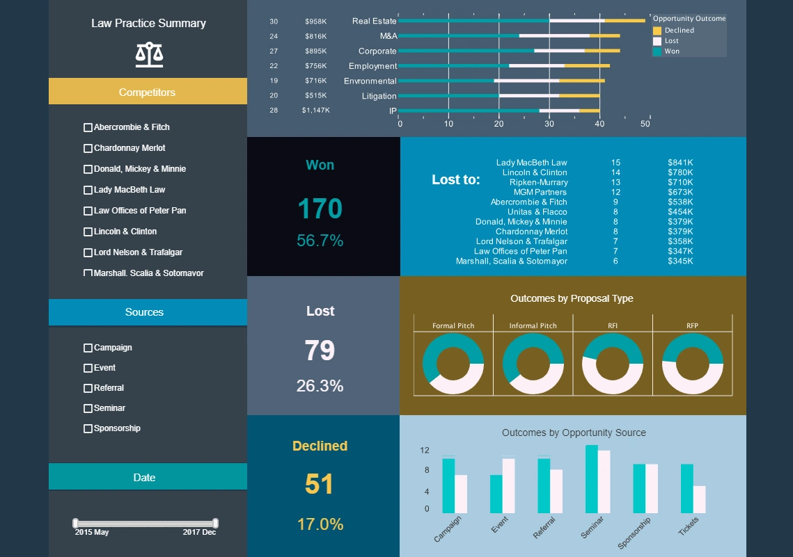
This law firm analytics sample gives an overview of cases won and lost as well as opportunities. Large text KPIs displaying number and percentage of cases lost, won, and declined give law firm partners an at a glance view of firm performance.
Maintenance Analytics
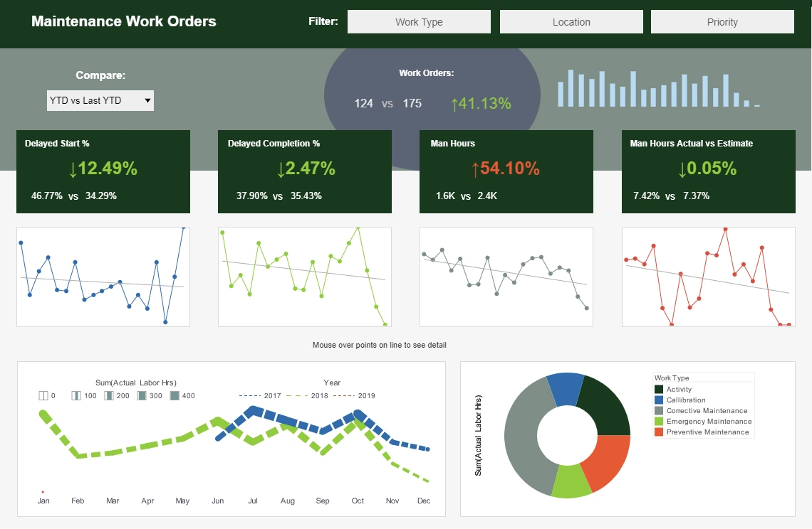
This maintenance analytics sample displays the percentage of work orders started and completed, and tracks the man hours necessary for completion of said work orders. A number of line charts display the fluctuations in these various measures over time, enabling managers to pinpoint where specific issues occurred.
Risk Analytics
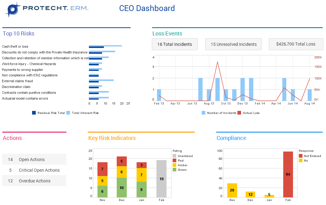
This CEO dashboard from InetSoft partner Protecht displays various measures of risk and compliance. An incidents by date chart features a red line tracking actual losses, utilizing color to draw the users attention to what's most important.
Sales Analytics
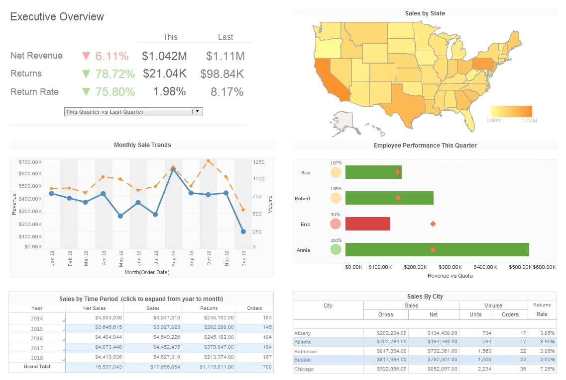
This sample sales analysis gives executives an overview of sales by area, time period, and salesperson. The Employee Performance by Quarter chart displays employee sales relative to their quota, with bars turning red when performance lags behind the goal.
Attorney Analytics
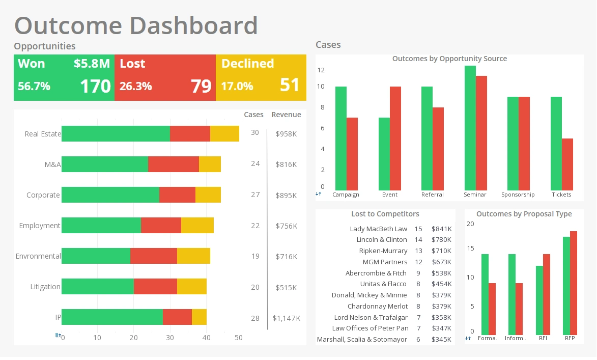
This attorney analytics sample analyses wins and losses by category, opportunity source, and proposal type. With wins in green, losses in red, and declines in yellow, this dashboard is a great example of how our intuitive associations with different colors can be used to make a dashboard more communicative.
Machine Learning Analytics
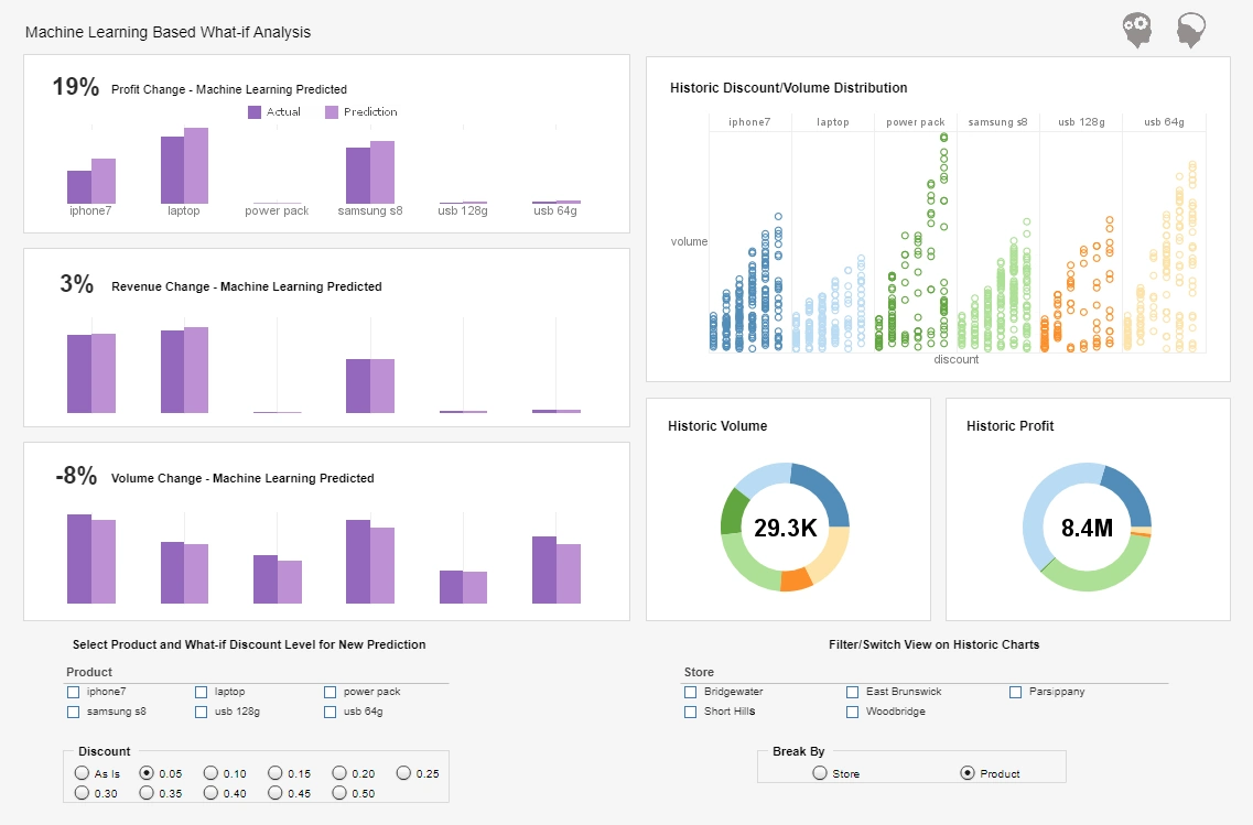
This machine learning analysis uses sophisticated AI to predict profit, revenue, and volume changes. Various checklist filters encourage drilling down into the data to further explore patterns, encouraging a combination of both ML generated and human driven exploration.
Churn Analytics
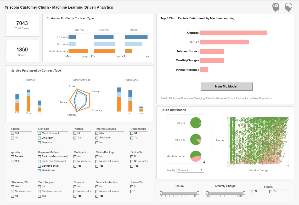
This churn analysis sample is another use case of combining machine learning with human driven visual data exploration. In addition to various charts that display the data, this dashboard features a button that further trains the machine learning model as the data is filtered and explored.
Supply Chain Analytics
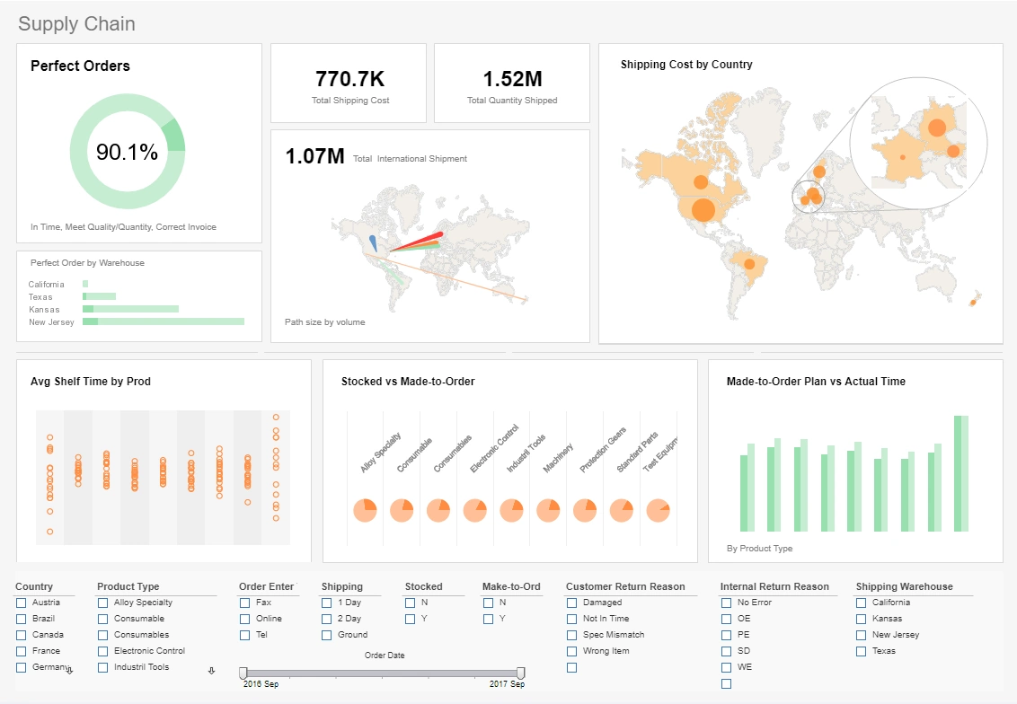
This supply chain analysis example gives a global view of shipped orders. This view is aided by several map charts, one of which features a zoom in on key areas.
Aviation KPI Dashboard
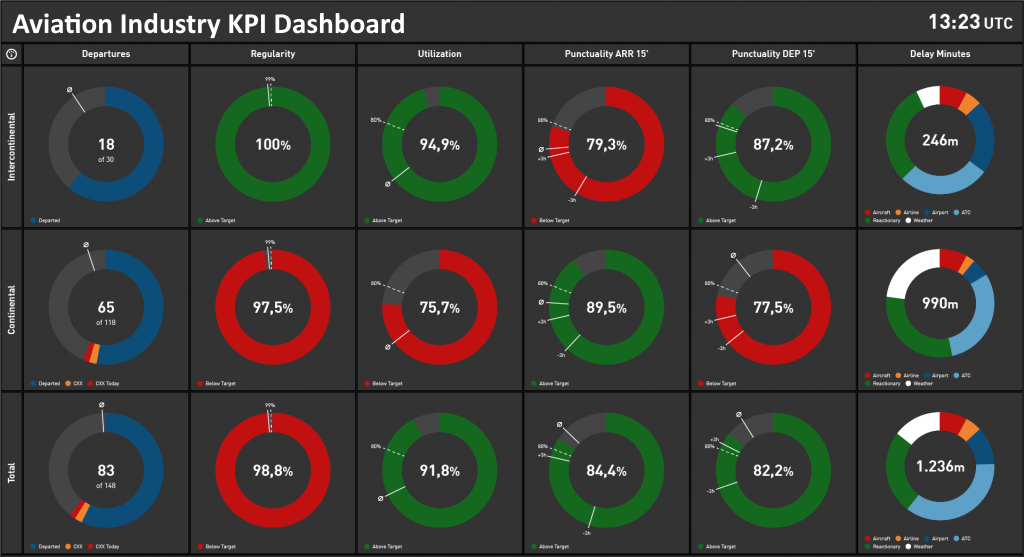
This aviation KPI dashboard consolidates operational metrics — on-time performance, turnaround times, fuel usage and safety incidents — into a single view. Airline operations teams use the dashboard to spot deviations quickly and prioritize interventions that keep flights on schedule.
Building Power Management
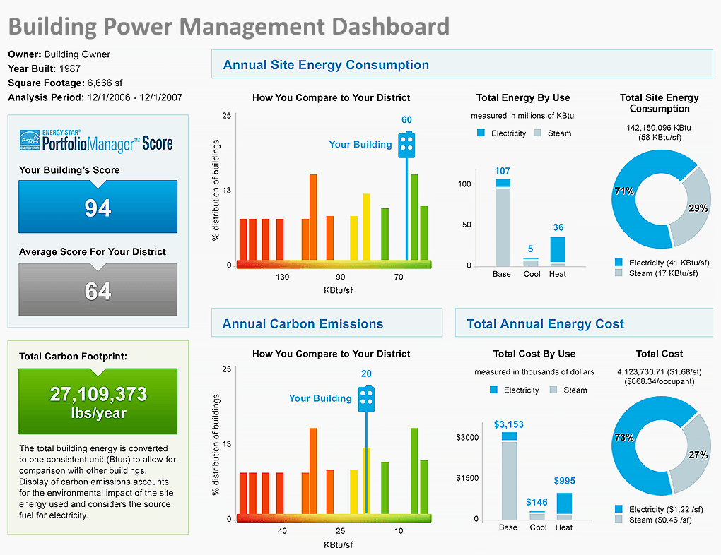
This power management dashboard helps facility managers monitor energy consumption, peak loads and equipment status. Integrated alerts surface anomalies so maintenance teams can respond before issues escalate, reducing downtime and lowering energy costs.
Calciferol Manufacturer Dashboard
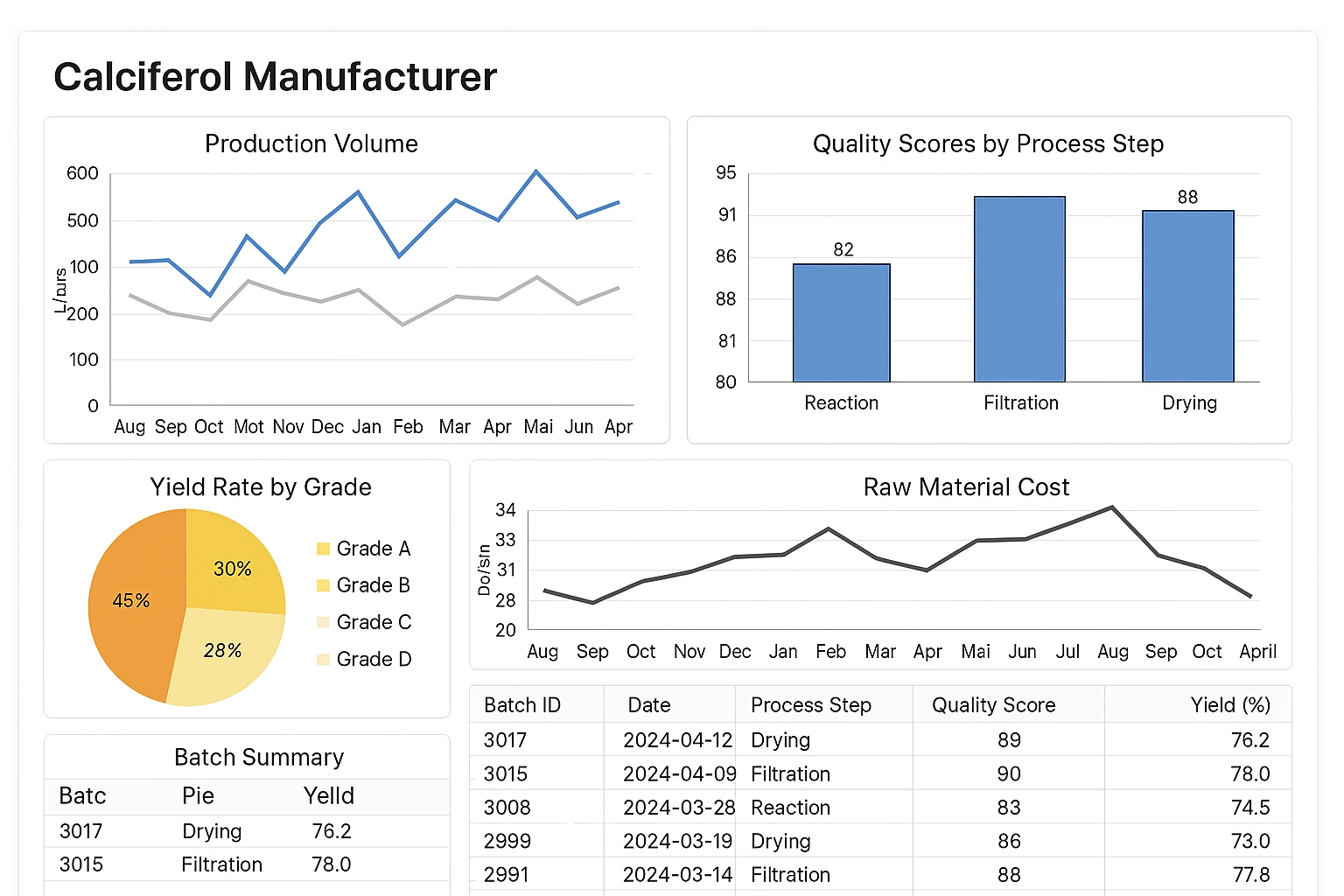
This manufacturing dashboard tracks production throughput, quality exceptions, and supply chain status. Plant managers rely on the combined operational and quality views to keep lines running and address bottlenecks affecting yield and delivery.
Capital Program Management
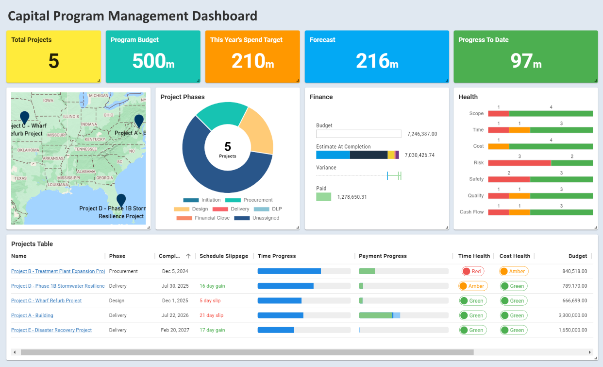
Program managers use this dashboard to track project budgets, schedule progress, and risk exposure across a portfolio of capital initiatives. The consolidated view improves governance and supports timely reallocation of funds where needed.
Cash Management Dashboard
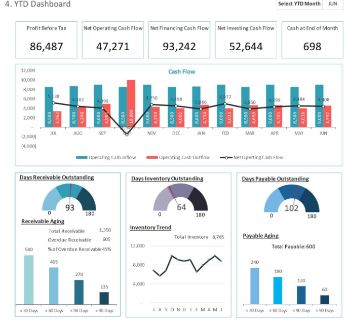
Cash management dashboards provide treasurers with liquidity positions, receivables aging, and cash flow forecasts — enabling better short-term funding decisions and reduction of overdraft risk.
Crisis Management Dashboard
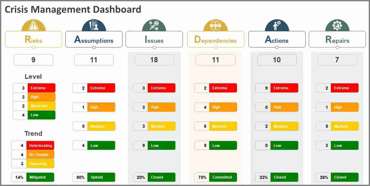
This crisis management dashboard collates incident reports, response team status, and real-time situational metrics to support rapid coordination and decision-making during high-pressure events.