Interactive Industry Dashboard Examples
Are you curious as to how interactive web dashboards can help you explore your business data? Below are some examples of industry-specific interactive dashboards built with InetSoft's Style Scope. Click on any dashboard that interests you, and a live interactive version will open in a second tab of your web browser. You can ask questions of the data in these visualizations by moving sliders and other selection components, hovering your mouse over a given data point, or even viewing and extracting raw filtered data.
Marketing Management
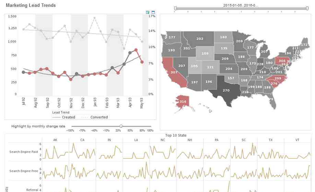
This dashboard tracks every aspect of sales leads, including their location, their source, conversion rates, and distribution among sales teams.
Enrollment Trends
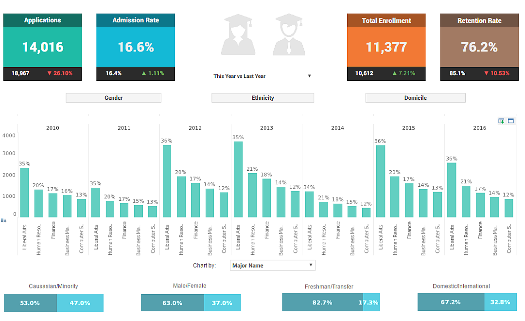
This dashboard shows a school administrator what the progression of major choices has been over the past several years, and breaks down the student population into various demographics, including race, gender, and other categories.
Emergency Management

Emergency Management dashboards aggregate situational awareness data into a concise operational display that supports rapid decision-making during incidents. This example blends live incident feeds, unit availability, resource status, and geospatial overlays so dispatchers and incident commanders can see where assets are located and which resources are nearest to a call. Incident timelines and filterable event lists make it simple to reconstruct sequences and surface recurring patterns, while capacity gauges show staffing and equipment readiness. By correlating incident severity with response times and outcomes, the dashboard helps agencies refine routing, staging areas, and mutual-aid agreements. The interface emphasizes clarity under stress: bold KPIs, clear map callouts, and persistent alerts that keep teams focused on the highest-priority events.
Financial Advisor

This Financial Advisor dashboard is designed to give planners a single-pane view of client portfolios, performance, and risk exposures. It synthesizes account balances, asset allocation, recent trade activity, and projected cashflow into clear KPIs and drillable charts. Advisors can segment clients by risk profile, aging of assets, or service tier to identify opportunities for rebalancing or fee-based advice. A scenario testing widget shows the projected impact of market moves on client portfolios, while alerts highlight accounts that require attention due to large withdrawals or concentration risk. The dashboard speeds client conversations by surfacing illustrated narratives—performance versus benchmark, income forecasts, and consolidated action lists—so advisors can focus on recommendations rather than data assembly.
Heavy Civil Construction

The Heavy Civil Construction dashboard presents project managers with an integrated view of schedules, resource utilization, cost-to-complete estimates, and safety incidents. Gantt-style schedule widgets sit alongside productivity KPIs so leaders can immediately see where trades are ahead or behind plan. Material delivery and equipment availability panels reduce surprises on site, while earned-value metrics and burn-rate visualizations help finance teams track budget health in near real-time. The dashboard also exposes quality and safety trends that can be correlated with crew assignments and shift patterns, enabling root-cause analysis for recurring incidents. By providing drill-downs from program-level aggregates to individual task cards, the tool helps teams keep large, complex projects on time and on budget.
Home Health Provider

This Home Health Provider dashboard helps clinical and operational leaders monitor case loads, visit adherence, and patient risk indicators across the care network. It highlights clinician availability, visit completion rates, and missed-visit drivers while linking to patient-level risk assessments that flag potential hospitalization risks. Population health tiles show readmission rates, medication adherence, and social-determinant signals so providers can target interventions to high-risk cohorts. Operational views include travel routing efficiencies and mileage tracking that drive scheduling optimization. Together, these insights improve continuity of care while reducing unnecessary hospital readmissions and lowering per-patient costs.
Homebuilder Production Scheduling

The Homebuilder Production Scheduling dashboard coordinates subcontractor schedules, build-phase progress, and material lead times to reduce idle crews and avoid handoff delays. Visual schedules and milestone trackers identify bottlenecks in framing, roofing, and finishing trades while inventory panels ensure key materials arrive just-in-time. Cost-to-complete dashboards tie production variances back to warranty exposure and profit margins so operations can prioritize corrective actions. The tool supports geographic roll-ups so regional managers can balance workload and resources across multiple communities, smoothing labor demand and improving cycle times.
Hospital Operations

The Hospital Operations dashboard brings together bed occupancy, OR scheduling, staffing levels, and throughput metrics so administrators can balance capacity and patient flow. Triage and admission KPIs surface bottlenecks in the emergency department, while length-of-stay and discharge readiness trackers help coordinate downstream services. Resource views show nurse-to-patient ratios and shift coverage, and predictive widgets estimate short-term capacity based on scheduled surgeries and current inpatient census. By linking operational performance to clinical outcomes, the dashboard promotes targeted interventions that reduce delays, improve patient throughput, and optimize utilization of high-cost resources like intensive care beds.
Insurance Claims
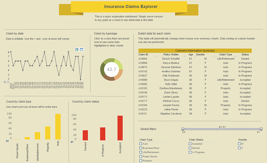
This dashboard breaks down insurance claims by demographics, claim type and status, enabling a manager to explore what tyoe of claims are coming from what people, and see the results of those claims.
CRM Lead Touch Tracker
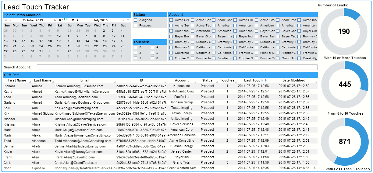
This dashboard enables a sales manager to keep track of how her department is keeping up with current leads, and also helps pinpoint which leads need to be contacted again. Leads can be filtered by date modified, status, amount of touches, and by account name. The dashboard also features a search bar, allowing the status of individual leads to be researched.
Telecommunications
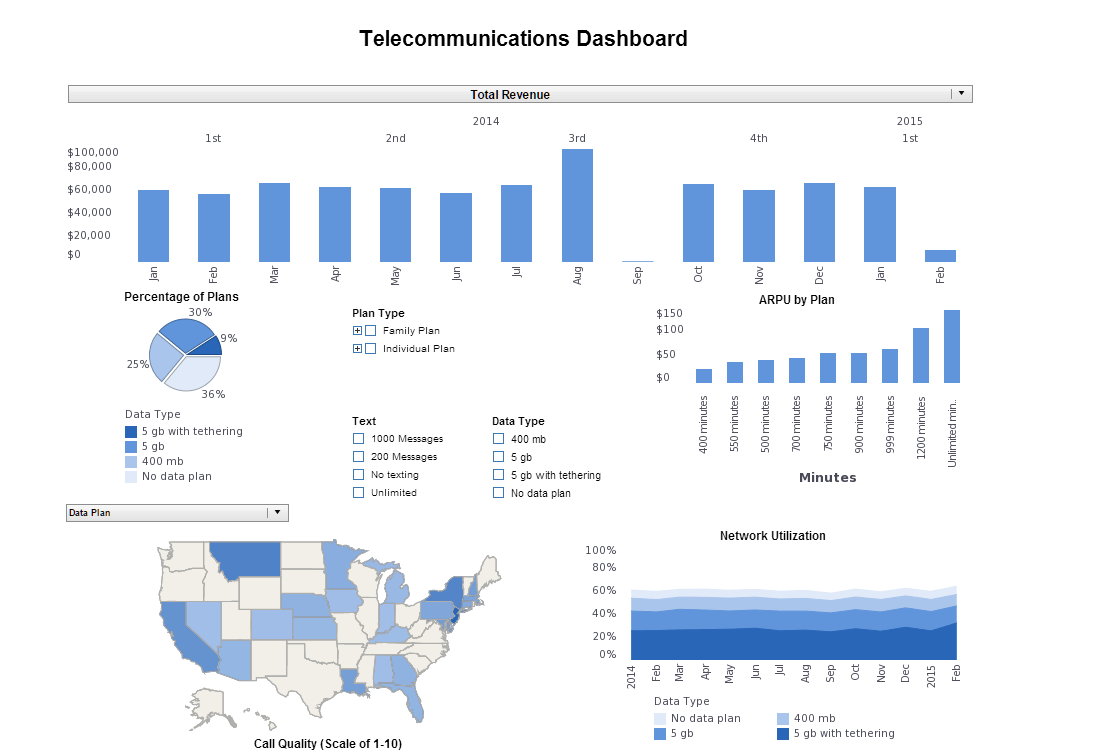
This dashboard helps a telecom provider see the popularity and network utilization of different data plans, how the networks are varying in quality across different states, and track the general revenue provided by the different data plans.
Industry Inputs
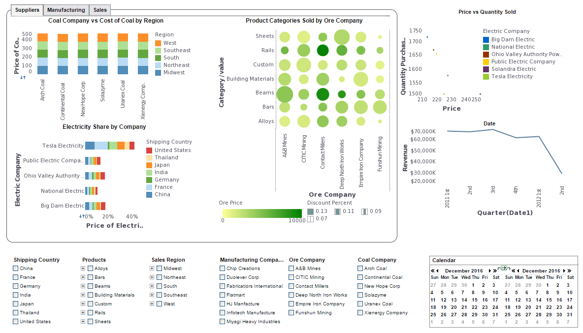
This type of visualization could enable an analyst of the steel market to explore what countries are importing and exporting the most steel, and how those imports and exports are changing over time.
Financial Client Demographics
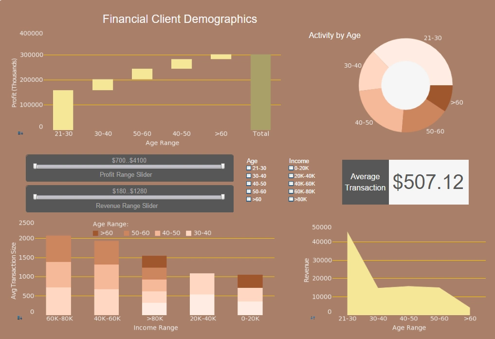
This dashboard of client demographics allows a financial company to see who their clients are in terms of income and age, and how these different categories of clients contribute to overall revenue and profit.
Product Orders
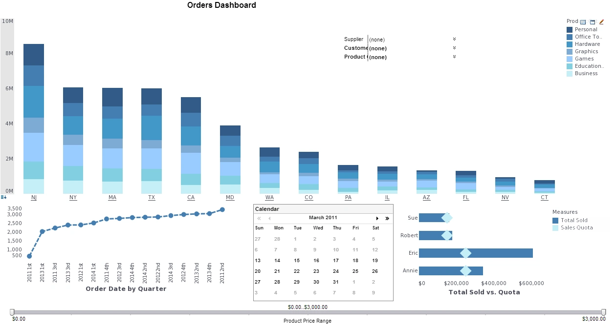
With this dashboard, a purchasing manager can see how his company's orders break down regionally, and also monitor the performance of his purchasing agents in comparison to their quotas.
Construction Accidents and Salaries
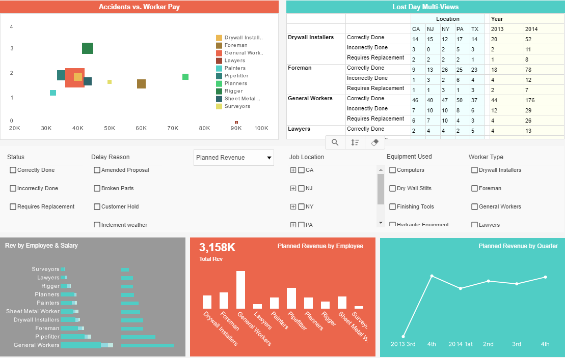
This construction dashboard enables a corporate manager to analyze various aspects of the company's relationship with it's employees and projects, exploring accidents vs. worker pay, worker type, job locations, equipment used, and reasons for delay. Additionally, this dashboard monitors revenue by state and employee type, and compares revenue to employee salaries.
Manufacturing and Sales
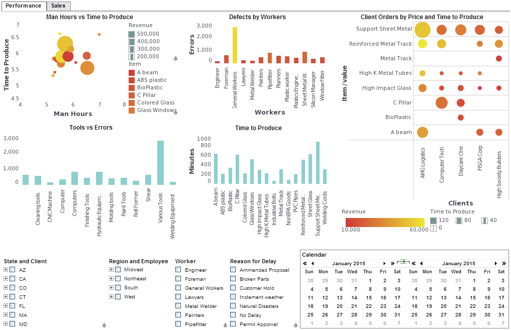
The dashboard above provides information regarding performance as well as sales for a manufacturing company. Some aspects presented include man hours vs. time to produce, defects by workers, client orders by price & time, tools vs. errors, and time to produce. In addition to this, data can be explored by considering the state and client, regions & employee, worker, and overall reasons for project delays.