How to Best Utilize Your Data Visualization Tool
This is the continuation of the transcript of DM Radio’s program titled “What You See Is What You ‘Get’ – How Data Visualization Conveys Insight,”
Mark Flaherty: With the tools of today, it’s not so hard to simply go to that trial and error process when mixing and matching data sets in Big Data. It works the best in business scenarios such as business analytics.
The best way to get started with these kinds of tools is by using the different fields that you have available and starting to plot them. This allows you see groupings in order to make clusters or outlier.
The clusters start an iterative process of defining relationships between these different data sets. Then you can really drill into what you see visually.
Eric Kavanagh: Yeah. I am guessing the lot of it is just manual iteration, meaning it’s probably difficult even today. Although, Jim was talking about templates some of the vendors are rolling out.
I am guessing it’s pretty difficult for a tool to simply dynamically ascertain which kind of visualization tool to use – bar charts or scatter plots, etc. There are a whole of variety of different tools that you can use.
Even though we are getting to a point where some of the tools can figure out you’re try to show this with a bar chart, for example, instead of a pie chart; is that happening yet?
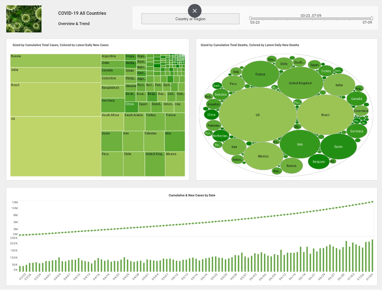
Mark Flaherty: At a basic level, yes, although it will never really catch up with the way people think. For example, trend data and time series data will almost always be displayed as line charts. And for multi-dimensional analysis, bubble charts are almost always the best method. Beyond that, however, human thought needs to be applied.
Eric Kavanagh: That’s good, so we won’t lose our jobs anytime soon.
Jim Ericson: Less and less likely, I am thinking.
Eric Kavanagh: Yeah that’s it. What are the some of the biggest mistakes you’ve seen people make with data visualization? Such as drawing false conclusions or focusing on false positives? What are some of the errors to avoid?
Mark Flaherty: Definitely that correlation is not causation. Just because we see a visual trend of all the dots going in one line doesn’t mean that whatever we applied them to is actually driving the Y axis.
So, you do have to understand the logic and see if it’s really possible. You need to do things using rational analysis where you bring in multiple variables and actually test. You know -- did they really drive that Y axis statistical?
Eric Kavanagh: Yeah, we have to watch obviously if the data is not clean or there is some problem with the data. You’re going to get some wacky visualization so you always have to apply the reality check, right?
Mark Flaherty: Correct.
Eric Kavanagh: And then, I am sure also look at the raw data to see some patterns. Then, the next step is probably, “Okay, let me get underneath this and take a look at the data sets.” That’s when you can figure out some field was askew or you know something else happened along the way to render nonsense.
I was working just yesterday and something happened with the formula because the little graph couldn’t rash dries itself. It just kept dancing around on the screen. I was like, “Mm-hmm, I think there is a problem with data quality in there somewhere.”
So you do have to watch out for just basic mistakes and basic errors to make sure that what you’re seeing is really what you’re getting, right?
Mark Flaherty: Yes, certainly for any new data set that you bring in. You are always going to go through that first step of trying to make sure it’s clean.
Where the software works best is in helping you profile a data you can see. Just take some data that is a part of the points -- then there are some that are negative when the rest are positive and that probably shows you that there is some data input error. It’s a common problem.
Data cleaning is a fundamental step in ensuring the accuracy and reliability of analytics, dashboards, and reports. For organizations aiming to make data-driven decisions, unreliable or inconsistent data can lead to flawed insights and costly mistakes. InetSoft's StyleBI, with its robust open-source capabilities, offers powerful tools for streamlining the data cleaning process. Below, we'll explore how StyleBI enables users to efficiently transform raw data into a usable, high-quality asset for analysis.
InetSoft's StyleBI for Data Cleaning
Overview of Data Cleaning
Data cleaning involves identifying and correcting inaccuracies, inconsistencies, and redundancies within datasets. Typical challenges include:
-
Duplicate Records: Repeated entries that distort insights.
-
Missing Data: Empty fields hindering comprehensive analysis.
-
Incorrect Formats: Data structured in a way that's incompatible with analytics tools.
-
Outliers: Extreme values that may skew trends or create misleading conclusions.
StyleBI's features address these challenges through automated processes, interactive tools, and customizable workflows, empowering both novice users and data professionals to improve data quality efficiently.
Data Integration and Profiling
The first step in data cleaning is integration—centralizing disparate data sources. StyleBI simplifies this with its REST API connectors and support for varied data formats like CSV, Excel, and SQL databases. By merging fragmented datasets into one cohesive pipeline, users can perform an initial data profiling, which involves analyzing statistical summaries and data distributions. This profiling helps identify anomalies, missing fields, or redundancies, providing a starting point for the cleaning process.
Data Transformation
InetSoft's data transformation pipeline lies at the heart of its data cleaning functionality. Key capabilities include:
-
Normalization: Standardizing formats across datasets, such as converting date fields to a uniform structure.
-
Deduplication: Identifying and removing repeated records using automated algorithms, significantly reducing manual effort.
-
Outlier Management: Detecting and flagging extreme values, allowing users to either exclude or adjust them according to predefined rules.
-
Data Validation: Applying rules or thresholds to ensure that values fall within acceptable ranges—e.g., verifying that a numeric field only contains positive numbers.
Users can create customized transformation workflows through StyleBI's drag-and-drop interface, streamlining repetitive tasks and ensuring consistent application of cleaning logic.
Handling Missing Data
Missing fields are a common issue in datasets. StyleBI offers multiple strategies for addressing this problem:
-
Imputation: Replacing missing values with default values, median values, or statistical estimates derived from the dataset.
-
Exclusion: Filtering out records with excessive missing fields, preventing them from corrupting analysis outcomes. These options empower users to tailor their approach based on the dataset's characteristics and the objectives of the analysis.
Real-Time Cleaning and Updates
One of StyleBI's standout features is its live data feed capability, which allows users to clean streaming data in real time. For example, IoT devices may send incomplete or inconsistent metrics, but StyleBI can automatically apply cleaning rules to ensure that dashboards display accurate, reliable insights instantly. This feature is particularly valuable for time-sensitive scenarios like logistics monitoring or stock trading.
Visualization for Cleaning
StyleBI's data visualization tools aid the cleaning process by transforming raw data into charts and graphs. These visual representations help users identify inconsistencies, such as irregular spikes or missing trends. Interactive dashboards allow users to filter, adjust, and validate data dynamically, ensuring that cleaned datasets align with analytical goals.
Automation and Scalability
StyleBI's open-source framework and Docker-based deployment make it easy to scale data cleaning processes for large datasets. Organizations can automate routine cleaning tasks, ensuring that even massive data streams are handled efficiently without manual intervention. Additionally, technical users can extend StyleBI's functionality by customizing its codebase to meet specific requirements.


