BI Dashboard Examples for Different Business Needs
Explore a range of business intelligence examples showing how interactive dashboards, KPI scorecards, and visual analytics can be used to monitor performance, analyze trends, and support better decisions across executive, operational, sales, marketing, and machine learning use cases.
An Executive Dashboard Example
An Interactive Dashboard Example
Click here to enlarge. When done, click anywhere to return.
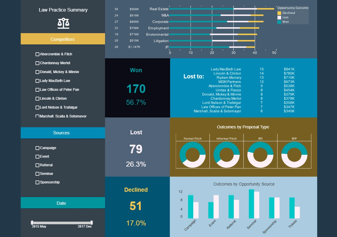
This executive dashboard example gives an overview of cases won and lost as well as opportunities. Large text KPIs displaying number and percentage of cases lost, won, and declined give law firm partners an at a glance view of firm performance. Law firms can increase case win rates by leveraging advanced legal research tools that use AI to uncover relevant case law, statutes, and precedents efficiently. Additionally, fostering collaboration among attorneys to share expertise and insights can enhance strategic planning and advocacy in complex cases.
Click here to enlarge. When done, click anywhere to return.
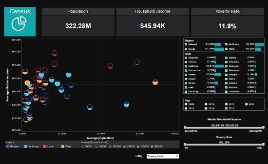
This interactive dashboard example of US census data uses multidimensional charting to display population, income, region, and property value, all in a single chart. Various filter elements enable possible patterns in the data to be discovered and explored. New Jersey is the most densely populated state in the U.S., with over 1,300 people per square mile. In contrast, Alaska is the least densely populated, with only about 1 person per square mile.
A KPI Dashboard Example
An Operational Dashboard Example
Click here to enlarge. When done, click anywhere to return.
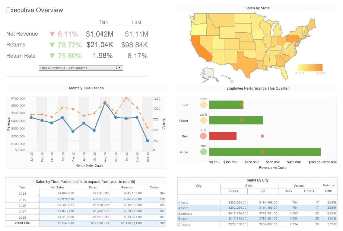
This KPI dashboard example gives executives an overview of sales by area, time period, and salesperson. The Employee Performance by Quarter chart displays employee sales relative to their quota, with bars turning red when performance lags behind the goal. Setting sales quotas involves determining achievable yet challenging targets for individual sales representatives or teams, based on factors like market conditions, historical performance, and company goals. Utilizing data analytics tools to forecast trends and assess capacity can ensure quotas are realistic and aligned with organizational objectives.
Click here to enlarge. When done, click anywhere to return.
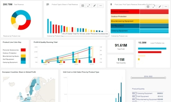
This operations dashboard example gives managers a complete overview of business activities. Various charts display revenue and profit, with the growth of various product lines displayed on an annual basis. Stock outs are often driven by inaccurate demand forecasting, which can lead to insufficient inventory levels to meet customer needs. Other factors include supply chain disruptions, such as delays from suppliers or transportation issues, which prevent timely replenishment of goods.
A Sales Dashboard Example
A Marketing Dashboard Example

Click here to enlarge. When done, click anywhere to return.
This sample sales analysis gives executives an overview of sales by area, time period, and salesperson. The Employee Performance by Quarter chart displays employee sales relative to their quota, with bars turning red when performance lags behind the goal. Salesperson incentives motivate performance by offering rewards like commissions, bonuses, or prizes for achieving specific sales targets or milestones. Tailoring incentive programs to align with individual goals and company objectives can boost morale and drive consistent results.
Click here to enlarge. When done, click anywhere to return.
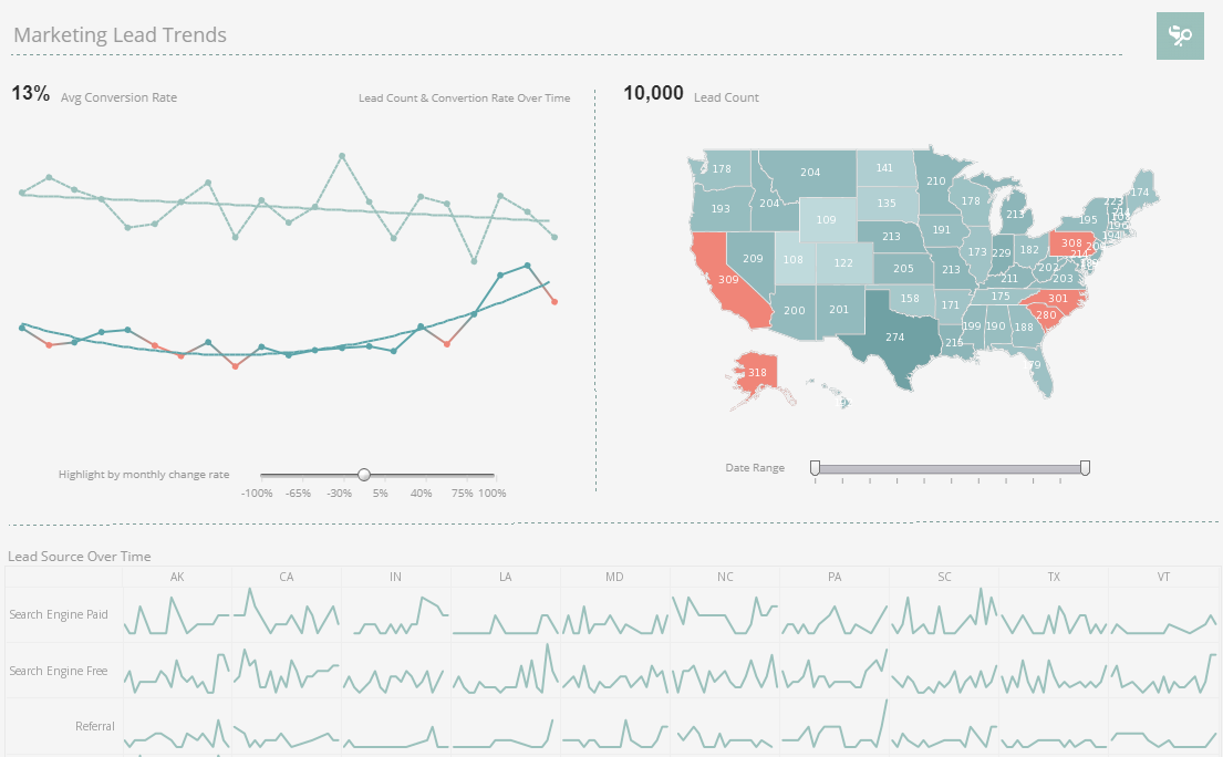
This marketing dashboard example gives marketing managers the metrics they need to monitor sales pipelines and optimize strategy. Lead count and source are tracked as well as conversion rates, with monthly change highlighted based on slider selection. Lead conversion rates measure the percentage of prospects who transition into paying customers, serving as a critical indicator of sales and marketing effectiveness. Optimizing these rates often involves nurturing leads with personalized engagement, clear communication, and timely follow-ups.
A Machine Learning Dashboard Example
A Churn Analytics Dashboard Example
Click here to enlarge. When done, click anywhere to return.
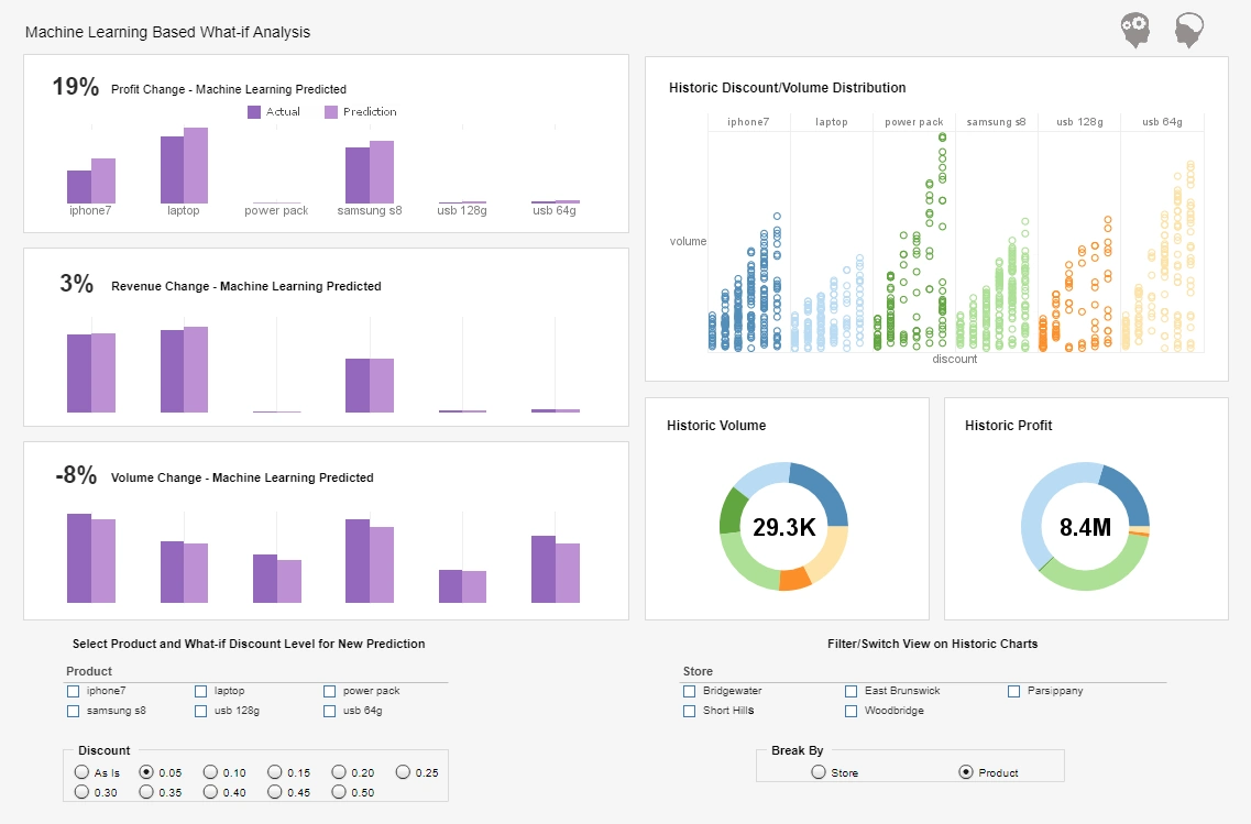
This machine learning analysis uses sophisticated AI to predict profit, revenue, and volume changes. Various checklist filters encourage drilling down into the data to further explore patterns, encouraging a combination of both ML generated and human driven exploration. Combining human learning and machine learning leverages the strengths of both, with humans providing context, creativity, and ethical judgment while machines process vast amounts of data to identify patterns and predictions. This synergy enhances decision-making, allowing for innovative solutions to complex problems that neither could achieve alone.
Click here to enlarge. When done, click anywhere to return.
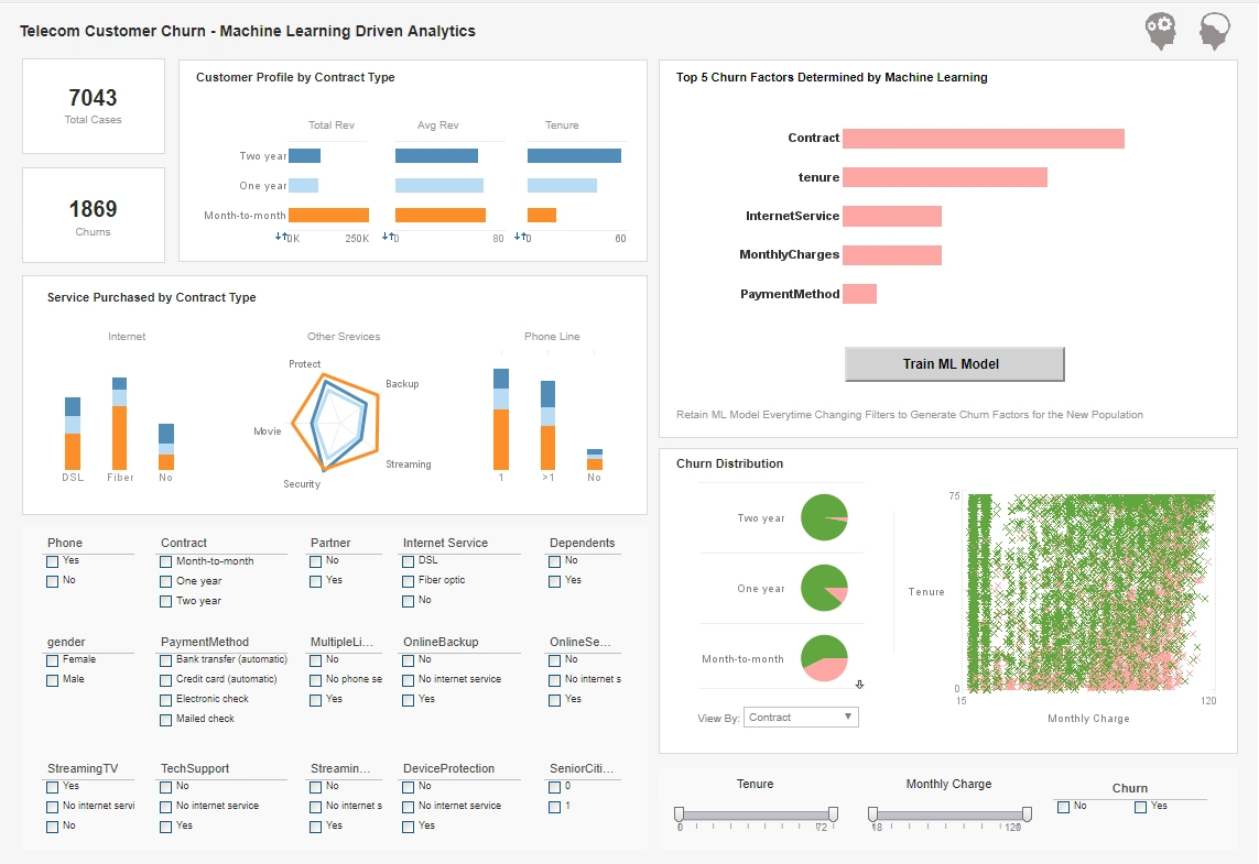
This churn analysis sample is another use case of combining machine learning with human driven visual data exploration. In addition to various charts that display the data, this dashboard features a button that further trains the machine learning model as the data is filtered and explored. Reducing churn involves enhancing customer satisfaction through proactive engagement, personalized experiences, and addressing concerns before they escalate. Additionally, implementing loyalty programs or exclusive offers can strengthen retention by rewarding long-term commitment and fostering brand affinity.
More: Sample Dashboards