Binary Dot Plot Charts - Definition, Example, How To Create
This page discusses the uses of binary ("yes/no") dot plot charts, and explains how you can create them in both Google Sheets and InetSoft. This page also provides access to a free online tool for creating dot plot charts and complete functioning business intelligence dashboards.
Contents Definition of a Binary Dot Plot Chart How to Make a Binary Dot Plot Chart How to Create a Binary Dot Plot Chart in Google Tool to Make Binary Dot Plot Charts Online for Free

Definition of a Binary Dot Plot Chart
A dot plot is a type of data visualization that represents individual values of a set of numerical data by plotting dots or markers on a number line or an x-axis. Each dot represents a single data point and is placed along the axis based on its value. This type of plot does not aggregate a measure, but merely displays the raw data points. In some respects, therefore, the basic dot plot is similar to a histogram.
Some benefits of a dot plot include:
- Easy to understand: Dot plots are easy to read and interpret, making them a good choice for presenting data to a wide audience.
- Clear representation of distribution: Dot plots clearly show the distribution of the data, making it easier to see the distribution of values and identify any outliers or patterns.
- Space-saving: Dot plots can often be made very compact, making them a good choice for reports or presentations where space is limited.
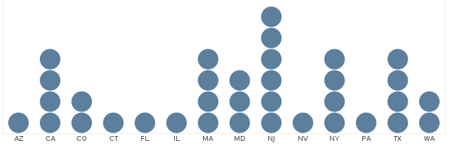
When measures in a data set have binary values ("yes/no" or "true/false"), you can create a binary dot plot that represents several measures. In this case, each individual dot represents a "yes/no" or "true/false" value by its shape, color, or fill. For example, in the chart below, a filled dot indicates that a particular company supports the corresponding policy or "perk". In this chart, the actual company names are not shown because they would introduce clutter and tend to obscure the main point of the chart, which is the overall pattern of support for different workplace policies among these 100 companies.
How to Make a Binary Dot Plot Chart in InetSoft
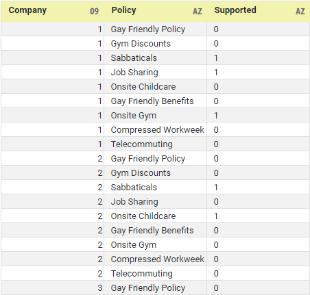
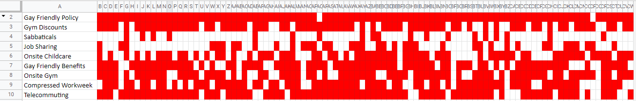
To create a binary dot plot in InetSoft, first check that the data is arranged correctly. The best configuration of the data for charting is shown below. The 0's and 1's in the 'Supported' column indicate 'no' or 'yes' for each "perk".
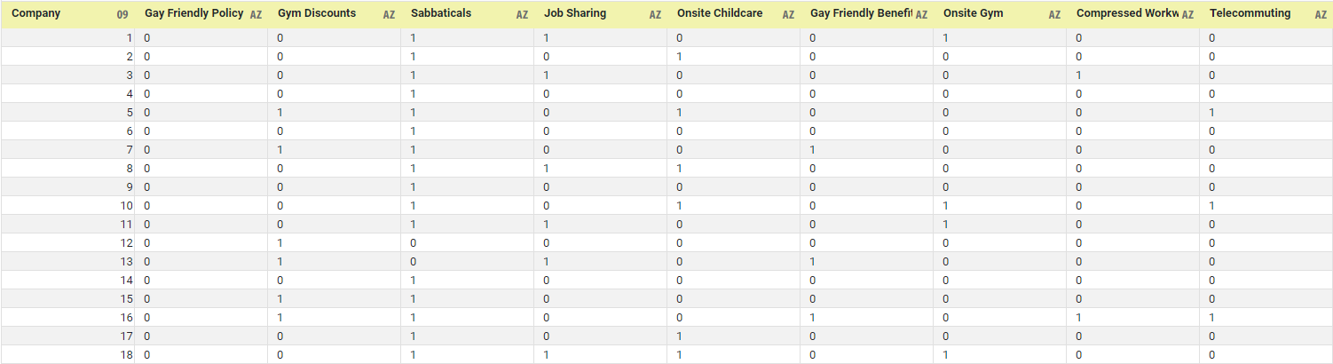
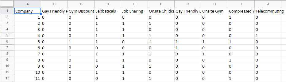
In many cases, the data may instead be arranged with independent measures, such as shown below:
If this is the case, you can easily unpivot this dataset using the 'Unpivot' function in a Data Worksheet to obtain the previous configuration, which is more suitable for creating the intended chart.
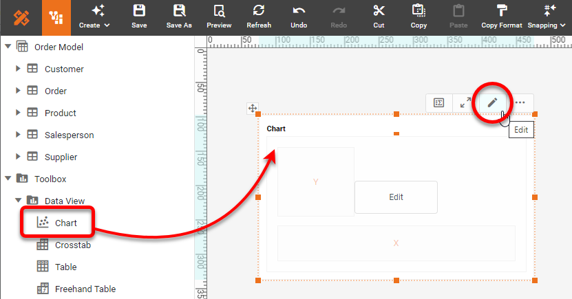
When you have data in the correct configuration, drag a Chart component from the Toolbox panel into a dashboard in Visual Composer, and then press the Edit button to open the Chart Editor.
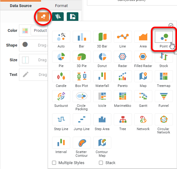
Press the 'Select Chart Style' button. Choose the 'Point' style and press 'Apply'.
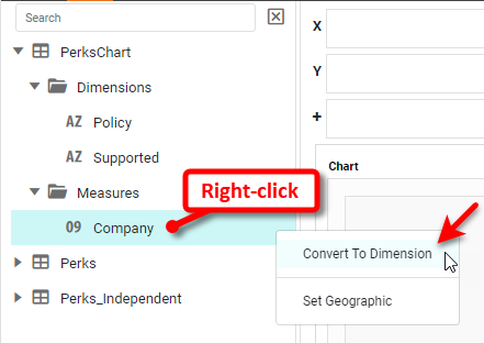
If any of the fields to be plotted are listed as measures in the Chart Editor, convert them to dimensions as shown below:
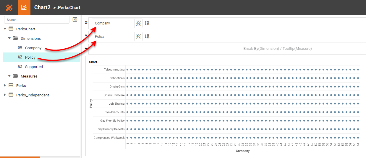
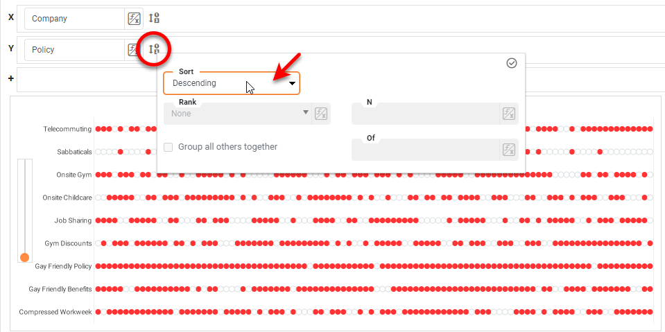
Drag the 'Company' field to the X region and the 'Policy' field to the Y region.
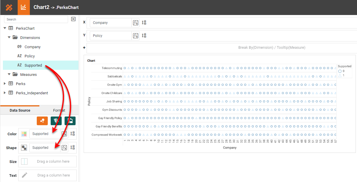
Drag the 'Supported' field to both the Color and Shape regions.
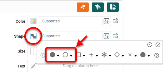
Press the Edit button next to the Shape region, and select the open circle and filled circle as the first two choices.
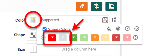
Press the Edit button next to the Color region and select red and gray as the first two choices.
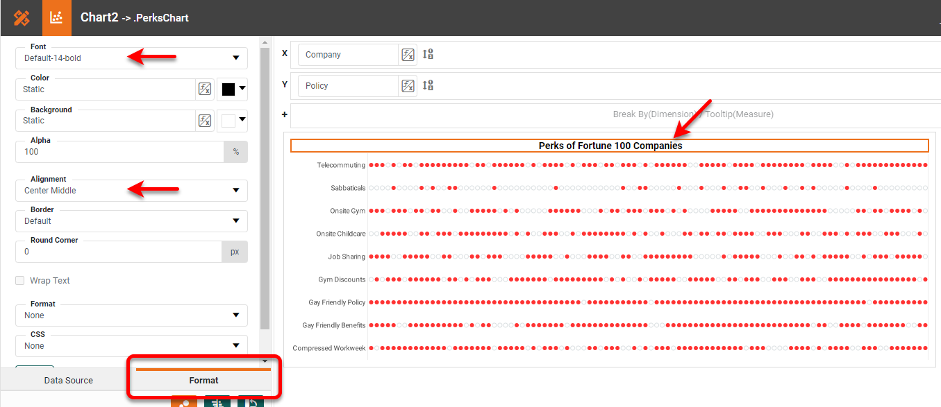
Right-click the Y-title and X-title in turn, and select Hide Title. Do the same for the legend (Hide Legend) and X-axis (Hide Axis). Edit the Chart title as desired, and center and format it using the Format tab.
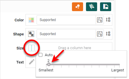
Press the Edit button next to the Size region, disable the Auto option, and increase the size to 2. This makes the circles just a bit larger.
Right-click on the chart and select Resize Plot. Drag the top slider all the way to the left to make the dots touch each other.
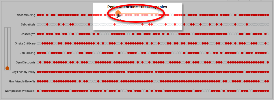
To apply an ordering to the 'Policy' labels, press the Edit Dimension button next to Y region, and choose the desired Ascending, Descending, or Manual sort order.
How to Create a Binary Dot Plot Chart in Google
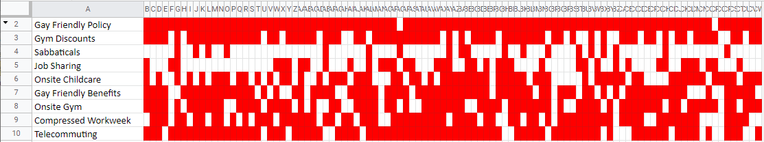
It is not possible to create the same chart such using Google Sheets. However, you can convey similar information by using conditional formatting on the Sheet cells themselves, as shown below.
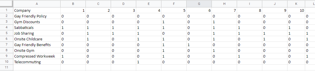
To create this presentation, first import your data into a Google Sheet as shown below:
Right-click to Cut/Copy all the data, and choose Paste special > Transposed to get the data into the correct orientation, as shown below:
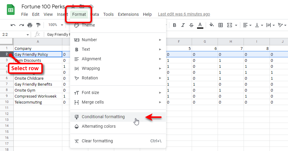
Click the header of row 2 to select the entire row. Then select Format > Conditional formatting.
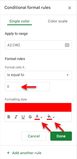
Create two conditional formats for the row, one with a red background and red font color when the value is equal to 0, and the second with a white background and white font color when the value is equal to 1.
Use the Paint format tool to copy this conditional formatting to all the other rows.
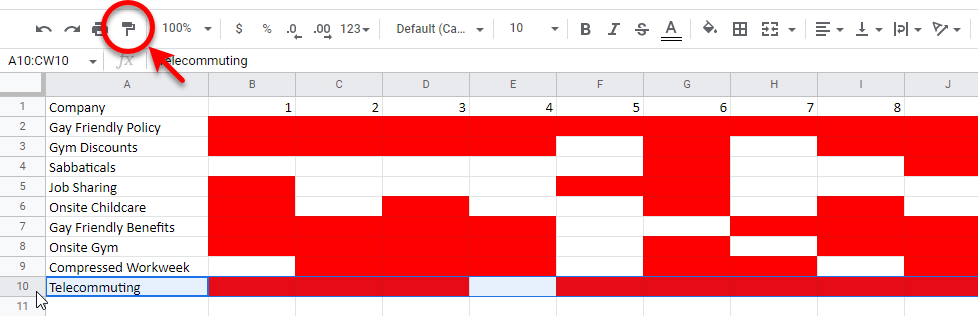
Select all the columns and resize them to be as narrow as possible, so that they all appear on screen. Right-click the 'Company' row, and select Hide row. The resulting sheet displayes essentially the same information as the binary dot plot created in InetSoft. However, the InetSoft chart is more compact and far more versatile in terms of layout and style.
Tool to Make Binary Dot Plot Charts Online for Free
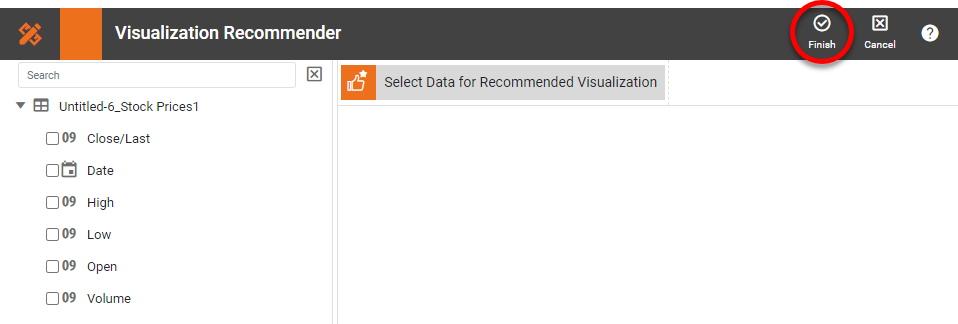
To easily and quickly create Binary Dot Plot Charts online for free, create a Free Individual Account on the InetSoft website. You will then be able to upload a text data set, as shown below:

Once you have done that, you will be able to proceed to the Visualization Recommender, which will get you started creating a dashboard. To start with a binary dot plot, though, you can skip the Recommender by pressing the Finish button at the top bar of the Recommender.
Then press Continue to go to Visual Composer. Proceed to add a Chart component using Visual Composer, and follow the steps shown earlier to create the desired dot plot chart.