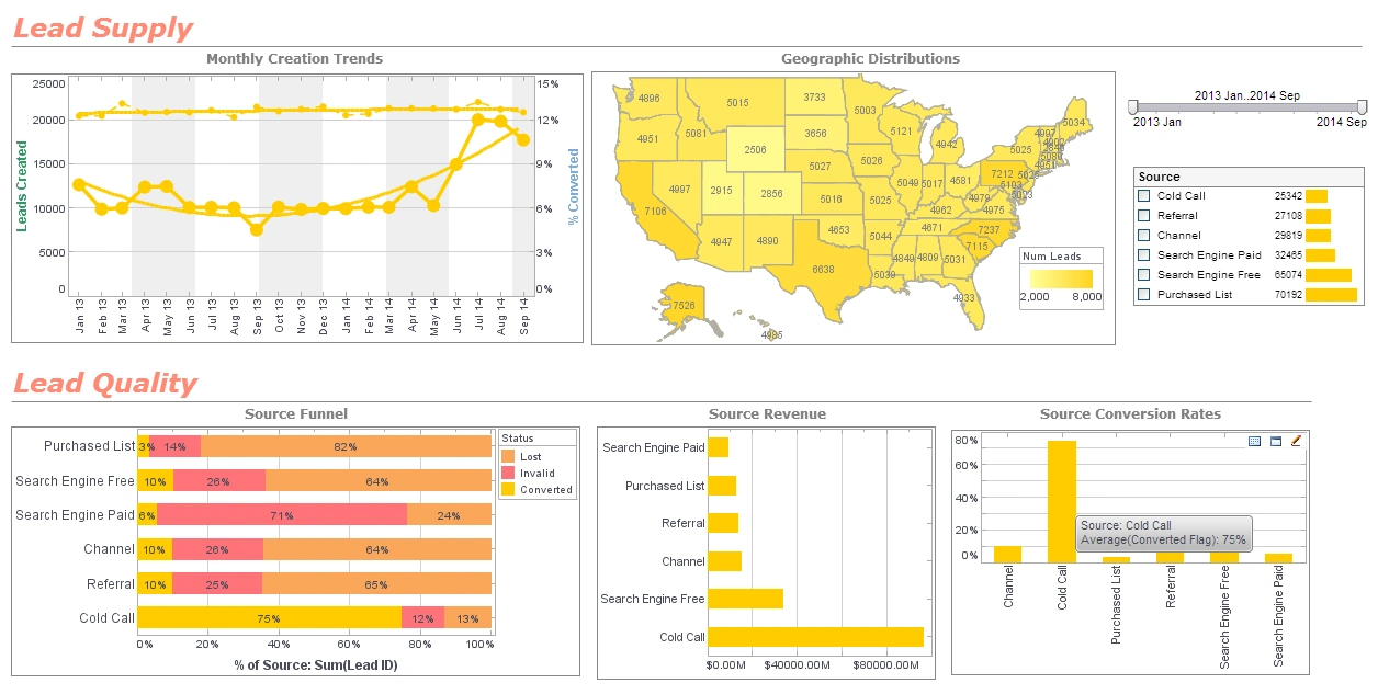
Business Intelligence Dashboard Design
Designing the perfect dashboard is more than just dropping a few charts onto a workspace. Proper dashboard design requires appropriate placement, knowledge of your data, and maybe a bit of color theory.
Placement
There are a few elements to consider when it comes to placement. Firstly, what do you want in your dashboard? It's important to only focus on important matters when creating a dashboard. Avoid placing too much detail or anything that could distract from the data at hand. Users eyes should be immediately drawn to the most important element of you dashboard. Research has shown that the top left quadrant of a screen is the most commonly looked at space, providing nothing else on the dashboard stands out more than it should. Place your most important data there to ensure it is seen by viewers.
Knowing your data
It is imperative that you are familiar with the data you are working with. One of the most common pitfalls of dashboard design is choosing the wrong medium to display data. More often than not, a simple bar chart will accurately display information. People like to get fancy, however, and use 3d-pie charts which, in reality, do nothing but confuse viewers and obfuscate data. Dashboards are about speed and this is completely counterproductive.
Color Theory
Color is a very simple, yet very effective tool for dashboards. With proper understanding, it can emphasize and accentuate a dashboard; without proper understanding, it can destroy one.
The first thing to note is that color is very powerful when it's absent. Grayscale has the potential to enhance a dashboard just as much as full color palettes.
If a full color display is the way you decide to go, pay attention to a few things, as the colors you choose say a lot. Red and green, for example, are associated with good and bad. You could really confuse someone if you create a graph with a downward trending line colored green.
Optimizing Manufacturing Insights with InetSoft’s StyleBI: A Case Study in Masonry Cutting and Grinding Wheels
StoneTech Abrasives is a leading manufacturer of diamond-tipped cutting wheels, carbide grinding discs, and industrial abrasives used in construction and metalworking. With multiple production facilities and a global distribution network, the company generates vast amounts of data related to manufacturing efficiency, supplier performance, and customer demand. However, managing and analyzing this data effectively was a growing challenge.
The Challenge: Fragmented Data and Limited Insights
Before implementing StyleBI, StoneTech Abrasives faced several key challenges:
- Data Silos: Information was scattered across different departments, making it difficult to gain a unified view of operations.
- Manual Reporting: Teams relied on spreadsheets and outdated reporting tools, leading to inefficiencies and errors.
- Limited Scalability: Proprietary BI solutions were costly and lacked flexibility for customization.
Recognizing the need for a cost-effective, scalable, and customizable BI solution, the company decided to build its strategy around InetSoft's open-source StyleBI.
The Solution: Implementing StyleBI for Business Dashboards
StoneTech Abrasives adopted StyleBI's open-source framework, integrating data collection, processing, and visualization tools.
1. Data Integration and Processing
The company leveraged StyleBI's data mashup engine to streamline data ingestion and storage:
- IoT Sensor Data: Real-time monitoring of production equipment to track efficiency and downtime.
- ERP System Integration: Pulling supplier performance metrics and inventory levels.
- CRM Data: Analyzing customer purchasing trends and regional demand.
StyleBI's data transformation pipeline allowed StoneTech to consolidate these disparate sources into a unified analytics environment.
2. Business Intelligence Dashboards
For data visualization and reporting, StoneTech Abrasives implemented interactive dashboards using StyleBI's built-in tools:
- Production Dashboard: Tracking machine utilization, defect rates, and cycle times.
- Supply Chain Dashboard: Monitoring supplier reliability, inventory turnover, and logistics efficiency.
- Sales Dashboard: Analyzing customer demand, regional trends, and revenue growth.
These dashboards featured drill-down capabilities, enabling teams to explore data at granular levels.
3. Predictive Analytics and Machine Learning
To enhance decision-making, the company integrated predictive analytics models using StyleBI's threshold-based alerts:
- Forecasting equipment failures to reduce downtime.
- Predicting customer demand fluctuations based on historical trends.
- Optimizing inventory levels to prevent shortages and overstocking.
By leveraging StyleBI's self-service analytics, business users could customize dashboards and perform ad hoc analysis without relying on IT support.
Implementation: Building a Data-Driven Culture
The transition to StyleBI required a structured implementation plan:
- Data Governance: Establishing clear policies for data collection, storage, and security.
- Training Programs: Educating employees on BI tools and fostering a data-driven mindset.
- Iterative Development: Continuously refining dashboards and analytics models based on user feedback.
The Impact: Transforming Operations
Within months, StoneTech Abrasives experienced significant improvements:
- Production efficiency increased by 22%, driven by real-time monitoring and predictive maintenance.
- Supplier performance improved, reducing procurement delays by 18%.
- Cost savings exceeded $750,000 annually, thanks to optimized resource allocation.
Future Plans: Scaling StyleBI
Encouraged by its success, the company plans to expand its BI capabilities:
- AI-Driven Automation: Using deep learning models to optimize production scheduling.
- Mobile BI: Deploying dashboards on mobile devices for enhanced accessibility.
- Blockchain Integration: Enhancing supply chain transparency with open-source blockchain solutions.
