Business Intelligence Dashboard Examples
Looking for business intelligence dashboard examples? InetSoft offers award winning dashboard solutions. InetSoft's dashboard tool requires no expensive BI experts or consultants to deploy and offers an intuitive point-and-click, highly visual, easy-to-use interface.
InetSoft's dashboard tools reduce TCO and help the enterprise realize immediate ROI by empowering their users with maximum self-service ability. Click on the screenshots below to get a closer look.
HR Attrition Dashboard Example
Maintenance Efficiency BI Dashboard
Project Management Office Dashboard Example
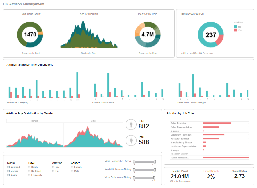
This HR attrition dashboard example breaks down the various factors involved in personnel turnover, helping HR managers identify factors in employee attrition. Attrition data is broken down by gender, department, marital status, and years worked. HR scorecards help give HR managers an overall picture of the factors that contribute to employees leaving the company.
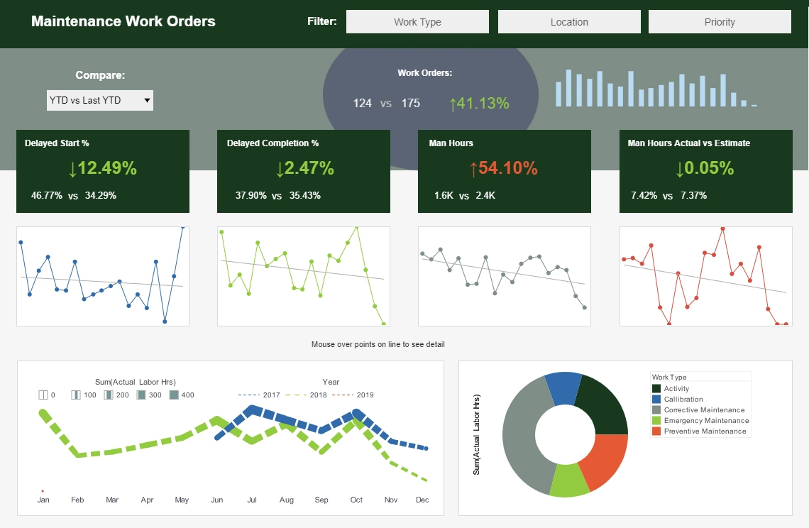
This maintenance efficiency dashboard sample displays the percentage of work orders started and completed, and tracks the man hours necessary for completion of said work orders. A number of line charts display the fluctuations in these various measures over time, enabling managers to pinpoint where specific issues occurred.
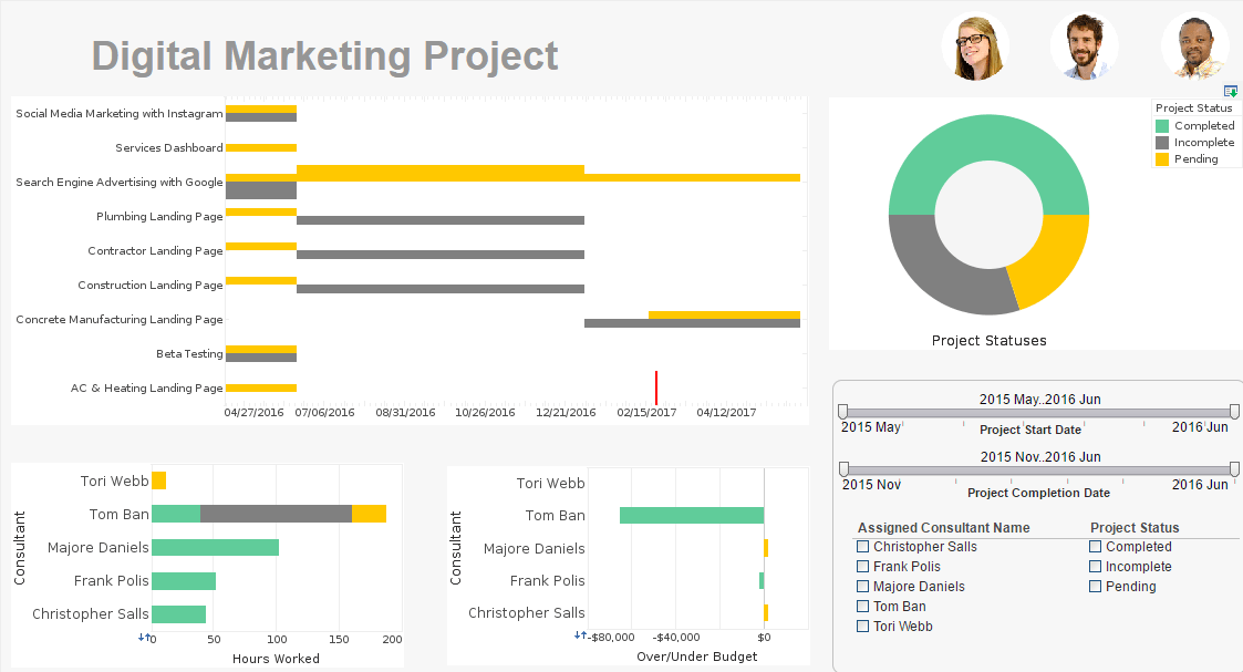
This project management office dashboard example aids in the monitoring of various marketing initiatives and the start and end times of various project stages. This type of dashboard helps digital marketing agencies track the progress of their consultants on various initiatives. A Gantt chart tracks the start and end date of various projects, giving a visual representation of project durations. Gantt charts now comes as a standard option in InetSoft's visualization engine.
Predictive Music Industry Dashboard Example
Sales Performance BI Dashboard
Help Center Dashboard Portal
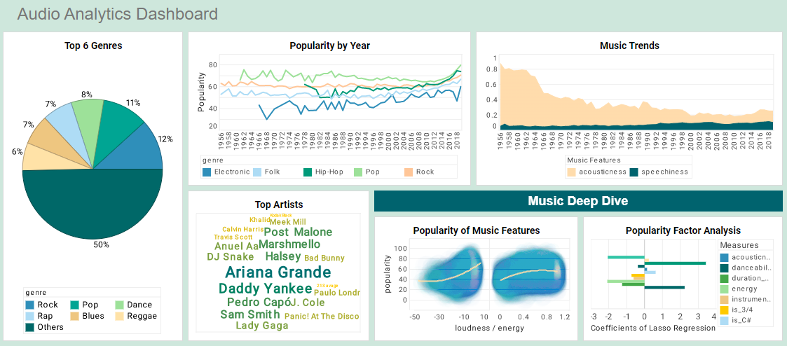
This predictive music industry dashboard example by InetSoft can be easily embedded into applications to help creators find the next hot music genre in certain areas. In the example dashboard, the most important audio features impacting popularity are identified by regression model. Moreover, end user can deep dive into the music fusion by checking simulated decision tree of genre classification.
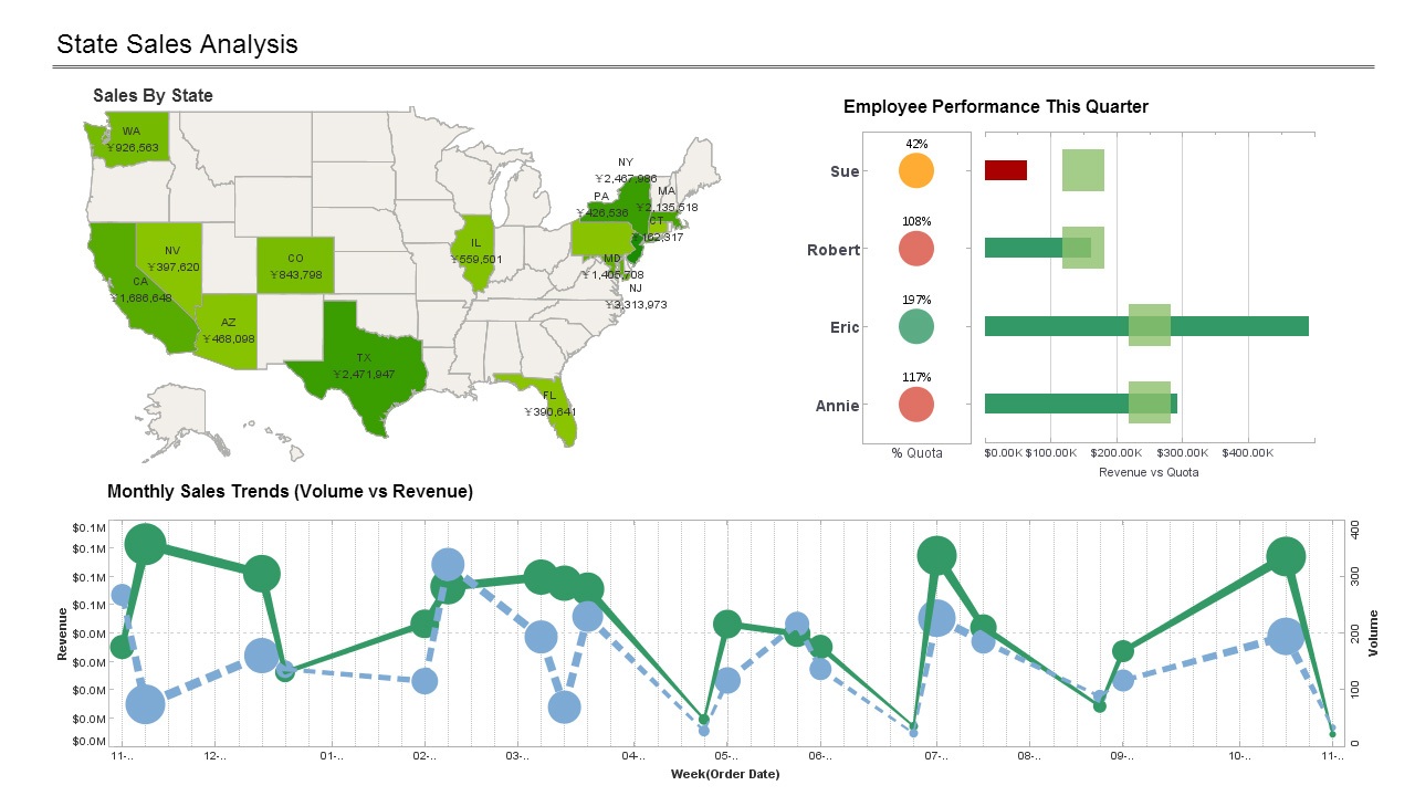
This sales-by-state sales performance dashboard gives a broad visual breakdown of revenue, prices, and profits, by product line. Color is used in several of the charts to add another dimension. The live version features a mouseover chart, packing in even more information without wasting dashboard real estate.
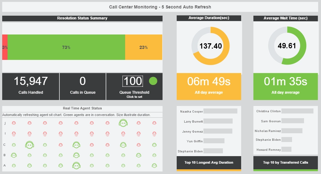
This real-time help center dashboard portal gives shows call center managers how many calls their employees are handling and how long they are taking. The dashboard refreshes ever 30 seconds, with individual employees represented with icons that change color when the employee is on the phone.
Risk Management Consulting Dashboard Example
Multidimensional Demographic Dashboard
Commerce BI Dashboard
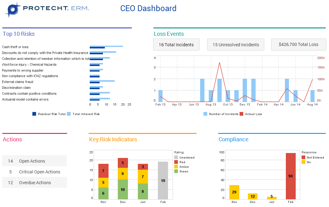
This risk management consultancy dashboard from InetSoft partner Protecht displays various measures of risk and compliance. An incidents by date chart features a red line tracking actual losses, utilizing color to draw the users attention to what's most important.
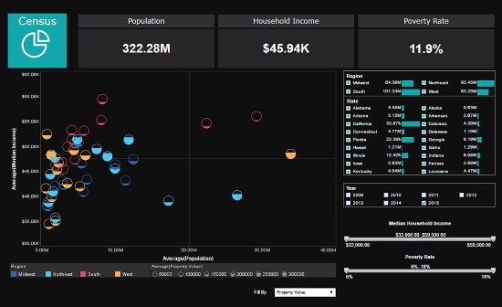
This multidimensional data analysis of US census data uses multidimensional charting to display population, income, region, and property value, all in a single chart. Various filter elements enable possible patterns in the data to be discovered and explored.
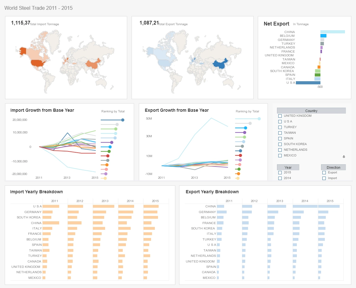
This commerce dashboard example paints a detailed picture of global imports and exports, with seven different charts, three of them multidimensional. With so many countries displayed, narrowing down the analysis with a selection checklist can make analysis exponentially easier for the end-user.
Forged Steel, Forged Insights: How a Structural Hardware Manufacturer Transformed Operations with InetSoft’s Open Source StyleBI
For one U.S.-based manufacturer of forged steel anchor rods, base plates, clevises, eye bolts, and turnbuckles, adopting InetSoft's open source business intelligence appliction, StyleBI, wasn't just a technology upgrade; it was a turning point in how the company understands itself and serves its customers.
This manufacturer, with a 70-year legacy in the civil and structural engineering supply chain, had long relied on Excel spreadsheets, siloed ERP reports, and hand-computed KPIs to guide production decisions. But as demand increased—particularly from transportation infrastructure, renewable energy towers, and stadium construction projects—the cracks in the old systems began to show.
They needed dashboards. Real ones. Not static charts in PowerPoint decks. Not reports that were out of date before they were printed. They needed data that could mash up across sources, update in near real time, and present visual insights tailored to each stakeholder—from plant managers and procurement teams to sales executives and the CEO. That's when they turned to StyleBI.
A Need for Adaptable, Embedded Intelligence
The company had evaluated several business intelligence solutions—Microsoft Power BI, Qlik Sense, and Tableau among them. While each had strengths, they were either too expensive, too rigid in their licensing terms, or too complex to integrate directly into the company's custom-built ERP and MES (Manufacturing Execution System). StyleBI, on the other hand, stood out because of three major features:
- Open Source Flexibility: As an open-source application, StyleBI allowed the IT team to deploy and customize without being locked into high recurring license fees or vendor-driven development cycles.
- Embeddability: StyleBI's lightweight footprint and RESTful APIs made it easy to embed dashboards directly into their internal web portals—no context-switching for users, just seamless insights where they already worked.
- Data Mashup Capabilities: Unlike traditional BI tools that require rigid ETL pipelines or proprietary data models, StyleBI was built to mash up data across SQL and NoSQL sources, CSVs, cloud storage, and REST APIs with minimal pre-processing.
These were more than just buzzwords—they translated directly to operational savings and agility.
Data Sources and Integration: A Mess Made Clean
Before StyleBI, operational data lived in a chaotic sprawl of formats and systems: Oracle databases hosted the ERP; the MES was built in-house using a PostgreSQL backend; inventory and batch tracking were stored in Microsoft Access databases and Excel; customer order histories resided in a legacy CRM with a SOAP API; and shift logs were still kept as flat files in shared network folders.
Within six weeks of adopting StyleBI, the IT team had used its data mashup engine to unify this scattered data environment into a coherent virtual model. The mashup layer allowed them to join production metrics with order histories, procurement lead times, and downtime logs—without needing a central data warehouse.
Now, instead of asking IT to manually prepare quarterly reports, production supervisors simply log into the internal portal and select their dashboard view: batch defect rates over time, OEE (Overall Equipment Effectiveness) trends per forging line, or even interactive Gantt charts of machine availability.
Dashboards with a Purpose: Tailored Views for Diverse Roles
The true value of BI doesn't lie in the volume of data—it lies in the stories dashboards tell and the decisions they empower. Using StyleBI, the manufacturer created role-specific dashboards for different layers of the organization.
- Real-time monitoring of forging press utilization
- Tool changeover frequencies and cycle time distributions
- Defect rates categorized by cause (material, die wear, operator error)
With these metrics updated every 15 minutes, plant managers could make same-day adjustments instead of reacting to problems weeks later.
Procurement & Supply Chain Dashboard
- Vendor lead times vs. committed delivery dates
- Price trends of alloy steel grades
- Inventory turnover rates for fasteners and threaded rods
Procurement officers used this to renegotiate terms with underperforming vendors and to optimize just-in-time stocking levels.
Executive Dashboard
- Revenue per product family
- Contribution margins by project type (bridge, utility, commercial)
- Order fulfillment rates and customer retention
The C-suite could now assess financial and operational health in one glance, complete with predictive forecasting widgets powered by StyleBI's built-in analytics engine.
Visual Storytelling: From Static Reports to Dynamic Exploration
One of the underestimated strengths of StyleBI is its approach to interactive data visualization. Rather than locking users into pre-built chart templates, it gives dashboard creators flexible control over layout, interactivity, and custom filters. The result is a user experience that mirrors the curiosity of the business user—inviting them to click, hover, drill down, and ask questions in real time.
For example, a quality assurance manager exploring high rejection rates for a particular clevis design noticed a pattern when cross-filtering by die maintenance logs and shift assignments. That insight—unavailable in standard Excel charts—led to a targeted retraining initiative that reduced defects by 14% in the following quarter.
These dashboards weren't just visualizations—they were cognitive tools. And they made the workforce smarter at every level.
Embedding and Security: The IT Perspective
For the company's IT team, StyleBI's embeddable architecture was a major win. They integrated the dashboard engine into their .NET-based intranet using a mix of REST API calls and secure SSO (Single Sign-On) mechanisms, ensuring that each user only accessed the data relevant to their role and department.
The dashboards are rendered dynamically within existing user dashboards—whether it's an HR portal showing labor productivity, or a customer portal displaying order status visualizations.
StyleBI's native support for row-level and column-level security meant IT could manage access controls without duplicating user permissions across multiple systems. This minimized compliance risks—especially important as the company serves public infrastructure projects and must meet federal cybersecurity standards like NIST 800-171.
Performance, Scaling, and Openness
Unlike traditional BI stacks that demand heavyweight infrastructure, StyleBI was deployed on a modest virtual server and scaled horizontally using containerization. With Docker-based deployment and Kubernetes support, the company now runs multiple StyleBI instances tuned for different business units.
Crucially, the open-source nature of the software gave them the confidence to extend and contribute back. Their developers created custom StyleBI plugins for predictive analytics modules and even published a GitHub integration to visualize GitOps metrics for their MES codebase—another example of how the BI tool went beyond data consumption to become a data-centric development platform.
A Culture Shift Fueled by Visibility
Arguably the most profound change wasn't technical—it was cultural. By putting dashboards into the hands of machine operators, logistics coordinators, and line-of-business managers, StyleBI democratized access to performance insights. Problems were caught earlier, collaboration became data-driven, and teams started speaking a common language rooted in shared metrics.
Instead of Friday postmortems driven by anecdotal evidence, team meetings began with shared dashboards and actionable goals. And because everyone could see how their area of responsibility contributed to larger KPIs, accountability and initiative improved across the board.
The Future: Predictive Maintenance and AI-Driven Decisions
As of mid-2025, the company is already piloting predictive dashboards powered by StyleBI's integration with Python-based machine learning models. By feeding historical vibration, temperature, and load cycle data from forging equipment into regression algorithms, they're building dashboards that forecast failure probabilities for critical components.
The long-term vision? To embed prescriptive insights into every process—automatically recommending tooling changes, flagging supplier risk, and even suggesting optimal batching schedules based on forecasted demand patterns.
